With Thanksgiving behind us, now is the time to get serious about decking the halls. Here are some expert decorating tips to help you perfect your Dallas home's signature holiday look for Christmas.
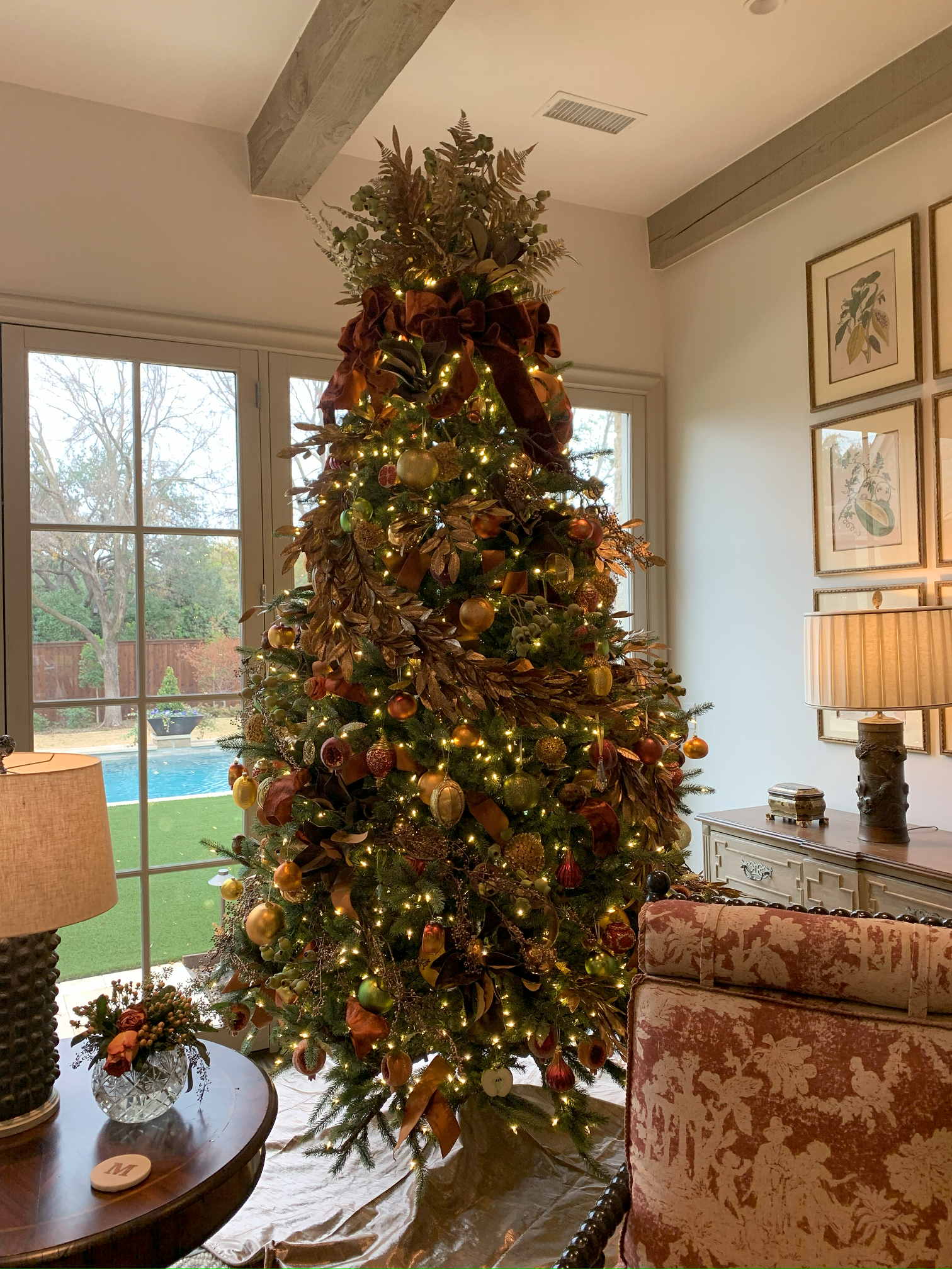
When it comes to ornaments, I recommend metallic colors, like the ones on the Christmas tree seen here. Some ornaments resemble fruit, adding a whimsical touch.
To start with, choose ornaments that complement the rest of the room's colors. Varying the ornaments in three basic sizes will also create interest. When mixed with matte finish ornaments, metallic ornaments scatter light and add a luxurious touch.
Garland creates a focal point across mantels, stairway banisters, and over doorways. Embellish your greenery with ribbons, flowers, faux berries, and hanging ornaments. When decorating your mantel, combine your all-season accessories (such as candles and porcelain) with seasonal accessories (like pinecones, vintage ornaments, tree toppers, and cedar greens) to fashion a holiday look that is all your own. Regardless of which accessories you choose, vary the height of the objects to create a sense of visual rhythm.
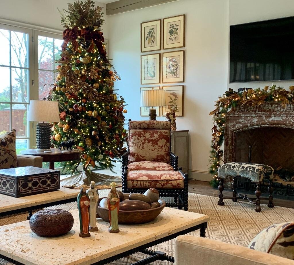
The mantel to the right of this picture is decorated with both a green and a gold garland, intertwined.
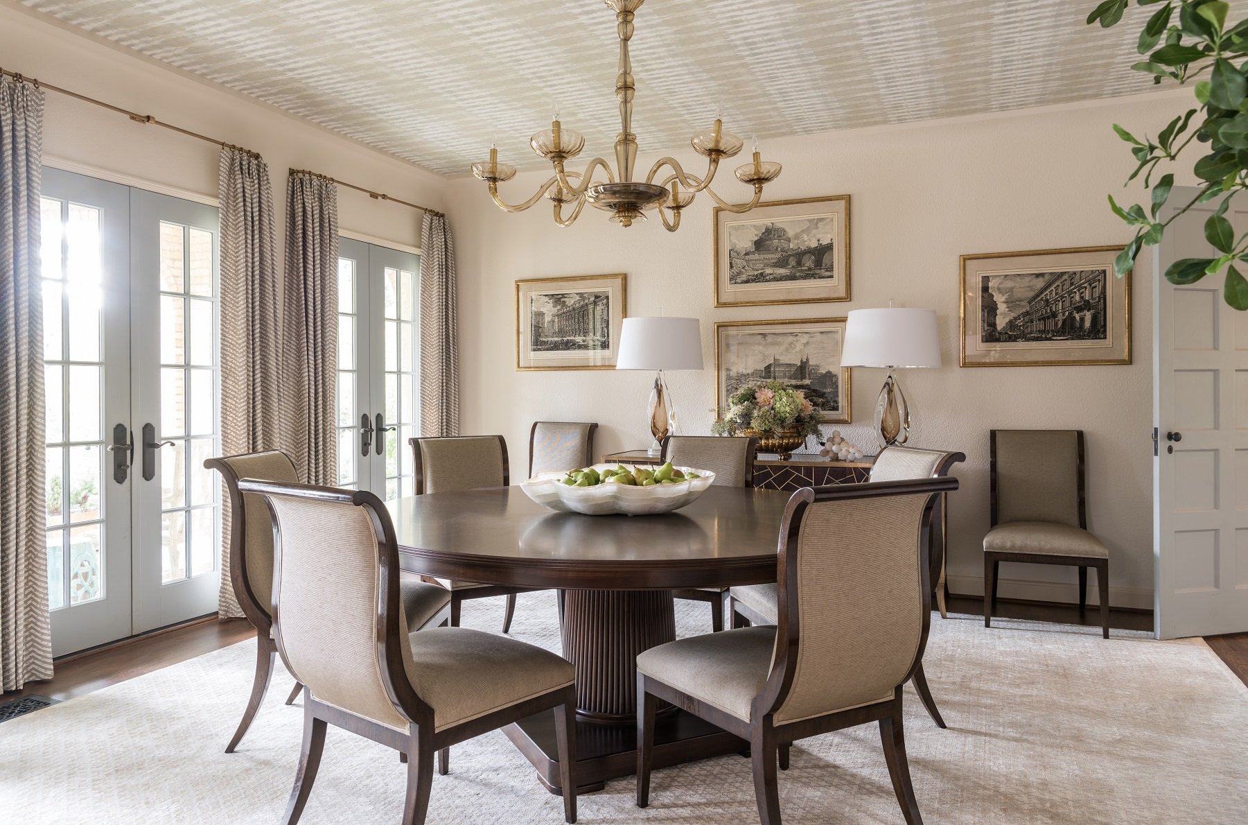
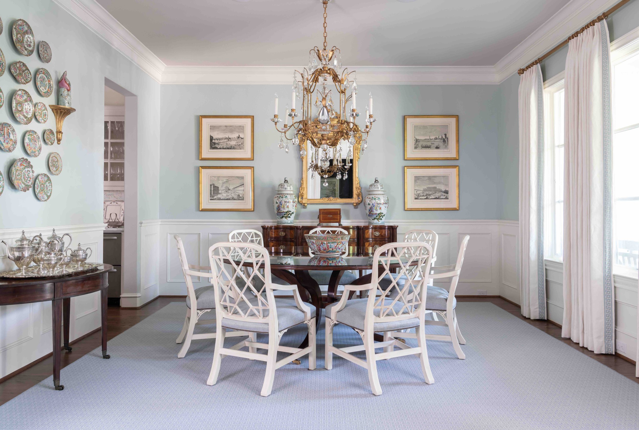
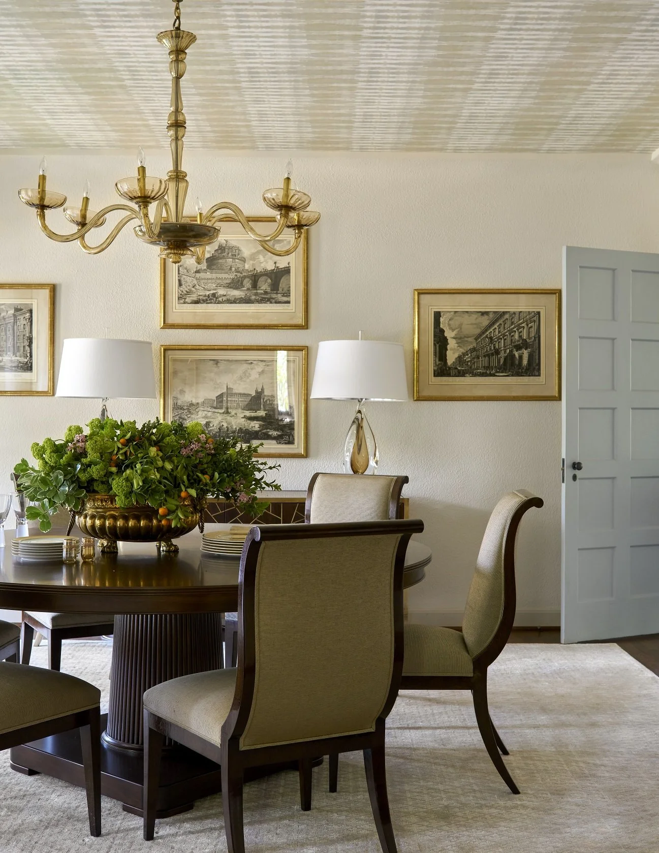
A welcoming wreath is a must for holiday decorating. Try mixing different kinds of greenery in the same wreath for a tone-on-tone look. Of course, no holiday home would be complete without a gorgeous table setting either. An elegantly-set table shows your guests that you appreciate them and want to celebrate with them in style. When choosing your table decorations, be careful not to pick tall accessories that could block conversation between guests. If your dining ware is colorful, you will want to make sure your centerpiece complements those colors.
Not all Christmas decorating needs to be red and green. Here at Chambers Interiors, we're big fans of decorating with jewel tones, metallics, and rich colors like deep purple and blue, too. While boxwood garlands, wooden candle holders, cedar branches and woodland creature figurines would give your home a cozy, rustic holiday feel, decorations in aqua, silver and white, mercury glass, and metallic reindeer figures lend a contemporary look instead.
The holidays are a special time to spend with loved ones, and our homes hold the magic of the holiday season. Consider hiring an interior designer to create your signature holiday look. Chambers Interiors & Associates will expertly style new and treasured holiday decor for a tasteful seasonal display that will impress your guests and give you more time to soak in the joy of the holidays. To schedule a free consultation with us, call us at 214.651.7665 or send an email to info@chambersinteriors.com.

Although aqua is not a traditional Christmas color, it pairs beautifully with the golds and greenery on the banister here. Our clients hung their family stockings on the staircase because there was more room there for their large family than on the fireplace mantel.