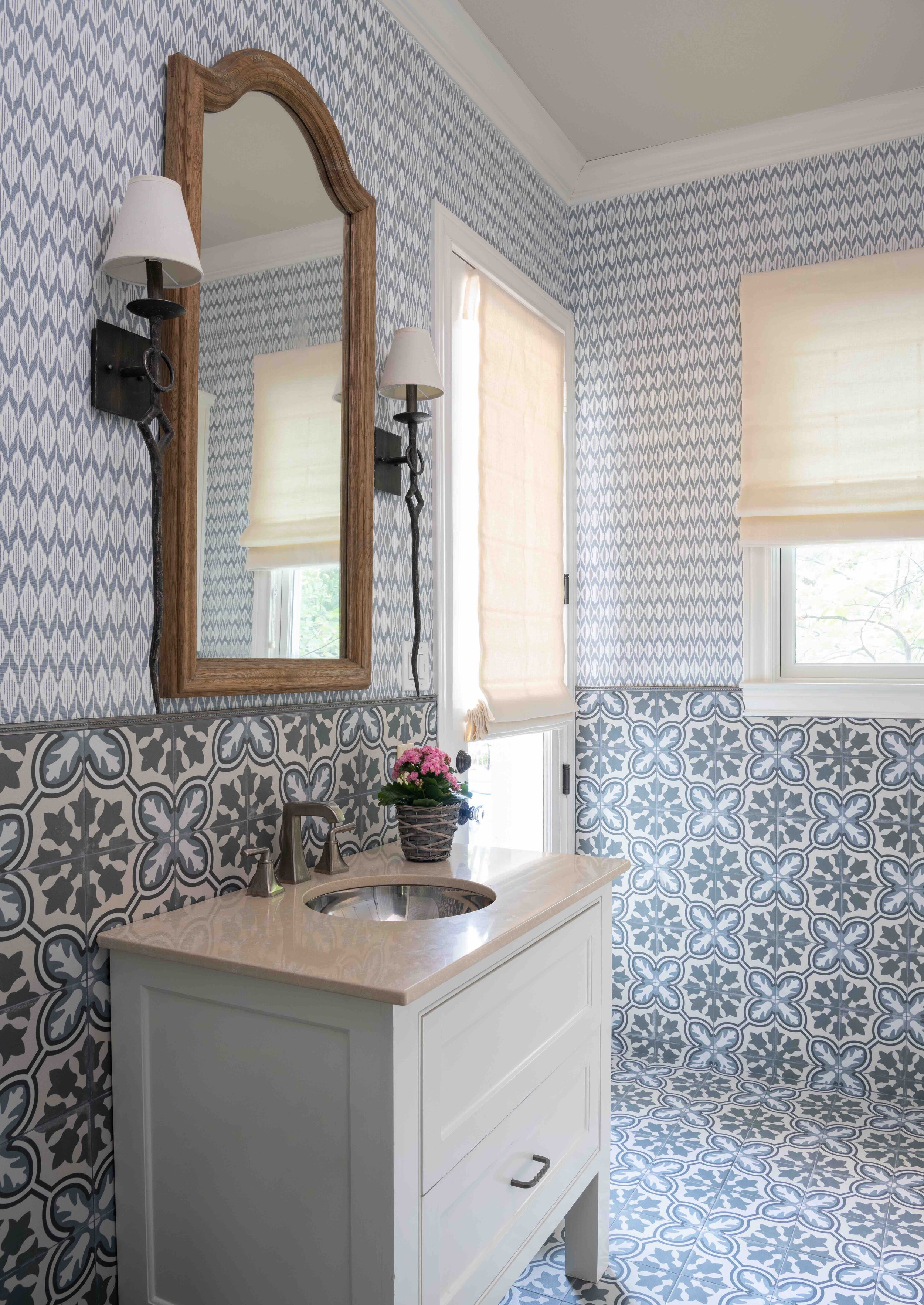
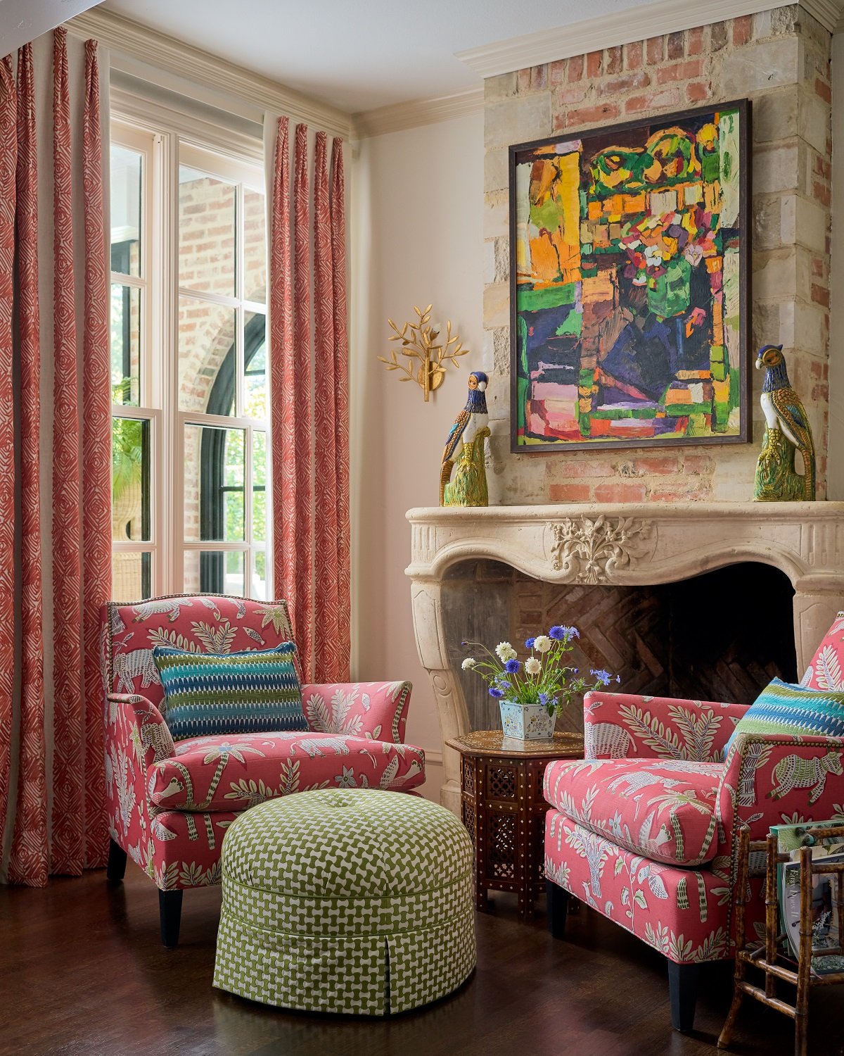
This keeping room from a University Park chateau feels like “eye candy” with its cheerful colors, fun fabrics, and little round ottoman. The fabric pattern on the chairs matches the patterned wallpaper in the nearby bathroom. We had fun mixing patterns and prints in this house.
I extolled the virtues of minimalism in my last article, but this time, I’m going to take the opposite approach and give a shout out to maximalism. While minimalism is all about “less is more,” maximalists would rather say, “more is more!” Maximalist design embraces color, abundance, and personal expression. Below, you’ll find my personal tips for designing a maximalist home, featuring photos from my interior design projects in Dallas.
Maximalism is a good fit for you if:
You love bold colors and busy patterns.
You have collections and want to show them off.
You prefer traditional styles with ornate details.
You have trouble editing down the number of pieces in a room.
Minimalism tends to stay rooted in the mid-century modern look, but maximalism is not afraid to mix and match styles from across history. The Gilded Age in the late 1800s and Hollywood Regency style from the 1920s are both major sources of inspiration.
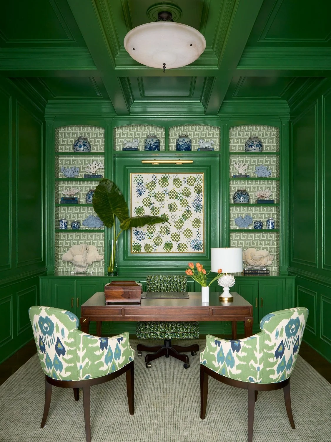
The lacquered green walls in this study make a strong impression, but since we kept the rest of the room in a calming color scheme (green, white, and blue) the space still feels restful.
Between minimalism and maximalism, I think maximalism is more trendy right now. All-white interiors were very popular 10 years ago, but interior designers like myself are starting to use more color and wallpaper again. That said, if you prefer minimalism, don’t worry about your home looking dated. Minimalism will always have its fans, so I don’t think it will ever go completely out of style.
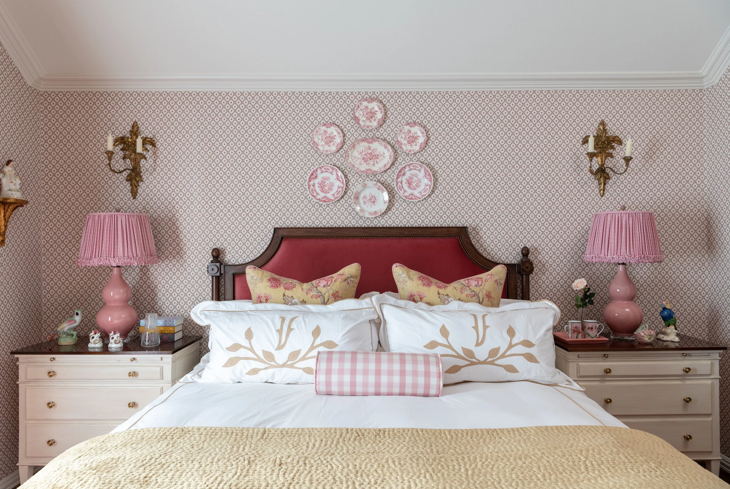
Maximalism is the perfect design style for collectors of travel souvenirs, beautiful books, vintage china, etc. Just keep in mind that the more stuff you own, the more dusting you’ll have to do. If you’re filling your room to the brim, you’ll need to create one or two focal points, such as a bookshelf or a gallery wall, that stand out from everything else. The rest of the elements in the room should be a little more subdued to let your focal points take center stage.
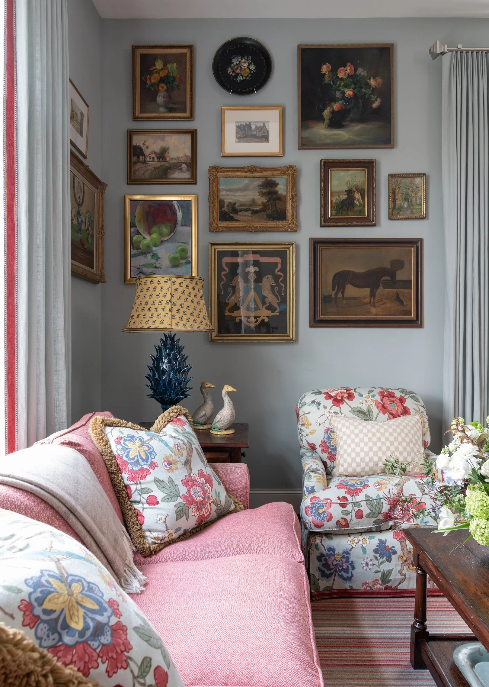
My client for this Turtle Creek townhouse loves to pick up oil paintings when she’s travelling. We found the perfect wall to display them all in her family room. This room has a lot of patterns and colors, especially pink.
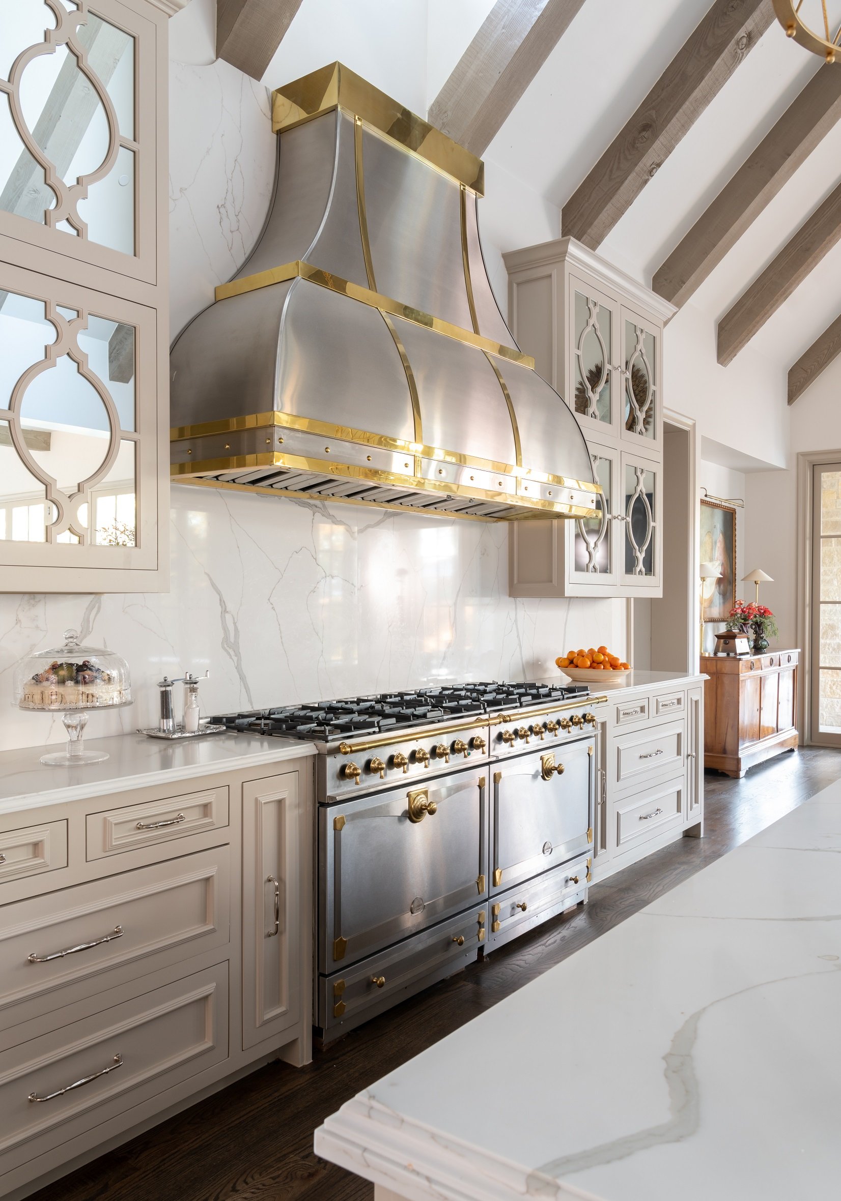
The textures and fabrics in a maximalist home tend to feel luxurious (like velvet or silk), with bright metallic accents (such as gilded picture frames or chandeliers). Other eye-catching elements, like furniture with a glossy finish or hand-painted wallpaper, can help you recreate the style.
Just because you’re using bright colors doesn’t mean that you should feature every color from the rainbow. As you would with any other style of room, pick one main color and a couple of supplementary colors, plus another color for accents. You could always start with a neutral base and then layer more colors and patterns over time until you find the “sweet spot.”
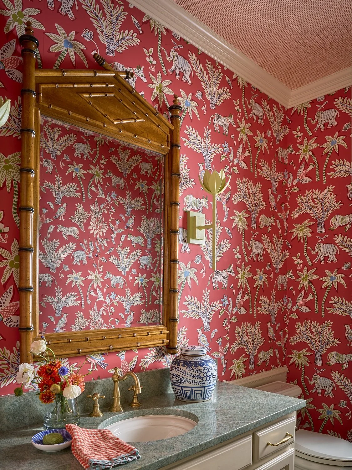
We went bold with a charming orange and green color scheme in this powder bath. This room has an Asian theme. Notice the bamboo mirror, blue-and-white Asian vase, and the painted lotus blossom sconce. In addition to the whimsical wallpaper, we added a patterned grasscloth paper to the ceiling.
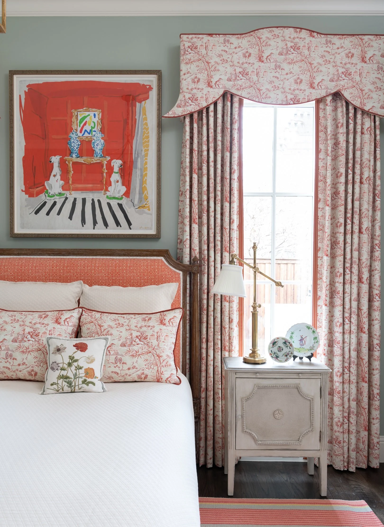
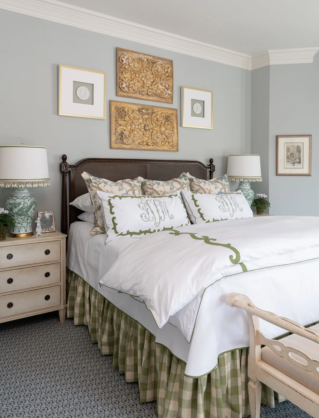
What if you don’t want to commit to making your whole home maximalist? Try designing some rooms in the home to be more minimalist, while others are maximalist. For example, you’d probably want your bedroom to be calmer and more restrained. The library is a good place to show off all of your books and collectibles in a more maximalist style. Regardless of which style you choose, you should prioritize buying well-made, timeless pieces of furniture.
Don’t forget that a maximalist home should be a bold expression of your personality. An interior designer can help you create a home that looks chic and beautiful instead of cluttered, but make sure your designer can recreate your personal style, rather than impose their own tastes on your home. The best part about maximalism is that you don’t have to hold back: your home can be a testament to your personality and all the things you treasure.
If you’d like to work with Chambers Interiors for your next project, call our Dallas office at 214-651-7665 or send us an email at margaret@chambersinteriors.com.