Preston hollow

Secrets for Styling a Gorgeous Bed by Margaret Chambers

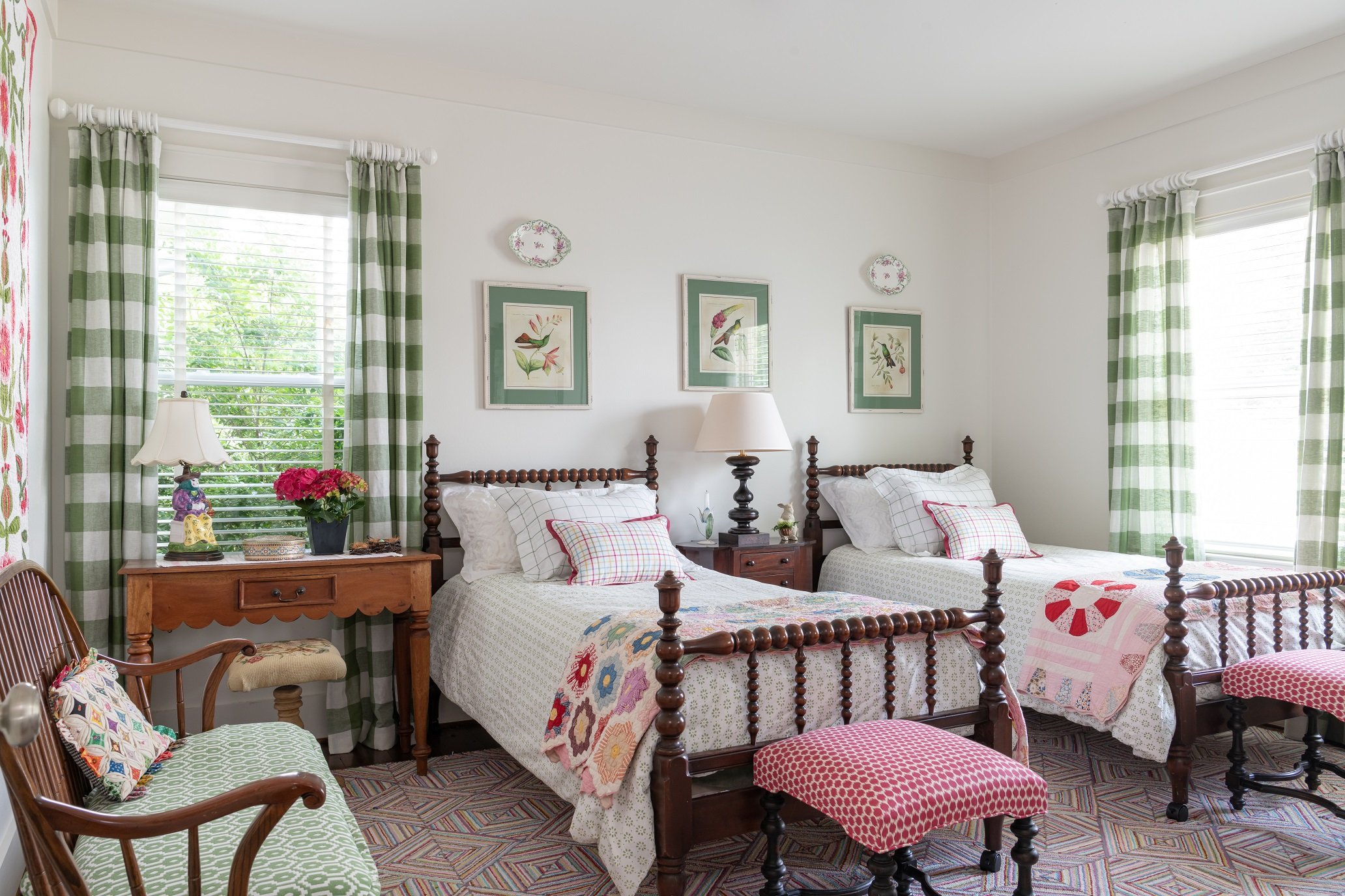
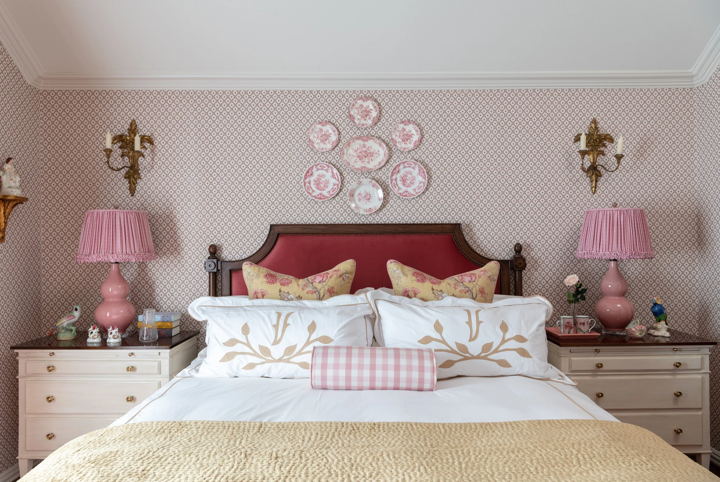
A pink-and-white check pillow is the finishing touch for this girl’s bedroom from a Turtle Creek townhouse.

A beautifully made bed makes a world of difference in interior design. Regardless of whether you want an upscale or a casual look, combining the right patterns, fabrics and colors will help you create a look that makes you (or your guest) want to dive right in.

When I’m designing a bedroom for one of my Dallas clients, I usually pick the bedding first. After all, the bed is the focal point of the bedroom and sets the mood for everything around it. Following up on my last article about choosing a mattress, this time, I’ll explain how to make your bed look like one you’d see in an interior design magazine.

StylE

A bed’s design style should always go with the architectural style of the house. In a traditional house, the bedding ought to have more detail, such as layered patterns and monogrammed sheets and pillowcases. The pillows are usually stacked, with maybe a bolster in the middle. A throw blanket at the end of the bed completes the look.

For a contemporary house, it’s more appropriate to design a sleek and simple bed, probably with neutral bedding and fewer pillows. You can still have some detail—for example, edged details on the sheets, pillowcases, or Euro pillows—but on the whole, it’s going to be more minimalist. Any bed with a monochromatic color scheme should use a variety of textures.

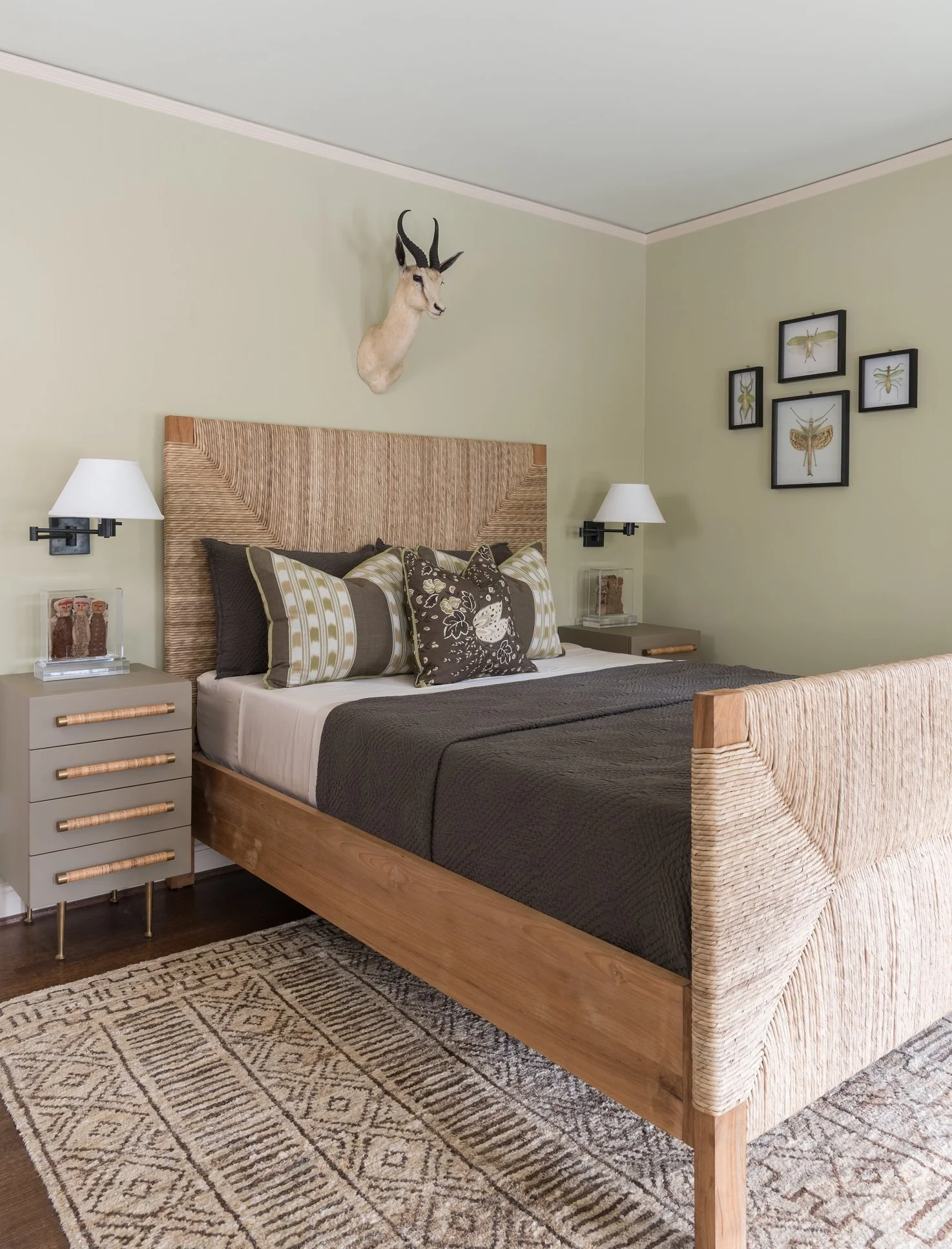
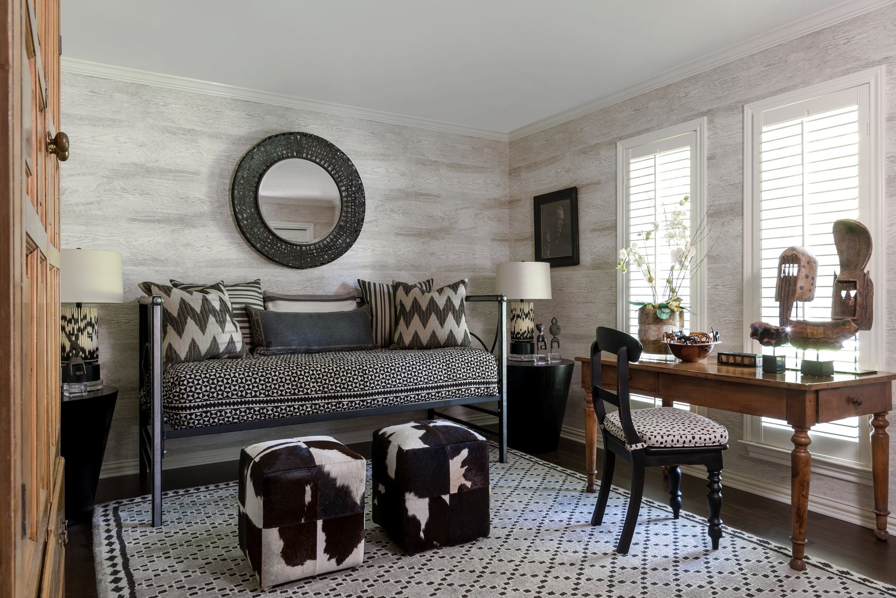
This Africa-themed guest bedroom in a Kessler Park home has a contemporary feel because of its simplicity and textural elements. The color scheme for the bedding is done in earth tones.

As a side note, don’t worry about whether every piece on your bed serves a function. Even if you never plan on sleeping with the decorative pillows or the throw blanket, they’re necessary for putting the finishing touch on the design. If you really want that professionally made-up look, you need to style your bed the same way you’d style a shelf or a table setting.

Color Scheme

You can create your bedding color scheme by picking a basic color that complements the rest of your bedroom. Then, build off that color by working with different shades of the same color family.

All-white bedding is popular because it promotes a feeling of relaxation. Since white linens will go with any other color, they’re a good base in case you want to change your duvet and pillows with each season. Blue is probably the next most popular color scheme for bedding. While white is elegant and refined, blue has more of a casual and coastal feel.

If you only want a touch of color, you could use your boldest color on your fitted sheet (which won’t be visible most of the time) or the throw pillows. Since the bedspread is the largest item, choosing a boldly colored bedspread will create the biggest impact. If your bedspread and pillows are colorful, it’s strongly recommended to choose white sheets and sleeping pillows. The white pillows and folded-down top sheet (if visible) will help break up the areas of color and give the eye a place to rest.

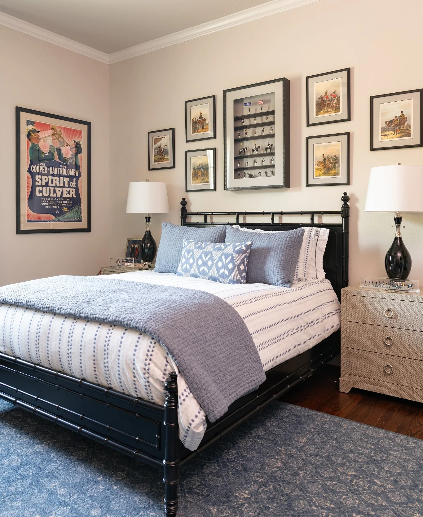
Blue-and-white is a classic color combination. It can instantly give bedding a refreshing and uplifting feel. Seen here is a boy’s bedroom from a Preston Hollow home we designed.

Love patterns? Make sure to break up the patterns in your bedding with some solid colors too so that the bedding is not too “busy.” To unite different patterns, make sure both patterns share at least one color. Keep in mind that large patterns are energizing, which is usually not the vibe you want in your bedroom. Small print patterns with subtle colors, however, can be calming.

Sheets

Your sheets should be the best quality you can afford because your skin comes in contact with them every day. I have a traditional house, Federal in style, so I have a turned-down bed where the coverlet and sheets are folded over. Since my sheets are visible, I like to keep multiple sets of sheets to change things up.

Here are some pros and cons to common sheet materials:

  • Cotton sateen sheets are silky with a subtle sheen. They are cool to the touch, but also trap some heat.

  • Cotton percale has a cool, crisp texture that feels like hotel sheets or a button-up shirt.

  • Cotton flannel sheets are super soft and cozy, making them ideal for the winter months.

  • Linen can feel rougher than cotton, but it softens up after washing. Its hollow fibers trap the optimal amount of body heat to keep you warm at night while also being soft and supple.

  • Silk is another soft material. Notably, it absorbs less moisture, meaning you can use beauty products before bed without worrying that they’ll get absorbed by your pillow.

Some people change their bedding with the seasons, using percale sheets in the summer, and flannels in the winter, for example. Linen is a good in-between material for both spring and fall.

Before ordering sheets, measure your mattress height. A tall mattress, such as a pillow-top, may require extra-deep cut sheets. Top sheets should be put in finished side down so that the sleeper can enjoy the soft texture. This way, the finished side will also be visible when you fold the banding back.

Bedspreads

It’s worthwhile to research the different types of bedspreads out there before you buy one. Although the terms “duvet” and “comforter” are sometimes used interchangeably, they are two different things. A comforter is a single piece of quilted bedding that is filled, while a duvet has two parts: the insert and the cover, which fits over it like a pillowcase. Comforters are often larger, spilling over the sides of the bed, while duvets are meant to match the size of the mattress.

Quilts or coverlets are cool in the summer and warm in the winter, although they are not as warm as comforters. Pinch-pleated or ruched duvet covers add textural depth and interest to a solid-color bed. A reversible duvet gives you two color options; the color on the opposite side can also be folded over partially to create a striking contrast. For an extra-fluffy look, you can put two inserts in a duvet.

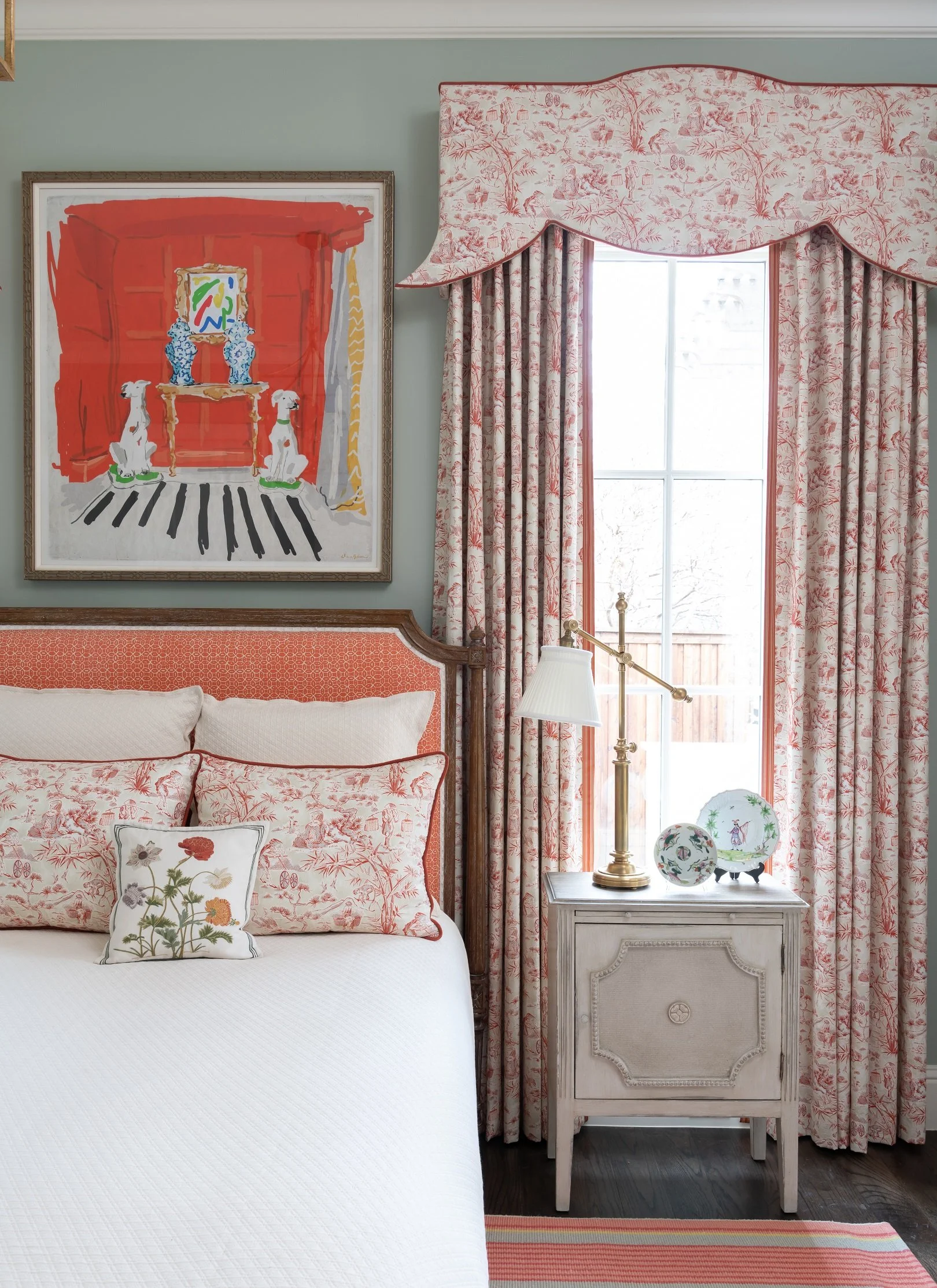
This is one of my all-time favorite bedrooms I’ve designed. The matelassé on the bed has a wonderful texture. The pillows have a layered look, with a hand-embroidered center pillow in front of a pair of Asian toile pillows. The upholstered headboard is within a stained French wood frame.

In my design projects I use a lot of matelassé bedspreads, which have a quilted-like fabric, because they’re washable. I work with several brands that carry “semi-custom” items, where we can pick a fabric from a line and have it made. Buying semi-custom bedding, as opposed to fully custom, makes putting together a bed quicker and more affordable.

The first thing to wear out on the bed is the coverlet or duvet cover because people sit on their beds to watch TV or read a book, or let their kids and pets get on the bed. I always recommend that people get an extra duvet or matelassé in case they need to send one out to be cleaned.

When you fold your bedspread, I suggest folding it in half, and then pulling it back towards you into thirds, past the rows of pillows. Pulling it back gives the pillows more “breathing room” and creates more depth.

Pillows

Decorative pillows are a must for adding more style, texture, or color to your bed. An odd-numbered, asymmetrical arrangement keeps things casual, while a symmetrical arrangement looks more formal. The pillows in front need to be smaller than the ones in the back so you can see behind them.

The number and size of the pillows you should use depends on the size of your bed. For example, a queen bed can have two Euro pillows stacked on each side in the back, two shams or larger throw pillows in the middle, and then either two throw pillows or a lumbar pillow in front. A king bed needs three pillows at the head of the bed. Sleeping pillows can be hidden at the back behind the Euro pillows.

If you have a pretty headboard, you may want to show it off by using fewer pillows. For lumbar pillows, consider placing a round decorative pillow in front; it’ll contrast nicely with the rectangular shape behind it.

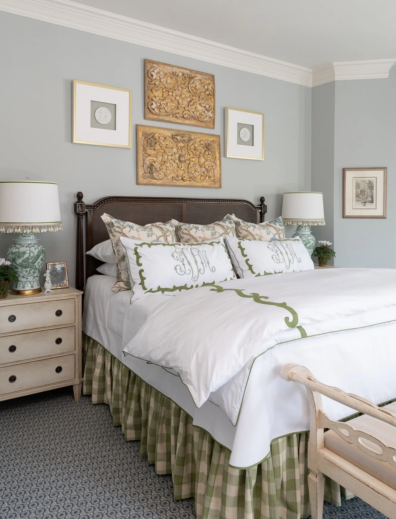
This green check bed skirt matches the green detailing on the duvet and pillows. Notice how the sleeping pillows are stacked and hidden behind the decorative pillows.

Bed Skirts

A bed skirt—also known as a dust ruffle—goes between the mattress and the box spring, hiding the lower part of your bed. You’ll definitely want a bed skirt if you store items under the bed. Although bed skirts are mostly decorative, they also help keep dust from accumulating under the bed.

Throw Blankets

Throw blankets, like throw pillows, can be swapped out with the change of season for an easy update. A throw blanket isn’t just for decoration; it also gives your guest another layer for warmth. They are sometimes draped across the bottom of the bed at a diagonal angle. Regardless of bed size, any blanket or quilt you put on the bed needs to be long enough that both ends could drape off the sides. Knitted, velvet, and mohair are all good materials for textural throw blankets.

Adding a throw blanket to the end of the bed creates a more interesting and layered look, especially if the rest of the bedding is understated.

Updating a single bed is easy if you follow these guidelines, but updating multiple beds in the house can get much more complicated. An interior designer like myself can streamline that process for you, should you choose to work with one. Whether you style your beds yourself or work with a professional, I think you should really like what you put on your bed. Use your favorite colors, patterns, and textures; that way, when it’s done, you’ll enjoy living with it for a long time.

Could the bedding sets in your home use a refresh? Consider bringing in an interior designer to give your bedrooms that “wow” factor. To schedule a consultation with us, call our Dallas office at 214-651-7665 or send an email to info@chambersinteriors.com.

RELATED ARTICLES:

7 Interior Design Trends for 2025 by Margaret Chambers

Global-inspired rooms, like this African bedroom we designed for our Dallas clients, are very popular this year.

Spring is the perfect time to refresh your home and bring it up-to-date. If you’re redecorating this year and want your rooms to look as current as possible, consider incorporating some of these design elements. Here are seven trends that designers like myself are featuring in our projects in 2025.

1. High-Lacquer Walls and Cabinets

Traditionally, lacquerware from China or Japan was created by coating an object with several layers of resin. Today, high-gloss paints and topcoats can be used to achieve that same effect for your walls. Lacquered walls add a lot of drama to a room. Dark colors, especially, make the room feel moody and mysterious. Greens and blues seem to be the most popular paint colors for lacquered walls right now. If you want something more subtle, choose a soft pastel or off-white instead.

The high-gloss enamel paint we used on this ceiling has a similar shine to a lacquered finish.

One thing to note is that lacquered finishes will highlight any imperfections in your walls. They also work best in rooms that don’t get a lot of natural light; when there’s too much light bouncing off the walls, it can feel overwhelming. If you don’t want all of your walls to have a lacquer finish, consider using a high-gloss finish on just the ceiling. High-gloss enamel paint has pretty much the same visual effect as lacquer.

2. Wallpapered Ceilings

When our clients bought this house in Kessler Park, the dining room had a dark terracotta paint color on the ceiling. The ceiling was only nine feet tall, so that color really brought the ceiling down. By installing a light-patterned wallpaper there, we actually “lifted” the ceiling. The wallpaper also adds interest without being too distracting.

Wallpaper has been making a comeback for several years now, and the trend will continue in 2025.

Since most homeowners ignore their ceiling, a wallpapered ceiling is very memorable. If you’re only wallpapering your ceiling, make sure to paint the rest of your walls in a solid, complementary color. A word of caution: wallpaper is much more difficult to install on the ceiling, typically requiring two people and scaffolding. I would recommend having it professionally installed rather than trying to do it yourself.

Installing wallpaper inside of built-in bookshelves is another popular trend. Here you can see an example from a Preston Hollow home we designed.

Also, keep in mind that wallpaper doesn’t stick to textured surfaces, and you’ll need to fix any cracks before adding wallpaper. The walls need to be as smooth as glass.

The colors and patterns you choose for your wallpaper make a big difference. Adding a darkly colored wallpaper to your ceiling makes the ceiling feel lower, while a dark wallpaper on every wall makes the room feel cave-like. That said, if the room is very large, this might work in your favor.

3. Textured Rugs

Designers are exploring other kinds of rugs besides traditional Oriental rugs. In my projects, I like to use sisal rugs or rugs made of wool carpet that have been cut to size. Rugs with tufted details, high-pile rugs, or rugs with raised patterns are all great ways to add more texture to the room. Subdued, neutral colors like cream, gray, and beige work especially well on textured rugs, along with earthy colors like terracotta or olive green.

Some rug sellers offer Oriental rugs with traditional patterns but contemporary, neutral colors. Asymmetrical designs are also trendy. The flowing lines of an asymmetrical rug can add softness and movement to a contemporary room composed of straight lines.

This textured rug is an African design from a Ralph Lauren line. It goes perfectly with the African theme and motifs in this guest bedroom.

4. Wide-Plank Wood Floors

Most new houses these days have wood floors with at least 5-inch wood planks, instead of narrow strips of wood. In a big house, you might see a herringbone pattern wood floor used in a study or a dining room for variety.

This is a bathroom we remodeled that features a herringbone pattern on the floor. Our client wanted to add hardwood floors to give the bathroom some warmth. Many people think that you can’t put wood floors in a bathroom, but you can. You just need to protect the floors from water by using multiple coats of high-quality polyurethane, which is what we did here.

A lot of homeowners are opting for natural materials in flooring, which last longer than laminates. Sustainable materials, such as bamboo, hardwood, cork, and marmoleum (natural linoleum) continue to grow in popularity. As far as wood color goes, I’m starting to see people in Dallas move away from gray and towards warmer browns or blond woods.

5. Flush-Mounted Decorative Light Fixtures

Flush-mounted fixtures are installed directly against the ceiling with no gaps. They are space-saving, sleek, and great for low ceilings or minimalist rooms. Since they are closer to the ceiling, they also accumulate less dust.

6. An Element of Surprise

Adding an element of surprise to a room introduces tension and keeps your space from being too matchy-matchy. It also gives your room individuality so that it doesn’t look like a model home or a hotel room. Some people will create surprise by installing an unusual light fixture, or mixing in contemporary art and lamps with traditional furnishings. Your hobbies and collections can be a source of inspiration here, especially art pieces collected from your travels.

Make sure your element of surprise is complementary in terms of texture or color to the rest of the room. Old antique pieces can be repainted in a new color, or re-upholstered in an unexpected, modern fabric.

7. Indian and African influences

Global-inspired rooms are very big right now, especially African or Indian-influenced. The term “Indian modernism” describes rooms with clean, straight lines but bright colors and traditional Indian patterns, especially on cushions and rugs. These rooms often feature a sprinkling of Indian antiques or brass accessories as well.

This kind of Syrian table is rare and hard to come by, which adds an element of surprise to this formal living room. Inlaid with mother-of-pearl, it has a wonderful sparkle. The table also makes a great conversation piece. In the background, you can see an Indian sunburst mirror set with shards of glass.

Handcrafted items like baskets, plates, or earthenware are important in African interior design. Terracotta, wood, straw, ivory, and clay are commonly used materials, while jute and sisal are often used in woven pieces. The geometric designs that are common in Africa pair perfectly with mid-century modern interiors. The color palettes tend to be warm, with muted reds, browns, oranges and yellows.

In my opinion, these are all trends that I think will stand the test of time. Although I stay abreast of the latest trends, I always try to design homes for my clients that are timeless enough to look beautiful for decades. You should only follow a trend if it’s something you genuinely enjoy. When you design a home personalized to you, you’ll love it for a long time, no matter how design trends change.

Are you updating your home this year? Consider reaching out to Chambers Interiors & Associates. Professional interior designers have access to on-trend items not available to the general public. To schedule a consultation, call our Dallas office at 214-651-7665 or send an email to info@chambersinteriors.com.

RELATED ARTICLES:

Why Homeowners and Designers Alike Are Embracing English Style This Year by Margaret Chambers

English style can work with both warm or cool colors. Pink adds a whimsical touch to this English cottage we designed.

English style has been making a comeback lately. If I had to make a guess as to why, I think it’s because English furniture is a little bit simpler than French or Italian style furniture. It mixes really well with a modern home.

If you’re drawn to English style but are worried that incorporating it will date your interior design, you’ll be glad to know that an English-inspired home can still look very current. In this article, I’ll give an overview of the key characteristics of English style and how I’ve been using English furniture and accessories successfully in my own design projects.

Traditional English homes, whether they are cottages or manors, tend to be comfortable, warm, and inviting. The color schemes are classic and understated rather than bold and vibrant. For example, these colors can include rust red, robin’s egg blue, pale green, pink, or gray. The flooring in an English home is usually wood with rugs over it, especially oriental or sisal rugs. The window treatments could be drapes, curtains, or shades, but never blinds.

Even a relatively modern or transitional English style home should be layered with antiques or traditional art to give the home a sense of history. That said, most designers are not using as many antiques as we did ten or twenty years ago. Back then, I would occasionally do entire rooms in English style, but nowadays, I use English antiques as more of an accent, scattering them throughout the home.

Another way to help an English-inspired room feel more current is to choose contemporary colors and simple draperies. For example, in one project with English antiques I used an aqua paint color to make the room feel fresh.

Aqua paint helps this English antique-filled dining room seem light and airy as opposed to dark and dated.

If you don’t already own English antique furniture, you’ll definitely want to brush up on the different periods of furniture making, such as the Tudor, Georgian, or Edwardian periods. Thomas Chippendale is the most famous English furniture maker: anything that was originally made in his workshop belongs in a museum today.

English furniture is usually made with very dark wood, such as mahogany, and has less carving than French or Italian pieces. Another interesting thing to know is that the English liked as many reflective surfaces in their homes as possible to brighten things up. As a result, they used shiny finishes on both their wood furniture and their hardware, with the hardware often finished in shiny brass.

English antiques are often made of dark woods with shiny finishes, like these in a University Park home we designed.

An easy way to capture the ‘English look’ is to learn about iconic furniture designs from England and incorporate them into your rooms. Some of these “staple” pieces include the Windsor chair, the Queen Anne chair, and the Chesterfield sofa. Four-poster beds with heavy drapes were traditionally used in English homes to insulate against the night chill.

I would also encourage anyone serious about English antiques to see collections in person if they can. Here in Dallas, the DMA has a whole wing of fine pieces of American furniture. American furniture is worth looking at as well: American and English antique furniture are so similar to each other that it can take an expert to distinguish the two. Another large collection of American furniture is in the Winterthur Museum in Delaware.

As far as accessories go, the English liked to use chinoiserie. Europeans in general have long been fascinated with Asian porcelains. Other accessories commonly seen in the traditional English home include needlepoint pillows, antique clocks, and oil paintings of family portraits, dogs, or horses.

Traditional paintings featuring dogs and horses, especially in hunting scenes, are classic English style.

Even if full-blown English interiors are considered outdated by some today, I still love to work with English furnishings and antiques. Balancing them with a modern or contemporary interior is a fun and rewarding challenge.

An interior designer like myself, especially one well-versed in European antiques, can be a valuable partner in both sourcing the antiques and figuring out the best way to use them in your home. To schedule a free consultation with us, send an email to info@chambersinteriors.com or call our Dallas office at 214-651-7665.

RELATED ARTICLES:

How to Use Paint to Add New Life to Old Furniture by Margaret Chambers

The bedside chest in this photo is painted in a neutral wash to balance out the bold oranges in the rest of the room.

Painting is a great way to update old and tired furniture with worn finishes. Painted furniture has been around for hundreds of years, and you can see examples of it in every major interior design style. For example, whitewashed furniture is traditionally used in Sweden to make a room feel brighter during Scandinavia’s dark and dreary winters. In Asia, a lot of antique furniture is painted in a cinnabar color with a high-gloss finish or black lacquer with a little gilding.

That said, with painted furniture, a little goes a long way. Before you pick up a paintbrush, read this design guide for some do’s and don’ts on using painted pieces in a room effectively.

Choosing the Right Color and Finish

Antiqued gold accents on a whitewashed piece of furniture add both dimension and a touch of flair to the piece.

Not all paint colors and finishes are created equal when it comes to furniture. Generally, muted colors are preferable to bright colors: a touch of gray in a color gives it sophistication. Old-fashioned desks or armoires can feel fresh and modern again when painted in an unexpected color, like gray green. Rattan chairs take on a refined air when painted with gray and mixed with modern furniture. However, I personally would never paint a fine antique, especially a piece from the 18th century or older.

At my firm, lately we’ve been lacquering vintage pieces with a high-gloss finish. Sometimes we also whitewash a piece of furniture, then paint the details in a contrasting color or gild them. Metallic paint looks best as subtle accents on painted furniture. With night chests, I like to stain the top and whitewash the bottom. Something to keep in mind is that furniture pieces don’t have to be painted all in one finish.

Mixing and Matching

Many homeowners are afraid to mix furniture with different styles and finishes, but a serious designer will never use a matching set of furniture. The challenge is worth it: in my opinion, rooms are much more interesting when the finishes don’t all match. For example, if you have three painted furniture pieces in a room, you might want to use different shades of the same color. I also like to add stained pieces, which ground the room, in with my painted pieces.

The painted chairs in this Preston Hollow dining room did not come with the table, but still complement it nicely.

On the other hand, using the same paint color for multiple furniture pieces is not a bad idea when you’re bringing together different kinds of chairs in the same seating area. The chairs should ideally be in the same general style and made of similar woods, so that you’ll know that they take paint the same way.

Don’t Rush the Process

The best paint jobs have a lot of prep work put into them. If you’re going to paint your furniture yourself, make sure to sand and prime it well so that the paint won’t chip later.

Also, remember that different types of wood take paint differently. For example, poplar or soft maple yield a smooth finish. Oak plywood is not recommended for painting, as paint or primer will not fill the pores very well.

Use Painted Pieces Sparingly

I only use painted furniture as accent pieces. I would never do a whole room with painted furniture, and the most I would use is three pieces per room. I often like to use a painted bed in my designs and scatter other painted pieces throughout the rest of the house. If you’re not sure whether you want to use one, two, or three painted pieces in a room, try painting just one and living with it for a while.

These leather and cane-back dining chairs, which have painted faux bois frames, are custom designed from The Chambers Collection.

Although painted furniture belongs in any home, no matter the style, it’s tricky for most people to learn how and when to use it. If you would love to extend the life of your vintage pieces but are unsure what finish or paint color would look best, ask an interior designer to look at your collection. This is one of the reasons why people hire interior designers in the first place: combining furniture pieces with different paint colors, wood types, and finishes is a skill that takes years of experience to master. You can schedule a free consultation with us by calling our Dallas office at 214-651-7665 or emailing us at info@chambersinteriors.com.

RELATED ARTICLES:

Design a Beautiful Dining Room You’ll Use Year-Round by Margaret Chambers

Almost everything in this dining room follows a neutral palette, from the English firework chairs to the feather crystal chandelier.

Whether your dining room is used often or reserved for special occasions, it's an important area in your home and deserves to be beautifully designed. Following are some interior design tips for dining rooms, drawing on my years of experience as a professional designer.

With dining rooms, it's helpful to consider the style of adjacent rooms, any heirloom pieces you intend to use, and the ambiance you want to create. If you own heirloom furniture or have furnishings you don't plan on replacing, such as built-in cabinets, you should pick a color palette that harmonizes with them.

Light colors, like the pale blues and creams we used in this Preston Hollow dining room, make a space feel more open.

Is your dining room small or large? If the room’s size is making it difficult for you to work with, you can use color to make the space appear more open or more enclosed. For example, choosing a deep color for your walls gives your dining room an elegant and cozy feel. Cream and pale colors can help open up a small dining room. If you're putting your dining table in a corner area, combining a banquette with dining chairs is a great way to make the best use of your space. Use the same upholstery fabric on both the banquette and chairs to tie the mixed seating together.

To avoid overcrowding, make sure there is enough room for people to move in and out of their chairs once they've been seated. A good rule of thumb is to leave three feet of room between the dining chairs and surrounding furniture or walls.

In order to seat eight in the relatively small room, we custom designed a round table that was a good fit for the space.

Consider how many people you will want to host before you buy new dining furniture. While rectangular tables are suited to hosting a large party in a rectangular room, round tables are great for square dining rooms and encourage conversation. Forty-two inches is the ideal width for a rectangular table. You should also make sure to take measurements before you buy new chairs for an existing dining table. If the chairs are the wrong height for the table, it makes things uncomfortable for guests. You can add some interest to your seating arrangement by using contrasting chairs for the head and foot of the table.

The textures and colors of your furnishings should be compatible with the style of your home. Steel and glass are a good fit for contemporary, while polished wood can have a formal look, and rougher textures like pine or distressed finishes convey rustic charm. Bring all your furnishings together with an area rug or a chandelier. With an area rug, it’s important to leave enough space on all sides for guests to scoot their chairs out without running over the edge of the rug—at least two feet out from the edge of the table. If your dining room does not have enough space for a rug, it’s preferable to not have one at all.

The table setting in this Dallas kitchen we designed exudes rustic comfort with a touch of class.

Make sure your lighting will create the ambiance you want for your dining room. Don’t hang downlights directly over chairs, or else you’ll create dark shadows on guests’ faces. A chandelier should be hung twenty-eight to thirty-four inches above the table to prevent bulb glare from being visible in the eyes of seated guests.

Sconces, buffet lamps, and wall washers are useful for adding ambient light to the room or highlighting artwork and architectural details. A dimmer is also great to have. Not sure what to decorate your dining room walls with? Aside from artwork, you might consider using photography, wallpaper, mirrors, a plate collection, or decorated shelves.

If you're having trouble making the best use of your furniture and your space, you can always consult an interior designer. After all, you'll want your dining room to be a room you love and use often, whether you plan on entertaining or using it as a family hangout space. To schedule a free consultation with us, send an email to info@chambersinteriors.com or call our Dallas office at 214-651-7665.

RELATED ARTICLES:

7 Tips for Charming Children's Rooms by Margaret Chambers

The best-designed children's rooms have a touch of childlike whimsy but also complement the rest of the home.

Decorating a room for your child can be a great opportunity to show your creativity, but it also presents some unique challenges. Children's rooms should express the child's interests while also blending with the rest of the house. If you're stumped on the best way to please both your child and yourself, consider these suggestions.

1. Use Multi-Purpose Furniture

Unless you want to spend a lot of money redecorating as the child grows older, you should decorate with flexibility in mind. A crib that can convert to a youth bed is a smart choice. It’s also not a bad idea to make space for a small desk now. Your child will appreciate having a place to work on drawings, and later, the workspace can be updated to a teen work desk. Younger children need plenty of floor space to play, so remember to leave lots of room.

Even if your child isn't attending school yet, try to leave space in the room for a work desk.

2. Include Enough Storage

You can encourage your child to be more responsible and independent by including storage bins and shelves that are low to the floor and easy to access. It’s easier for them to put away clothes on shelving rather than hangers in a wardrobe. Use a mixture of open and closed storage so your child will be able to display a few favorite items while keeping the rest out of sight. Baskets and canvas bins are a more attractive storage option than plastic bins and are softer to the touch.

3. Plan Ahead for Lighting

Lighting is important in every room, but a child's room should be especially well-lit. You can fill the room with light using a pendant light or a cute chandelier that completes the room's theme. A reading light beside the bed or a favorite chair is a must.

The art and rug in this boys’ room were previously owned by the clients. We chose fabrics to match their bold colors.

4. Weigh Your Flooring Options

Choosing flooring for children’s bedrooms can be a balancing act between comfort and maintenance. While carpet is comfortable and absorbs noise, it’s also harder to clean in case of messes. Hardwood is easy to clean, but doesn’t insulate noise or soften falls. A good compromise is hardwood flooring with plush rugs. Don’t forget to put a pad underneath the rug to prevent slippage.

A wall-mounted collection of toy soldiers add charm to this boy's room we designed in a Preston Hollow home.

5. Approach Theming in a Balanced Way

An important topic to consider is themed decorating. While your dinosaur-obsessed toddler may love to see dinosaurs throughout the room, he or she might outgrow the phase. How themed you want the room to be is up to you. You can go all the way with a sports theme using sports posters, bedding, and wall decorations, or you may decide to focus on choosing patterns and colors your child enjoys instead. A suggested middle ground might be to use simple and flexible furnishings while placing a few themed accents around the room.

6. Choose Paint Color Carefully

When you have a baby on the way, it's tempting to paint the room in pink or blue, but gender-neutral colors like green and yellow are becoming more popular as well. Also, keep in mind that color has a psychological effect and can be either calming or energizing. A good rule of thumb is to choose a light wall color and use stronger colors for the accessories and furnishings.

Light green is a gender-neutral paint color that is becoming more popular for children's rooms.

7. Don’t Forget About Wallpaper

Wallpaper has been making a comeback over the last decade and instantly adds charm to a child’s bedroom. Wallpaper patterns designed for children’s rooms are not your only options. Basic geometrics and florals are versatile enough to work with a wide variety of room styles.

By choosing timeless furnishings and colors, and a few personal touches to express your child's interests, you can create a beautiful room your child will remember fondly. If you need help designing a nursery for a baby on the way or updating a bedroom for a growing child, give us a call. Most of our clients have children or grandchildren, so at my firm, we have a lot of experience in both children’s and teen bedrooms. You can reach our Dallas office by calling 214-651-7665 or sending an email to info@chambersinteriors.com.

RELATED ARTICLES:

The Art of Collecting: How to Use Collections to Personalize Your Home by Margaret Chambers

We paired this Rose Medallion porcelain collection with Chinese porcelain birds, which add a three-dimensional element.

Collections are so important to interior design that I can't help but be surprised when I meet a client who doesn't collect anything. Collectibles give a home personality, pull the house together, and serve as conversation starters when guests come over.

That said, not everyone has discovered a collecting hobby that they're passionate about. Others might enjoy collecting but worry that their collections create too much clutter. In this article, I'll talk about how an interior designer would normally display a client’s collection, as well as list some ideas for collections for those who are interested in collecting but don't know where to start.

A collection of framed insects is an unexpected and whimsical addition to this African themed bedroom in Kessler Park.

Step 1: Starting Your Collection

Of course, you shouldn't collect just for the sake of collecting. Your collection should be something personal to you. Whether you are drawn to blue-and-white Delft, ceramics, black-and-white photography, tortoiseshell boxes, or snuff bottles, there are many different kinds of collectibles that are suited for different styles of homes. Car aficionados might enjoy collecting framed prints of classic automobiles. An avid reader, on the other hand, will likely want to own beautiful old books, interspersed with other decorative objects, like small lamps, bookends, and photographs.

If nothing comes to mind, consider collecting something that will complement your home’s existing decor and architecture. For example, I like to decorate modern homes with African art and textiles. For a Santa Fe style home, I would recommend Native American pottery and baskets. Another good starting point for a collection could be a family heirloom or a sculpture you picked up while traveling.

Step 2: Curate Your Collection

Before you find a place for your collection, make sure to curate it first. Prioritize the pieces that are in the best condition and fit your decorating scheme. You can always keep some pieces in storage and rotate them back out as the seasons change.

The items in your collection don't have to be a part of a matching set, but they do need to harmonize in terms of color, scale, and texture. When it comes to scale, having some variety is also important. If you're displaying prints on a wall, start with the largest in the middle, and arrange smaller prints around it. The frames should be cohesive as well.

We decorated the walls of this upstairs den with a collection of sepia animal prints.

Step 3: Artfully Arrange Your Pieces

Next, you’ll want to design the display area. It needs to serve as an attractive backdrop for the items while also drawing a visitor’s eye and keeping it there. The setting you choose to display your collection should be understated in order to keep the focus on the collection itself.

Open shelves, for example, can be painted the same color as the wall to help them fade into the background. You can create a more formal look by displaying items in a lighted curio cabinet. If you want to display a large collection of family photos, remember that a wall gallery is less cluttered looking than a series of propped up photos on a table. A hallway wall is a great place to display family photos.

Wallpapering the back of these bookshelves with a Schumacher star pattern helps to highlight the porcelains and books.

For small collections and vignettes, try using a decorative tray to bring your objects together. Trays are a good choice for collections of perfume bottles, small ceramics, seashells, or glassware.

Step 4: Balance Your Collection with the Rest of the Room

Don’t forget to surround your collection with some open space. A room with even the most beautiful collections will still look cluttered without visual buffers between each vignette. You can tie everything together by pulling from the colors in your collections and echoing them elsewhere in the room.

A collection of vintage architectural prints can look stunning when displayed together in matching 22 karat gold frames.

If you have some ideas for a collection but aren’t sure where to start shopping, consider working with an interior designer. As an interior designer, I have access to items that most clients wouldn’t have access to. People who already own an extensive collection can also benefit from working with a professional. A designer like myself will enjoy finding the best way to showcase your prized collection, and by having it on display, you can ensure that the space is truly a reflection of you and your personal taste. To schedule a free consultation, email us at info@chambersinteriors.com or call our Dallas office at 214-651-7665.

RELATED ARTICLES:

Four Pointers for Teenage Bedroom Design by Margaret Chambers

Wall art is an important asset for giving a teenage bedroom its individuality.

Designing a teenage bedroom can be an interesting challenge. At this point, the nursery décor your teen grew up with has got to go. On the other hand, you can’t simply decorate the room the same way you would with an adult bedroom. Striking the right balance between casual and formal is key here. Your teen will also want to be included in the design process, so it’s important to keep their interests in mind.

Every teen bedroom should be a unique expression of that teen’s personality. However, there are also some general guidelines that can be applied to any teenage bedroom. Before you begin with your interior design project, keep these pointers in mind.

1. Create Separate Zones for Resting, Studying, and Socializing

Colors like pastel green and purple are excellent alternatives to pink for a teenage girl bedroom’s color scheme.

Chances are, this is the room your teen will spend the most time in. Any teen bedroom needs to be a refuge, a home study, and also a hangout space for them and their friends. Make sure there’s a designated zone for each of these. One thing to remember is that your teen might want to take their furniture with them when they move out, so don’t break the budget on furnishings. 

A comfortable work desk will help your teen stay focused and on-task. If the room is too small for a separate seating area, you could also create a lounging space on the floor with pillows and a rug, or add ottomans to the foot of the bed. For a teenage girl’s bedroom, you’ll probably want to include luxurious fabrics, like velvet pillows, soft blankets and bedding, gauzy curtains, or thick-pile rugs.

Navy blue and brick red are both great colors for a boy’s room, like this one we designed for a Preston Hollow home.

2. Use Your Teen’s Favorite Colors in a Sophisticated Way

One of the easiest ways to differentiate between a child and a teenage bedroom is through color choices. While nurseries usually have pastel colors, and most adult bedrooms are in neutrals, teens tend to gravitate to bold color combinations. Even if the majority of the furniture in the room is neutral, there should ideally be a burst of your teen’s favorite color somewhere.

For teen boy bedrooms, navy blue or warm neutrals (such as warm gray) are popular wall colors. Today’s teenage girls usually prefer green, purple, grey, or blue over pink as the dominant color in their rooms. Purple is a versatile color in that some shades can be whimsical (like lavender) while others are romantic (like deep purple). While touring homes, I’ve noticed that teenage girls’ rooms often have a lot of white furniture.

3. Plan for Plenty of Storage Space

If you have a teen who keeps their room tidy, you have a rare teen indeed. That said, including enough storage space and shelving in the bedroom can go a long way towards helping your teen keep clutter out of sight. The room’s overall design should also be clean and minimal, but not too fussy. Remember that your teen will almost certainly want a room with a more casual and approachable vibe.

A bedside table with pullout drawers is a good choice for adding storage to a small teen bedroom.

4. Design Around Accents and Art that Express Your Teen’s Individuality

Before you begin decorating in earnest, ask your teen if they have art pieces or prints in mind that express their personality. You can potentially use art pieces as a focal point or as a source of stylistic inspiration for the rest of the room. Some other ways to set your teen’s room apart from those of their friends include: incorporating an unusual piece of furniture that makes a conversation piece, adding wallpaper to the ceiling, or wallpapering an accent wall.

Your teen will appreciate having something fun and unique in the room, such as these framed insects on the wall.

Sometimes even when you follow recommended design guidelines, it can still be difficult to bring everything together. In cases like these, your next step should be to consult a professional designer. When I work with clients with teens, I ask my clients to provide examples of rooms that inspire them. An experienced designer such as myself will know how to accommodate both the parents and the teenager’s requests and deliver a result that will wow them and visitors alike. To schedule a free consultation with us, send an email to info@chambersinteriors.com or call our Dallas office at 214-232-9501.

RELATED ARTICLES:

A Designer’s Guide to Selecting the Best Tiles for Your Bathroom by Margaret Chambers

Patterned tiles, like the ones we used in this Preston Hollow pool bathroom, can add a lot of impact to a small space.

One of the reasons choosing tiles for your bathroom can be so tricky is that there are a lot of options, but not all of them will still look current in a few years. And, unfortunately, swapping out tile is not an easy project. The key is to find the right balance between a tile that is timeless but also has some character to it. The most important factors to consider are: the size of your bathroom, your preferred colors, and what pattern you want the tiles to be installed in.

Tile Sizes:

Different parts of your bathroom call for different sizes of tiles. For example, if you have a shower bench, a larger slab will feel more comfortable to sit on than a lot of smaller tiles. At my design firm, we usually use matching slabs of the same material for both the shower seat and the sink countertop.

This shower we remodeled in a Colleyville home has small mosaic tiles on the floor for safety and security.

Mosaic tile has more grout lines, which makes it suitable for shower floors: more grout lines equal better drainage and more traction. Ideally, the tiles should be two inches or smaller. Mosaic tiles are not the only choice for shower floors, however. Slip-resistant ceramic is another safe option.

Tile Colors:

The most popular tile for bathrooms is white subway tile. I recommend choosing a bright white tile if your toilet, bathtub, and sink are also bright white. Sometimes, a warmer white (such as a biscuit color) is preferable, especially in traditional houses.

I personally consider bold accent tiles to be dated. I haven’t used them in my projects for a decade. Instead of having a border of accent tiles in your bathroom, I suggest combining a neutral tile (like white or gray) with an interesting wallpaper or paint color.

These floor tiles are cut in a fresh new version of a traditional pattern. The biscuit white color matches the tub.

Remember the rule of three: a patterned tile should contain no more than three colors, and you should stick to no more than three varieties of tile in the entire bathroom. A good starting point is to pick out a tile you really love and then pick two other tile types that complement it.

Something to note about dark grout is that it shows efflorescence (light grey spots from salts) over time. White grout will show dirt more easily, so make sure to use grout sealer and thin grout lines if you choose white for your grout color.

Tile Materials:

Ceramic is the most affordable tile, so it’s a good choice for covering large areas such as your floor. Porcelain is more expensive, but many people prefer it for the following reasons: it’s more durable, and the color goes all the way through the tile instead of being merely glazed on top. That way, if a porcelain tile is chipped, the color that shows underneath is the same.

Glass tile is great for an accent wall, but it’s also slippery, so don’t use it on the floor. If you’re interested in glass tile, try shopping for it in person instead of online. Seeing it in person helps you get a better sense of its color and shine.

Tile Placement and Patterns:

Tile should be used on every side of the shower except for the door or curtain. I like to encourage my clients to also cover the shower ceiling with tile instead of paint, since paint can peel in humidity.

A common piece of advice is to install floor tiles diagonally to makes a small bathroom feel more expansive. Just keep in mind that attention-grabbing patterns like diagonal and herringbone should only be used with simple tile patterns that have subtle grout lines. The most conservative patterns for tile are “running bond” (which looks like an alternating brick pattern) and “stacked,” in which rows of tiles are stacked vertically from top to bottom.

This floor has small hexagon-shaped tiles that run into the shower, while the shower walls have herringbone tiles.

The right tile choices can make or break a bathroom, so it’s worth your time to research and proceed with caution. After all, it’s a costly mistake to pick the wrong tile. If you’re hesitating between several different options, then it might be time to consult a professional designer. An experienced designer like myself will be able to point you towards options that are both practical and pleasing to the eye. To schedule a free consultation with us, send an email to info@chambersinteriors.com or call our Dallas office at 214-232-9501.

RELATED ARTICLES: