
When you work as an interior designer, you encounter many misconceptions about home decorating. These misconceptions can lead homeowners to make unnecessary mistakes and fail to capture the true potential of their home. Thankfully, many of these problems also have quick and inexpensive solutions.

Klismos chairs, a modern chandelier, and an abstract painting give character to this breakfast nook in a 1960s Dallas ranch home. A breakfast table such as this one needs ‘breathing room,’ and should not be placed too close to walls or corners.
One of the most common decorating mistakes is pushing furniture up against the walls. People do this to make more space in the center of the room, but ironically it actually makes things feel more cramped! The solution is to bring your furniture closer together to create intimate seating areas. This also allows there to be some “breathing room” between the walls and furniture.

We used a console table to act as a buffer between the two sofas in this Kessler Park Spanish Colonial home.
As you plan your seating areas, consider how foot traffic will flow in and out of the room. You don’t want the room to be awkward to navigate. As a rule of thumb, you should make sure the back of your sofa is not facing the entrance into the room. Entering a room where the main seating area is facing away can feel subtly unwelcoming to visitors. If turning the sofa around isn’t an option, place an attractive console table at the sofa’s back with books or other accessories.
This may sound surprising coming from a designer, but comfort is just as important as style. It’s a mistake to settle for an uncomfortable chair just because you love its look. Comfort is especially crucial for dining chairs: whether you’re sitting down to a family dinner or entertaining guests, you want everyone to be able to relax.
A large room needs a large rug. The unfortunate reality is that a small rug that “floats” in the center of the floor never works! For small rooms, we like to use a rug that leaves only ten to twelve inches of floor space between the rug and the wall. Using a large rug will make a small room feel more expansive.
If you haven’t bought a rug yet, you can use painter’s tape to plan out the area you want the rug to cover. Want to get the most out of the rug you already have? Hide the edges of it under furniture legs. This tricks the eye into thinking the rug stretches farther than it actually does.

Chambers Interiors designed this study hall and dining area for SMU’s Kappa Alpha Theta house. The two separate seating areas here each have their own large area rug. Using two rugs helps to visually break up the space.
You may see an abundance of decorative pillows when you browse design magazines. I’m here to tell you that it’s actually better if you don’t put throw pillows everywhere. Not only will too many pillows look fussy, but you’ll also get tired of moving them to make room every time you sit on the couch. It’s also unnecessary to have all the pillows on a bed or sofa perfectly match.

A pair of decorative pillows add color and pattern to the sofa in this family room. Because there are only two pillows, there is plenty of space left to sit.
Another common mistake is displaying every accessory you own. Generally, the less clutter the better. Reducing clutter on counters or walls gives the eye places to rest, too. Give yourself permission to let go of any decorating items you don’t want to keep anymore, even gifts from loved ones. If you have lots of photos to display, create a gallery wall for them instead of clustering them on mantles and shelves.
Our clients for this home wanted a refreshing and high-gloss look. Lacquered furniture and glass light fixtures, such as the ones seen in this foyer, helped to cinch the look.
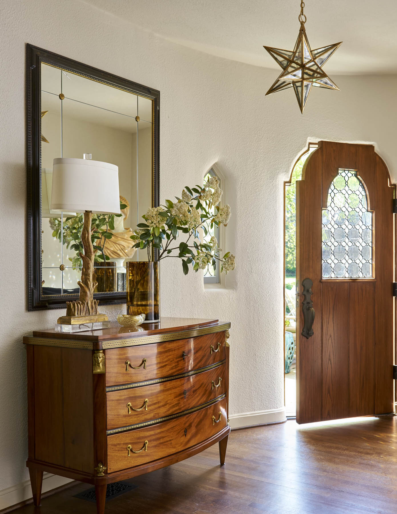
That said, it’s also possible to make a room feel too staged. A room without any family photos or other personal items runs the risk of feeling like a furniture store. Another common decorating mistake is ignoring your foyer. The foyer is an opportunity to make a great first impression for visitors, so don’t leave it bare.
Be careful of design fads. Don’t chase any trends that will be expensive to redo or replace later, because there’s always a possibility you’ll get tired of a certain look. Instead, pick trendy accessories that will be easy to replace if they look dated in a few years. Or better yet, pursue classic looks that have already stood the test of time.
This list covers some of the most common decorating mistakes we see. If something doesn’t feel right with a room you’ve decorated, I hope you can now identify and solve the issue.
Have a home decorating problem that isn’t discussed here? We’d love to help you find the solution. Reach out to us by calling 214-651-7665 or sending an email to info@chambersinteriors.com.