Kessler Park

4 Things to Consider Before Buying a Sofa by Margaret Chambers

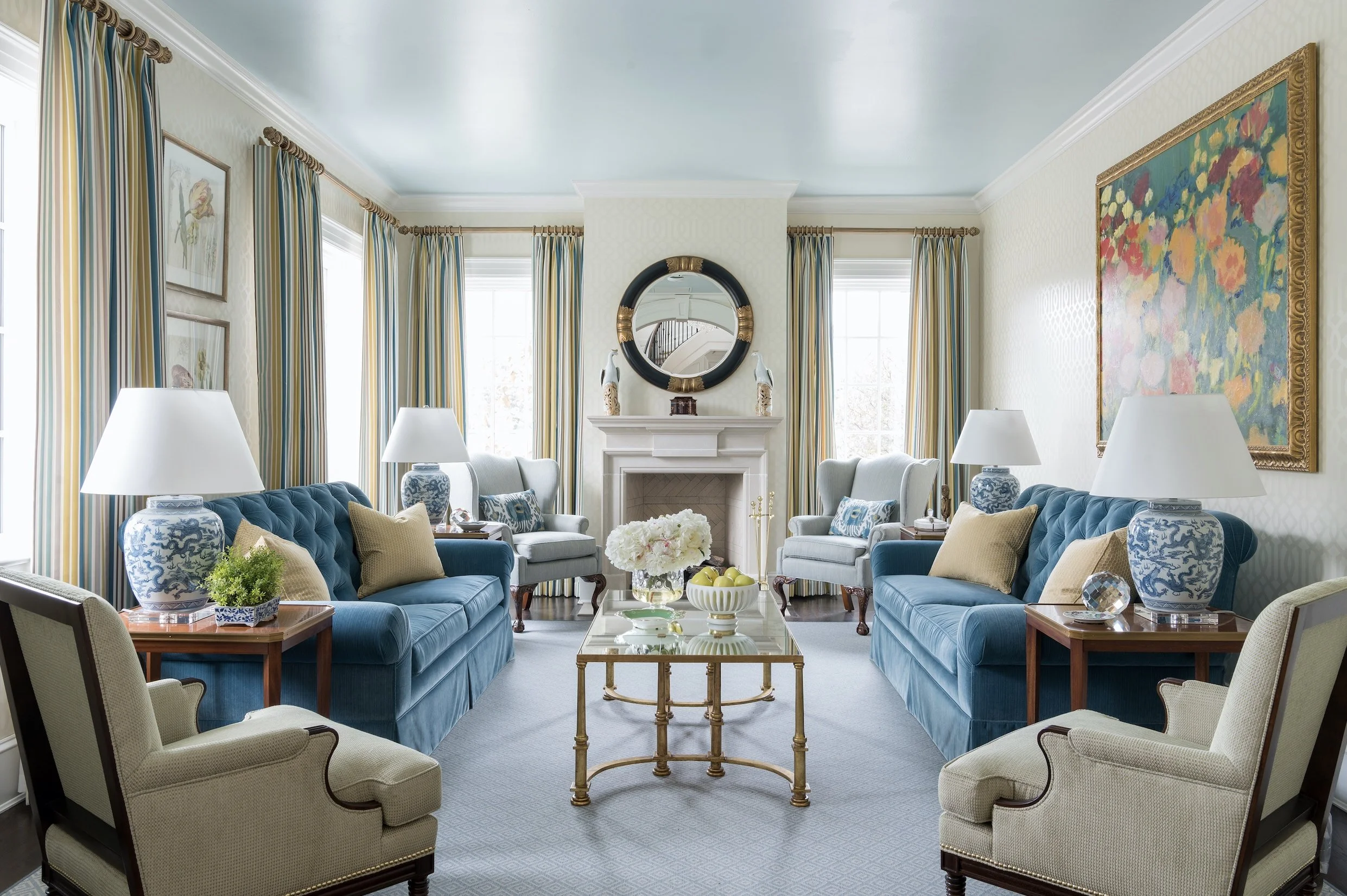
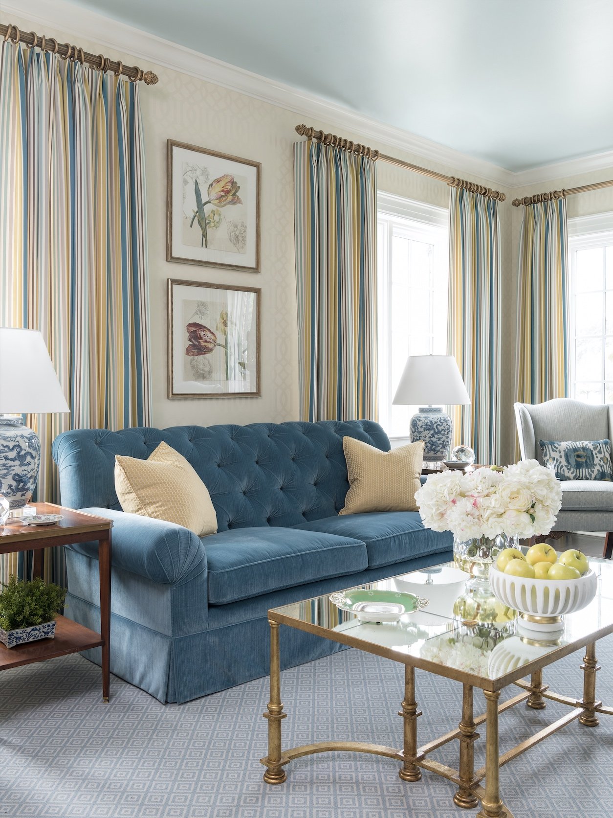
This blue sofa with yellow throw pillows perfectly matches the colors we chose for this SMU Theta sorority house in Dallas.

Sofas are one of those “anchor pieces” that define the look of the whole room. Since they aren’t inexpensive, you’ll want to find one that you can enjoy sitting on and looking at for years to come. Following is a checklist of four things that I, as an interior designer, would suggest that people keep in mind as they shop.

1. Scale

Consider the different ways that you sit or lounge on a sofa. Do you like to sit with your legs up? Make sure that the sofa is deep enough to accommodate. Do you lie down sometimes? Your sofa will need to be long enough for you to stretch out. If you’re tall, you may also want to look for a sofa with a higher back for better back support. For couples, sofas that are between 80-90 inches are an appropriate width. Families should seek sofas that are 90 inches or wider.

Sectionals look best in large rooms, so for a small living room, I would recommend a pair of two-seater sofas instead. That way, you don’t have a large block of the same color fabric dominating one side of the room.

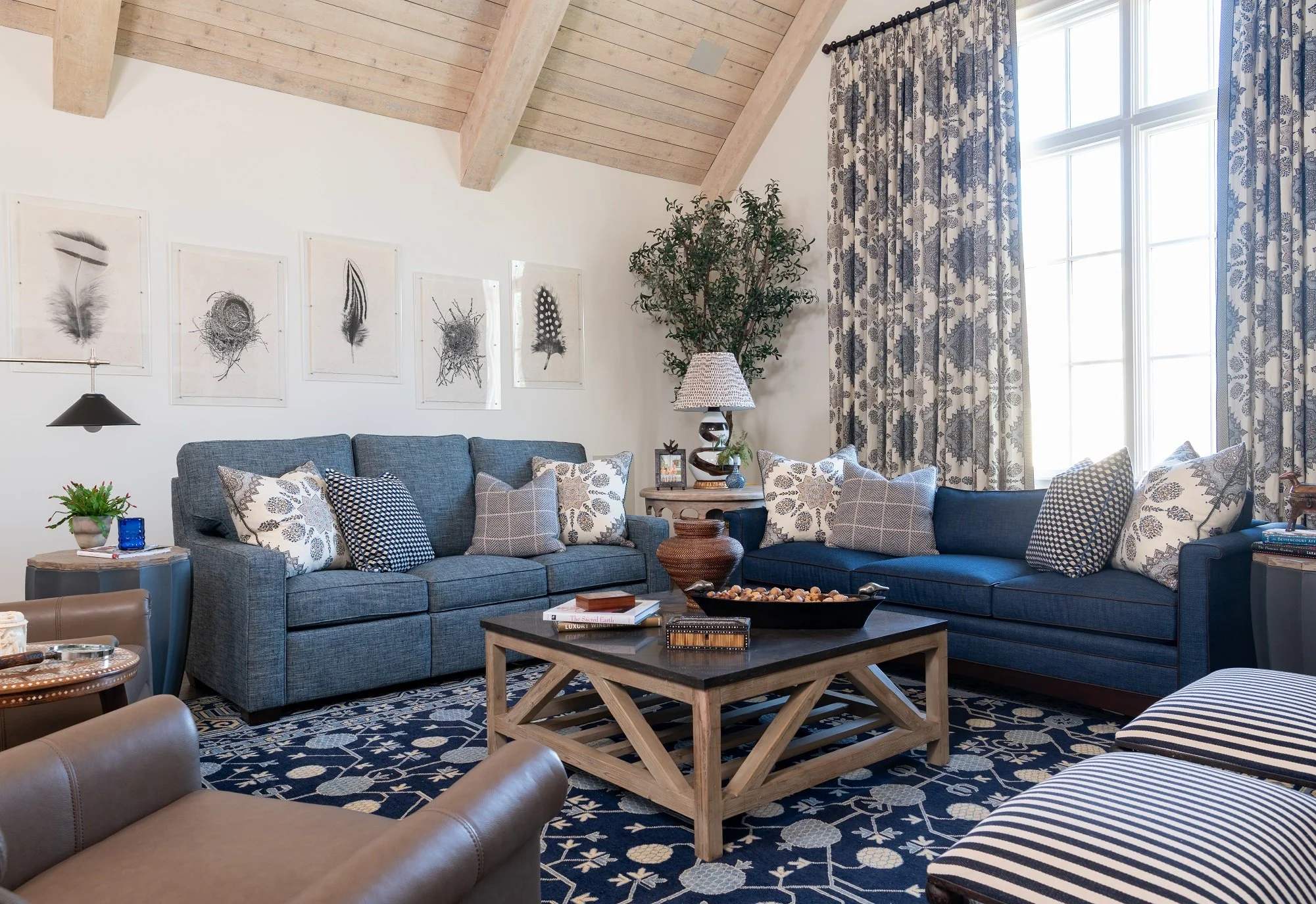
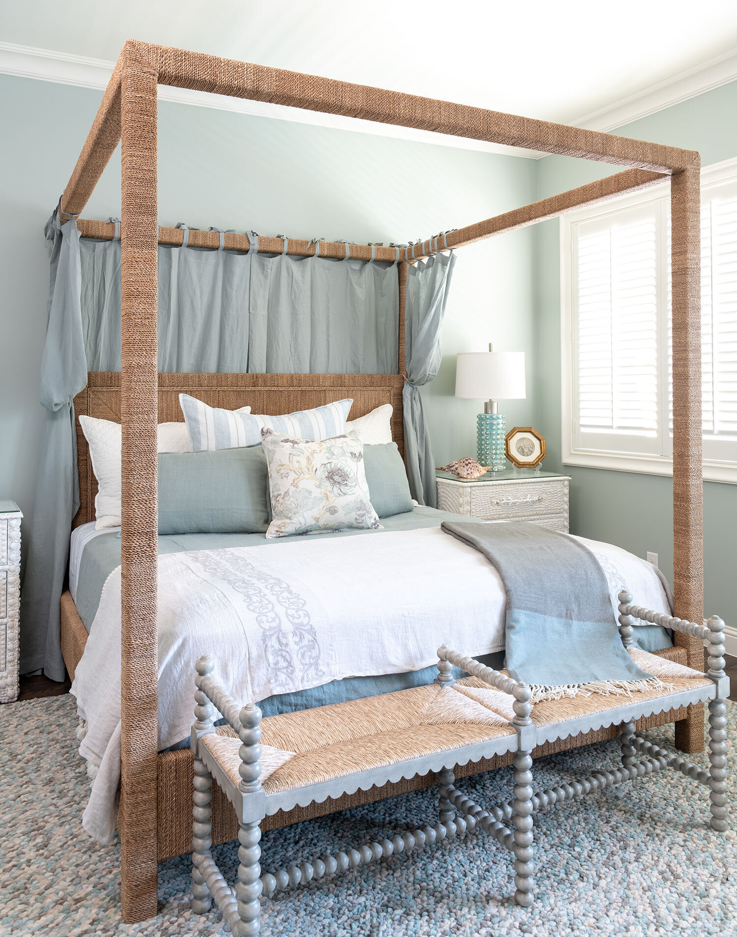
Sectionals, like the gray L-shaped sectional we used in this Kessler Park den, look best in large rooms.

When you’ve found a sofa that you like, try cutting out the shape of it from newspaper and placing it on your floor to serve as a visual guide. Check to see if you have enough space to walk around it and that any open doors or shelves won’t swing into it. Measure your doorways too to make sure you can fit your newest purchase into the house. If you’re going to have difficulty getting a sofa into the house, you can look for sofas with a low back style or removable legs, or modular sofas that can be brought in piece by piece.

To leave enough room for a side table, add about 20 inches of width to your measurement. You should also leave 20 inches of space between the edge of your coffee table and the front of your sofa. Don’t forget to measure the sofa’s height too, especially if you plan on having it in the middle of an open concept living space. You want the back of the sofa to be low so that it doesn’t cut across sightlines in the room.

When the seat is too low, it makes the sofa more difficult to get out of, especially as we age. 15 inches or less is considered a low seat height. 

2. Comfort

For a casual living room, opt for comfortable cushions, but for a formal sitting area, you want cushions that are firm and keep their shape. Feather-filled cushions have a cloud-like feel; however, they need to be fluffed once a week to retain their shape. Foam-filled cushions are less plush, but they hold their shape better. Cushions with inner springs that are wrapped in both foam and down feathers are my top pick because they keep their crown longer.

3. Fabric

For families with small children, I suggest choosing stain-resistant outdoor fabric brands like Sunbrella or Crypton. These fabrics won’t fade in sunlight either, so they can be placed near windows. Leather is easy to clean but also scratches easily, so it might not be a good option for families with pets.

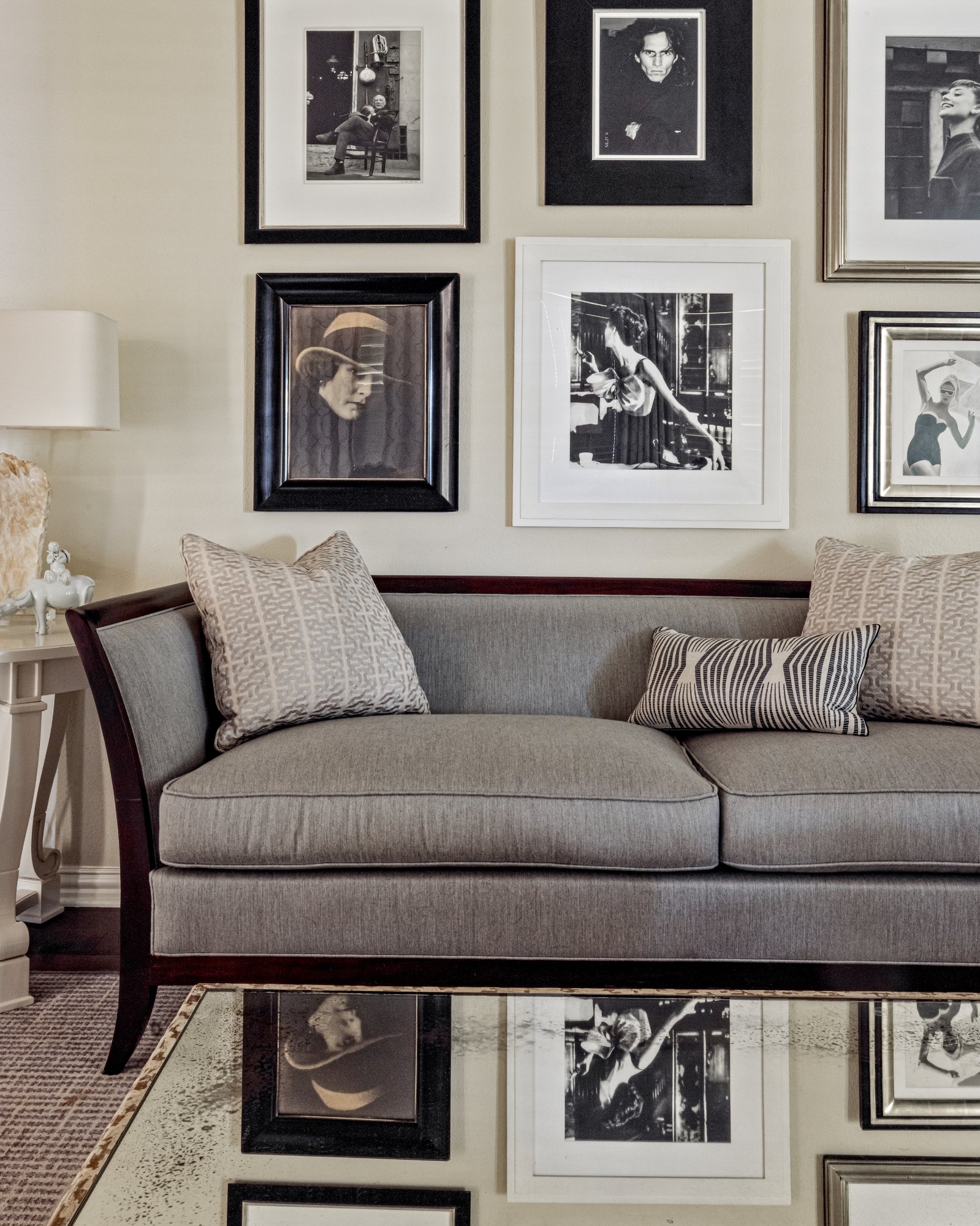
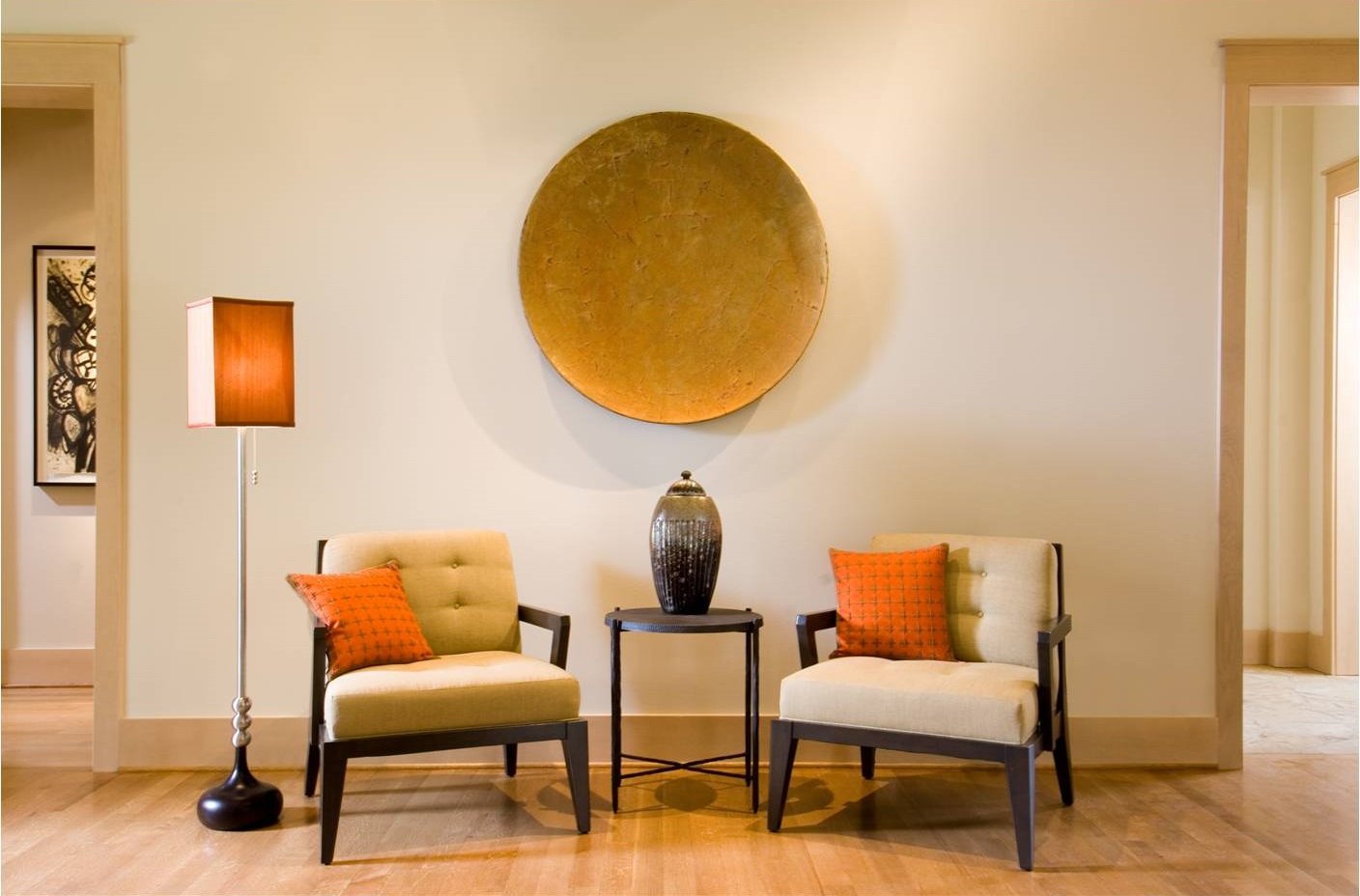
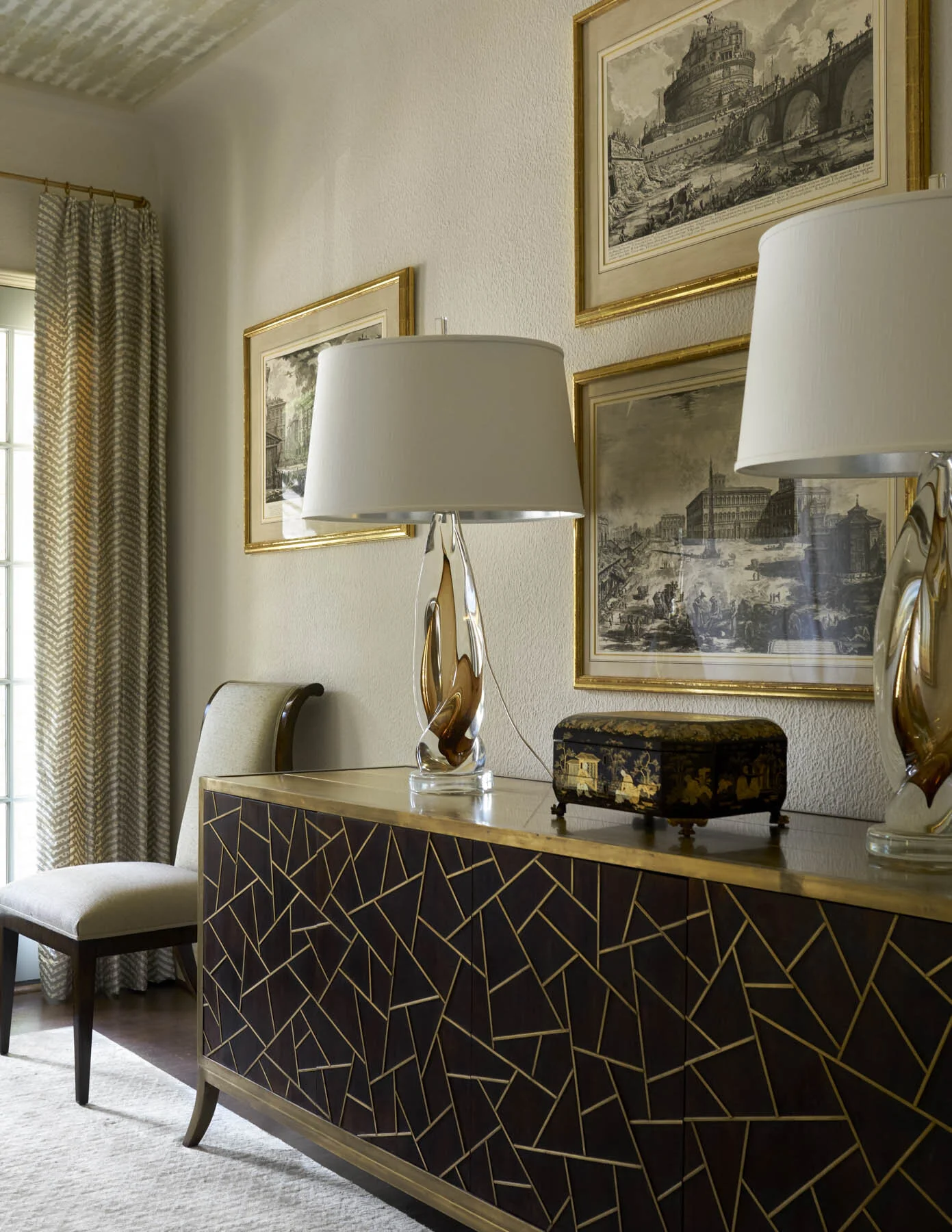
We used a combination of different upholstery textures to create variety for this seating area in a North Dallas home.

In choosing your fabric color, ask yourself: is this room intended to be calming, playful, or elegant? A colorful or patterned sofa can inject energy into a room. A neutral, solid color sofa provides harmony. Make sure to bring home a sample swatch. With a swatch, you can see how the scale of the pattern looks in your living space or how the light in the room changes the color of the fabric.

4. Style

When it comes to sofas, some people prioritize comfort over style, so they end up bringing home a sofa that looks completely out of place. It’s worth your time and money to find a sofa that matches your home and feels great.

Although it’s possible to mix different styles of furniture, the safest bet is to pick a sofa that matches the style of the rest of the room. Modern sofas often have tapered legs, track arms, block feet, and grid-tufted cushions. Traditional sofas tend to have a skirt with tape on the bottom, rolled arms, and contrasting cording. Modern sofas will be a lot sleeker, deeper, and lower to the ground than traditional sofas.

Finding the perfect sofa isn’t easy. However, arming yourself with a checklist of your top priorities will make the shopping process faster and easier. If you could use more guidance, try reaching out to an interior designer like myself. Interior designers have access to the most durable upholstery fabrics on the market. And once we see your space, we’ll know exactly what style and size of sofa will fit right in.

You can reach us by sending an email to info@chambersinteriors.com or calling us at our Dallas office: 214-651-7665.

RELATED ARTICLES:

Bring Warmth and Beauty to Your Home with These Fireplace Design Tips by Margaret Chambers

When we renovated this Spanish Colonial house in Kessler Park, we left the existing fireplace. It is surrounded with Rookwood tiles.

If you don’t have a fireplace, you may have wondered about what it takes to have one built. There are a lot of options out there: how do you decide which one is best for your Dallas home? On the other hand, maybe you have a fireplace already and want to give the mantel a major facelift for the holidays. Whether you already have a fireplace or are building a house for the first time, these tips should help you get started in your design process.

If you’re planning on adding a fireplace to your next home, you should start by selecting the basic type that you want:

Wood-Burning Fireplaces:

For many people, nothing beats the nostalgia, warmth, crackling sounds and aroma of a natural wood fire. Traditional wood-burning fireplaces come in handy during a power outage because they require no gas or electricity. However, they are an inefficient heating source compared to newer alternatives.

Gas Fireplaces:

Gas fireplaces do not require a chimney and can be controlled with the push of a button. They are also more energy efficient and environmentally friendly than traditional wood-burning fireplaces. The main requirements for a gas fireplace are a gas supply line and a venting mechanism, such as a chimney or metal tubing.

Gas logs are actually made of ceramic and placed above the gas burner to imitate the look of a real wood fireplace. Personally, I don’t mind gas logs. They’ve gotten more realistic and are convenient and easy to clean.

This dramatic fireplace is one of the architectural highlights of this home, which was designed by Bernbaum Magadini Architects, one of Dallas’s finest contemporary architecture firms.

Fireplace Style and Design:

It’s really important for a fireplace to be in the same style of the architecture of the house and proportional to the rest of the room it’s in. In my opinion, fireplaces should have a good size opening, preferably forty by forty inches. I also like to do a nice background, like a herringbone pattern, in the interior brick. If the mantel is wood, there needs to be one foot of noncombustible material around it. This material could potentially be cast stone, limestone, or brick. In my designs, I like for the firebox to go to the floor, which has a more classical look.

Keep in mind that the mantel should have enough depth for decorations: eight to ten inches deep, or deeper for a large fireplace. It’s also a good idea to have a plug above the center of the fireplace mantel for Christmas lights.

Sometimes all a fireplace mantel needs is a large piece of artwork over it, like this Audubon painting above the fireplace in the foyer of SMU’s Kappa Alpha Theta house. Fusch Architects designed this project.

Decorating Your Fireplace Mantel:

Since the fireplace is usually the focal point for a room, make sure it’s something that you want to look at. I recommend hanging a large piece of art or a mirror in the center that serves as an anchor for the decorative accessories in front of it. To create interest and lead a person’s eye all across the mantel, vary the height of the objects and include contrasting colors.

In this Hill Country farmhouse, we decorated the stone fireplace with a metal compass sculpture, rocking horse, candlesticks, and grass bouquet.

Note that if the mantel is crammed with too many accessories and picture frames, nothing stands out. On the other hand, mantels with just a couple of small items look underwhelming. Take a look at pictures of professionally decorated fireplaces to get a good idea for how many items to use and how big they should be. I usually use three to five items, such as a tea caddy in the center and candlesticks or vases on either side.

Although fireplaces may not get used often here in Dallas, now is the time of year when people are grateful to have them. Fireplaces are also a popular amenity that can raise the value of your home. If you’d love to include a fireplace in your dream home but find all the different options dizzying, consider connecting with an interior designer.

An interior designer like myself can help lay out the options for you and add the finishing touches to your mantel after the house is built. You can reach us by calling our Dallas office at 214-651-7665 or sending an email to info@chambersinteriors.com.

RELATED ARTICLES:

6-Step Checklist for Making Your Next Outdoor Party a Success by Margaret Chambers

We mixed wrought iron and concrete faux bois furniture in this Kessler Park outdoor seating area to create a more interesting look.

An outdoor party takes a little more planning than an indoor one. Here are some of my personal tips for making sure everyone has a great time at your next barbecue, cocktail hour, or pool party.

1. Seating:

For this North Dallas project, it worked out better to have two small tables with umbrellas instead of one large table.

Once you’ve figured out how many guests you’ll be having, you can determine what your seating arrangements will be. Will your guests be seated at a long table? Or will you create a variety of seating arrangements for individual conversation groups? If there will be kids present, do you want a kids’ table?

You may want to rent additional tables, table cloths, linens, and chairs. In the past, I’ve ordered bamboo tables that seat four people and pushed them together to seat six people.

2. Table Settings:

I recommend decorative melamine plates because they are shatterproof and dishwasher safe. With melamine, you can hardly tell that it’s not real porcelain. Acrylic stemware is a sturdy alternative to glassware—after all, you don’t want glass near the pool.

3. Food:

It’s very important that the food you serve won’t melt or wilt in the heat. Some tried-and-true choices for outdoor parties include nuts, crudités and hummus dips, puff pastries, charcuterie boards, and dried fruit.

4. Drinks:

Self-service drink areas encourage guests to circulate the space and possibly cross paths with someone new to talk to. Stock your drink station with glasses, cups, straws, lemons and limes, club soda, and a cocktail shaker. Also consider including your own cocktail mix or punch (serve ice separately so that you don’t water down the mixture).

5. Games:

Food and drinks are not the only ingredients for a successful outdoor party: don’t forget to include games so that your guests never get bored. Good outdoor party games include horseshoes, croquet, giant Jenga, and badminton.

Cheese, olives, crackers, and cold cuts are all good snack choices for an outdoor party, even on a hot day.

6. Weather:

Here in Dallas, the window of opportunity for perfect weather is pretty small. If chill is a concern, provide throw blankets, outdoor heaters, or use a fire pit to keep guests warm. During the hot summer, guests will appreciate access to cold nonalcoholic drinks, misters, plenty of ice, fans, and shade.

Even if you’ve never entertained outdoors before, if you keep these tips in mind, you can plan with confidence. My firm also has a lot of experience with decorating both indoor and outdoor spaces, so if your outdoor living space could use an update, consider giving us a call, too. You can reach us by calling our Dallas office at 214-651-7665 or emailing us at info@chambersinteriors.com.

RELATED ARTICLES:

Make Your Home Inviting Day or Night with the Right Exterior Lighting by Margaret Chambers

Using a variety of lights creates a balanced and professionally-lit exterior, like this Dallas home we helped to design.

I’ve discussed interior lighting design in previous articles, but today I want to address exterior lighting because it’s really important for accenting your home and landscape. Exterior lighting helps you get the most out of your outdoor living spaces, even during short winter days. It’s also crucial for personal safety: a well-lit property gives intruders fewer places to hide. Below, I’ll go over some of the things I’ve learned about exterior lighting as a design professional.

Just like indoor lighting, outdoor lighting should be layered with different types of coverage. To light the front of your house, use bullet lights with bulbs that have a narrow (12°) spread, and aim them at the corners of your house or on architectural details. Fill in the gaps with soft wash lights. Generally, spotlights should be placed about one-and-a-half feet from whatever they’re shining on. When lighting the upper areas of your house, use smaller fixtures that won’t stick out as much.

For front porches, I recommend hanging a light fixture over the doorway and lights on either side of the door. I like to make sure loggias have hanging lights and fans. You can also put sconces on the columns, and add extra lighting with upward and downward lights. Steps will need lights — such as risers or lit treads – so that people don’t stumble.

One way to light a front or back door is by putting a sconce on either side.

Many people will put a series of lights in a straight line along a pathway, but this can make the path feel like an airplane runway. A more attractive alternative would be to stagger the lights on either side. As far as landscaping goes, there should be at least a little bit of lighting in the flowerbeds. If you have a large yard, you can light it by putting lights on posts at the corners.

Pool lighting is also important, and water features like fountains should always be lit. It’s also a good idea to think about where your Christmas lights will plug in. Add them to the backyard too if you’re planning on having backyard Christmas parties.

Solar lights are not recommended for exterior lighting because they are not as bright as electric lights. If you do use solar lights, you’ll need to choose larger fixtures to compensate. Although LED lights are more expensive upfront, they are a wise investment over time: they are more energy efficient and usually last twenty-five times longer than standard bulbs. When in doubt, use warm temperature bulbs. 3000K is a great standard color, one that is suitable to be used for your entire landscaping system.

It’s important to consider the scale of your home when choosing fixture sizes. For example, a two-story house will need larger lanterns than a one-story house will. If your house is under construction, go ahead and start purchasing fixtures now. You can compare different sizes, holding them up to your house to see which will be more proportional.

When you can, match the style of your outdoor lighting fixtures with the style of your home’s architecture. A traditional home should be lit with traditional wall sconces or an outdoor lantern, for example, while modern homes should use light fixtures with simple silhouettes. If you have a historic house, you may want to have the original exterior light fixtures rewired and refinished instead of replacing them.

When we updated this 1927 home in Kessler Park, we kept the original exterior light fixtures and rewired them.

Getting that “professionally lit” look for your house can be daunting. Between fixture placement, fixture style, voltage, wattage, color temperature, and beam spread, there are a lot of factors to consider for each and every light that you choose. These tips will help you get started, but if you’re pressed for time or feeling unsure, you can always bring in a professional.

As an interior designer, I’m often involved with choosing the exterior lighting for my projects. A full-service interior design firm such as mine can help make sure that your home is well lit inside and out. You can reach out to us by calling our Dallas office at 214-651-7665 or emailing us at info@chambersinteriors.com.

RELATED ARTICLES:

Framing Art 101: How to Properly Protect and Showcase Your Art by Margaret Chambers

When we frame and hang wallpaper panels, like these seen here, we don’t add glass in order to keep them lightweight.

Framing art is a project that people tend to put off because there are so many decisions involved. It’s not just the frame that you have to select: you also have to choose the right mat and decide whether you want glass, plexiglass, or no glass. As an interior designer, I love to work with clients who are art collectors. Here are some of the things I’ve learned while framing my clients’ art pieces.

Protecting Valuable or Personal Art

If you’re looking to reframe multiple art pieces, start by separating your most valuable pieces from the rest. These pieces should be framed using archival, museum-grade materials, such as an acid-free mat, a dust cover, and possibly a glass or plexiglass front.

We usually put non-glare, museum quality, UV-protected glass on fine art pieces. Textiles and watercolors are extra-sensitive to light and should be hung in shaded areas, even if they have UV-protected glass.

Use a Mat to Create a Neutral Backdrop

Most artwork looks better matted. The mat acts as a visual buffer between the artwork and the frame. By separating the art from the glass, it also creates a small space for airflow so that the glass and the art do not stick together.

These antique pen and ink drawings are framed in 22 karat gold.

Although mats can come in different colors, you almost always want to go with a white or off-white. Brightly colored mats tend to look dated. However, black or gray mats can be an appropriate choice for artwork that is already mostly white. For very small artworks, keep in mind that the smaller the artwork, the larger your mat should be. For prints or botanicals, I like to use French mats; a lot of the time, we also include a fillet of gold or silver on the inside, depending on what color the frame is.

Finding the Right Frame

Since professional framing can be expensive, it’s worthwhile to shop at antique stores for pretty frames to repurpose. When I’m helping a client, I like to give them high, medium, and low price points for frames. Prices vary a lot, and sometimes the framing can be almost as expensive as the art.

On the left is a 16th century Indian painting that was reproduced onto a tapestry. We mounted it in a custom acrylic shadowbox.

When it comes to framing, I want to highlight and complement the art rather than distract from it. For example, I would use an elaborate frame for traditional art, such as a portrait, and a simple frame for modern art. Sometimes people put mirrors in nice antique frames. I also love to frame textiles from Africa and India. With a textile, we will attach it to a linen backing and put a Lucite box around it. When framing large wallpaper panels, we like to use a very thin gold frame or a bamboo frame.

Seen here is a series of prints on handmade paper. We floated them in acrylic enclosures for this Dallas family room.

The Pros and Cons of Glass and Plexiglass

Museum grade glass was the standard option for a long time, but plexiglass has come a long way and is a solid choice. Plexiglass is lightweight, antistatic and scratch resistant. However, even scratch resistant varieties of plexiglass are easier to scratch than real glass. Plexiglass is great for collectors who move often: it’s easier to take with you from place to place and less likely to shatter if it’s dropped.

We always put glass on watercolor and prints, but we don’t put any glass on large wallpaper panels or oil paintings. Oil paint does not fade in the sunlight, so it doesn’t require the same protection as other mediums.

Rather than using all-matching frames for your gallery wall, try choosing frames that are different but complementary to each other, like the simple, monochromatic frames we chose for this gallery of black-and-white photos.

Although framing art can be intimidating, it’s a great opportunity to make your art look even more spectacular. By arming yourself with knowledge, you can approach a framer — or frame a piece yourself — with confidence.

For homeowners with large collections and little time, I would recommend contacting an interior designer. An interior designer like myself will not only know the best way to frame your pieces, but can also help you find where to put them in your home and hang them at the correct height. Our Dallas office can be reached by calling 214-651-7665 or sending an email to info@chambersinteriors.com.

RELATED ARTICLES:

Take Your Interiors to the Next Level with Decorative Mirrors by Margaret Chambers

Antique mirrors are best for traditional homes, like this English cottage we designed in University Park.

Mirrors are one of those interior design tools that no home can really do without. Even in rooms where you wouldn’t normally need a mirror, they still offer many benefits, such as reflecting more light into the space or making a room feel more expansive. If you’d like to add more mirrors to your home but aren’t sure what kind to buy or where to hang them, read on for some of my personal tips.

Choosing Mirror Size

This mirror in a Dallas home goes all the way up to the ceiling. It makes the small powder room feel twice as large.

As far as size goes, you should usually go for the largest mirror you can afford. Because mirrors tend to recede into the background, you can get away with a large mirror even in a space where a large painting of the same size wouldn’t work. Don’t forget that mirrored walls are an option too — they really open up a small space, like a bathroom.

Selecting Mirror Shapes

In a room with a lot of straight lines, a round mirror will add some much-needed variety.

Mirrors come in a lot of shapes besides rectangular, so consider your options carefully before buying. It’s possible that a round, oval, bull’s-eye, square, or sunburst mirror would be the perfect shape for your wall. At my firm, we sometimes use beveled mirrors with small medallions in the corners.

Finding the Right Mirror Style and Frame

Carved frames like this one can be ‘too much’ for contemporary homes but are perfect for Old World style homes.

The style of your home or room should complement the mirrors you choose. Traditional mirrors, which often have sculpted frames with intricate details, are best for traditional houses, for example. If you have a brand-new mirror that you want to include in a traditional room, you can always have it antiqued. Mirror frames in contemporary or modern homes tend to be more simple and subtle.

Placing Your Mirrors

We placed a painting and a mirror across from each other in this entry so that the painting would reflect in the mirror.

When it comes to finding the right spot for your mirror, you have two options. You should either try to reflect natural light or reflect something decorative in your room. For windowless rooms, you can also put your mirror next to a lamp or sconce to double the amount of light: this is a great technique for lighting up dark corners.

If you’re going to reflect something besides light or scenery, it’s important that your mirror shows something attractive. For example, try to reflect a painting, a piece of pretty furniture, or a beautiful door in your mirror.

Hanging Your Mirror

If you're hanging a mirror above a chest, it should generally be closer to the chest rather than centered on the wall.

How high you hang your mirror depends on what kind of room it’s in. For example, a hallway mirror should be at eye level so that you can check your reflection before you leave the house. If you’re hanging your mirror above a piece of furniture, the mirror should be closer to the furniture than it is to the ceiling. This brings the mirror and furniture together as a vignette. A nice way to fill a large wall is to hang one mirror in the center of a group of small individual paintings or prints.

Mirrors need to be hung with at least two wall hooks or picture hangers. The problem with hanging a mirror on a single hook is that it will end up resting against the wall at an angle, which distorts the reflection. Always have your very heavy mirrors hung by professionals.

Once you’ve learned about the different kinds of mirrors available and how to utilize them effectively, adding that extra touch of luxe to your home will be that much easier. If you could use some help with sourcing antique mirrors or custom mirrors for your Dallas home, give us a call at 214-651-7665 or send an email to info@chambersinteriors.com. I work with a wide variety of interior design styles, so I have a lot of experience with using both traditional and contemporary mirrors.

RELATED ARTICLES:

Design a Beautiful Dining Room You’ll Use Year-Round by Margaret Chambers

Almost everything in this dining room follows a neutral palette, from the English firework chairs to the feather crystal chandelier.

Whether your dining room is used often or reserved for special occasions, it's an important area in your home and deserves to be beautifully designed. Following are some interior design tips for dining rooms, drawing on my years of experience as a professional designer.

With dining rooms, it's helpful to consider the style of adjacent rooms, any heirloom pieces you intend to use, and the ambiance you want to create. If you own heirloom furniture or have furnishings you don't plan on replacing, such as built-in cabinets, you should pick a color palette that harmonizes with them.

Light colors, like the pale blues and creams we used in this Preston Hollow dining room, make a space feel more open.

Is your dining room small or large? If the room’s size is making it difficult for you to work with, you can use color to make the space appear more open or more enclosed. For example, choosing a deep color for your walls gives your dining room an elegant and cozy feel. Cream and pale colors can help open up a small dining room. If you're putting your dining table in a corner area, combining a banquette with dining chairs is a great way to make the best use of your space. Use the same upholstery fabric on both the banquette and chairs to tie the mixed seating together.

To avoid overcrowding, make sure there is enough room for people to move in and out of their chairs once they've been seated. A good rule of thumb is to leave three feet of room between the dining chairs and surrounding furniture or walls.

In order to seat eight in the relatively small room, we custom designed a round table that was a good fit for the space.

Consider how many people you will want to host before you buy new dining furniture. While rectangular tables are suited to hosting a large party in a rectangular room, round tables are great for square dining rooms and encourage conversation. Forty-two inches is the ideal width for a rectangular table. You should also make sure to take measurements before you buy new chairs for an existing dining table. If the chairs are the wrong height for the table, it makes things uncomfortable for guests. You can add some interest to your seating arrangement by using contrasting chairs for the head and foot of the table.

The textures and colors of your furnishings should be compatible with the style of your home. Steel and glass are a good fit for contemporary, while polished wood can have a formal look, and rougher textures like pine or distressed finishes convey rustic charm. Bring all your furnishings together with an area rug or a chandelier. With an area rug, it’s important to leave enough space on all sides for guests to scoot their chairs out without running over the edge of the rug—at least two feet out from the edge of the table. If your dining room does not have enough space for a rug, it’s preferable to not have one at all.

The table setting in this Dallas kitchen we designed exudes rustic comfort with a touch of class.

Make sure your lighting will create the ambiance you want for your dining room. Don’t hang downlights directly over chairs, or else you’ll create dark shadows on guests’ faces. A chandelier should be hung twenty-eight to thirty-four inches above the table to prevent bulb glare from being visible in the eyes of seated guests.

Sconces, buffet lamps, and wall washers are useful for adding ambient light to the room or highlighting artwork and architectural details. A dimmer is also great to have. Not sure what to decorate your dining room walls with? Aside from artwork, you might consider using photography, wallpaper, mirrors, a plate collection, or decorated shelves.

If you're having trouble making the best use of your furniture and your space, you can always consult an interior designer. After all, you'll want your dining room to be a room you love and use often, whether you plan on entertaining or using it as a family hangout space. To schedule a free consultation with us, send an email to info@chambersinteriors.com or call our Dallas office at 214-651-7665.

RELATED ARTICLES:

7 Tips for Charming Children's Rooms by Margaret Chambers

The best-designed children's rooms have a touch of childlike whimsy but also complement the rest of the home.

Decorating a room for your child can be a great opportunity to show your creativity, but it also presents some unique challenges. Children's rooms should express the child's interests while also blending with the rest of the house. If you're stumped on the best way to please both your child and yourself, consider these suggestions.

1. Use Multi-Purpose Furniture

Unless you want to spend a lot of money redecorating as the child grows older, you should decorate with flexibility in mind. A crib that can convert to a youth bed is a smart choice. It’s also not a bad idea to make space for a small desk now. Your child will appreciate having a place to work on drawings, and later, the workspace can be updated to a teen work desk. Younger children need plenty of floor space to play, so remember to leave lots of room.

Even if your child isn't attending school yet, try to leave space in the room for a work desk.

2. Include Enough Storage

You can encourage your child to be more responsible and independent by including storage bins and shelves that are low to the floor and easy to access. It’s easier for them to put away clothes on shelving rather than hangers in a wardrobe. Use a mixture of open and closed storage so your child will be able to display a few favorite items while keeping the rest out of sight. Baskets and canvas bins are a more attractive storage option than plastic bins and are softer to the touch.

3. Plan Ahead for Lighting

Lighting is important in every room, but a child's room should be especially well-lit. You can fill the room with light using a pendant light or a cute chandelier that completes the room's theme. A reading light beside the bed or a favorite chair is a must.

The art and rug in this boys’ room were previously owned by the clients. We chose fabrics to match their bold colors.

4. Weigh Your Flooring Options

Choosing flooring for children’s bedrooms can be a balancing act between comfort and maintenance. While carpet is comfortable and absorbs noise, it’s also harder to clean in case of messes. Hardwood is easy to clean, but doesn’t insulate noise or soften falls. A good compromise is hardwood flooring with plush rugs. Don’t forget to put a pad underneath the rug to prevent slippage.

A wall-mounted collection of toy soldiers add charm to this boy's room we designed in a Preston Hollow home.

5. Approach Theming in a Balanced Way

An important topic to consider is themed decorating. While your dinosaur-obsessed toddler may love to see dinosaurs throughout the room, he or she might outgrow the phase. How themed you want the room to be is up to you. You can go all the way with a sports theme using sports posters, bedding, and wall decorations, or you may decide to focus on choosing patterns and colors your child enjoys instead. A suggested middle ground might be to use simple and flexible furnishings while placing a few themed accents around the room.

6. Choose Paint Color Carefully

When you have a baby on the way, it's tempting to paint the room in pink or blue, but gender-neutral colors like green and yellow are becoming more popular as well. Also, keep in mind that color has a psychological effect and can be either calming or energizing. A good rule of thumb is to choose a light wall color and use stronger colors for the accessories and furnishings.

Light green is a gender-neutral paint color that is becoming more popular for children's rooms.

7. Don’t Forget About Wallpaper

Wallpaper has been making a comeback over the last decade and instantly adds charm to a child’s bedroom. Wallpaper patterns designed for children’s rooms are not your only options. Basic geometrics and florals are versatile enough to work with a wide variety of room styles.

By choosing timeless furnishings and colors, and a few personal touches to express your child's interests, you can create a beautiful room your child will remember fondly. If you need help designing a nursery for a baby on the way or updating a bedroom for a growing child, give us a call. Most of our clients have children or grandchildren, so at my firm, we have a lot of experience in both children’s and teen bedrooms. You can reach our Dallas office by calling 214-651-7665 or sending an email to info@chambersinteriors.com.

RELATED ARTICLES:

Why Sconces Belong in Any Home’s Lighting Plan by Margaret Chambers

Lantern style sconces are usually used outdoors, but can be used indoors as well, like in this Dallas bathroom.

Sconces are a wonderful way to add decorative lighting to any room. You most often see them on either side of a bathroom mirror, but I like to use them in many other applications as well, such as alongside a big painting, next to bookshelves in a library, or above fireplace mantles. If you’re currently designing a new home and want to try incorporating more sconces into your plan, you’ll find the following pointers useful.

Researching Sconce Styles and Materials

If you have a modern or contemporary home, you’ll want to look for wall sconces with straight lines, simple forms, and sharp angles. For a very traditional home, I’d recommend fine reproductions of traditional sconces, or shopping for antique sconces and having them rewired.

While sconces do not have to perfectly match the other light fixtures in the room, they should be complementary in some way, like sharing the same metal or similar shapes. At my interior design firm, we used to use a lot of iron sconces, but nowadays we prefer sconces made of brass or polished nickel, some with patterned fabric shades.

Ordering and Hanging Your Sconces

Adding sconces to an existing wall is a difficult process, so the planning for sconces is typically done during the design phase for a house. When we work with the client, we use a tape measurer to figure out where sconces should go so that we’ll know where the electrician should pull the cords to.

These modern sconces are an appealing contrast to the multicultural antiques and patterns in this formal living room.

Whenever possible, buy the sconces you think you want and hold them in the room to make sure they’re the right size. Getting the right proportion is tricky for most clients. Generally, the lower your ceilings, the smaller your sconces should be. Most sconces should be hung at approximately eye level, between five and a half to six feet high.

Hallways and Stairways:

Space the sconces about eight to ten feet apart to make sure that the hallway is adequately lit without being too bright. In a narrow hallway, sconces should not stick out too far.

One of the trickiest places to add sconces in is a staircase, but they can be helpful for safety purposes. Here, it’s usually better to use odd numbers of sconces rather than even.

Bedrooms:

Wall-mounted sconces are perfect for creating reading light over the bed. They should usually be positioned thirty to thirty-six inches above the top of the mattress, and no more than a foot away from the edge of the bed. Another great spot for a bedroom sconce is where the fabric is gathered on a canopy bed.

You can also use sconces to light the area where you get ready for the day. After all, overhead lights are not the best for putting on makeup or shaving.

Bathrooms:

Sconces for a bathroom mirror should be hung one quarter to one third of the way down from the top of the mirror. If your bathroom has two vanities, you’ll want three sconces: one to put on either side of the outer edges of the vanities, and one in between them.

It's best to put sconces on either side of a mirror. Overhead lighting casts unflattering shadows on the face.

Exterior Lighting:

Outdoor lanterns are essentially sconces with covers to keep dirt out. In my opinion, people often position them too high or too low on the front of a house. Outdoor sconces need to be durable enough to withstand the elements and also bright enough to illuminate the porch, the front, or the back of your home.

Even after doing research and making careful measurements, some homeowners may still find it difficult to get sconces that are the right proportion and style for their home. In cases like this, they may want to seek out an interior designer such as myself who often uses sconces in their designs. The trouble is worth it: when sconces are thoughtfully chosen and positioned, they are a fantastic asset to your overall lighting plan. If you live in the Dallas-Fort Worth area and would like to schedule a free consultation with us, call 214-651-7665 or send an email to info@chambersinteriors.com.

RELATED ARTICLES:

5 Alternatives to a Plain White Ceiling by Margaret Chambers

A coffered ceiling in a foyer, like this one in a Dallas home we designed, makes a dramatic first impression.

Ceilings are usually the most forgotten part of a room. It’s a shame, because there are so many ways to make ceilings the finishing touch for your interior design. If you’ve made a habit of ignoring your ceilings but are ready to try something new, you’ll be glad to know that there are paint colors, wallpaper patterns, plasterwork, and faux beams that can instantly transform your ceiling from drab to dramatic.

1. Accent Ceilings

We painted the ceiling in the formal living room of SMU's Kappa Alpha Theta house a high-gloss sky blue, reminiscent of southern porch ceilings.

My favorite paint colors for ceilings lately are light blues and light aquas. Blue paint is often used for porch ceilings in the South to deter wasps from building their nests, but increasingly, homeowners are starting to use it for their ceilings indoors.

If you do decide to paint your ceiling a contrasting color, I recommend choosing high gloss enamel or lacquer for the finish. A high-gloss ceiling will reflect the surrounding colors and make the room feel more expansive. However, steer clear of glossy paint finishes if your ceiling has imperfections, as the sheen will make small bumps or cracks more noticeable.

Dark ceiling colors tend to make rooms feel smaller. Interestingly, though, a room with the same dark color on all four walls and the ceiling will not feel small as long as there’s plenty of natural light in the space. For black-painted ceilings, make sure to also use black elsewhere in the room to ensure that the whole design is balanced.

2. Wallpaper

My firm has also been doing wallpapered ceilings for the past few years. In one project, the clients’ existing dining room had a ceiling painted in a dark salmon color. To make the room feel more open, we covered that ceiling with a light, patterned wallpaper. For a contemporary home, you might consider a subtle tone-on-tone pattern or a textured wallpaper, like grass cloth.

The wallpaper we added to this ceiling is a big improvement over the salmon paint color that was there before.

3. Plasterwork

Color and pattern are not the only ways to draw the eye upward to your ceiling. You can also add a three-dimensional element with decorative plasterwork. Designers like myself have been bringing back beautiful plaster ceilings with detailed borders around the edges of the room. I’d recommend using this kind of ceiling in dining rooms, living rooms, and bedrooms. However, you do have to think carefully about light fixture placement.

4. Beams

Running beadboard in the opposite direction of your beams will make a vaulted ceiling more dynamic.

Even if your home didn’t have beams originally, you can always have faux beams added. They should only be installed in rooms with ceilings that are nine feet or higher, or else they’ll make the room feel claustrophobic. I love the look of beams in a vaulted ceiling with beadboard running in the opposite direction. We usually run the beams up and down and the beadboard crosswise.

5. Coffered ceilings

A coffered ceiling is one in which recessed panels are created by adding beams in a grid pattern. Coffered ceilings look best in rooms with nine to fourteen-foot-high ceilings. To add more contrast, you can paint in the recessed sections, wallpaper them, or have them paneled with wood while leaving the beams white. Coffered ceilings are definitely more formal, so you usually won’t see them in rustic or casual homes.

Like coffered ceilings, tray ceilings have recessed areas to give the ceiling depth. The recessed areas resemble upside-down trays. They are great for open concept homes because the recessed areas can act as a reflection for separate zones on the floor below.

In this home office we designed for a Dallas home, the patterned, wallpapered ceiling matches the curtains.

For those of you who like the idea of a painted, wallpapered, beamed, or coffered ceiling, but are having trouble deciding between them, try looking at interior design magazines or Instagram and pay attention to the ceilings you see. If you’re still drawing a blank, the next best step would be to consult with an interior designer like myself. An interior designer will know which ceilings in your home would look best if left white, which could benefit from wallpaper, and which rooms would be perfect for a showstopper like a coffered or plasterwork ceiling. To schedule a free consultation with us, email us at info@chambersinteriors.com or call us at 214-651-7665.

RELATED ARTICLES:

4 Things You Should Know Before You Decorate Your First Home by Margaret Chambers

Even small spaces, such as this breakfast area with a custom banquette, can be very special and unique.

Buying your first home is an exciting milestone. For most people, it’s their first chance to truly make the space their own. However, first-time homebuyers might also find the prospect of decorating a whole home daunting. Below are some tips that I think all first-time homebuyers should know before they start decorating.

Plan Your Space in Advance

Get your hands on the plans for the house if possible. Having these will help you see ahead of time which of your furniture will fit and if you need to knock down walls to create a more open layout. If your house does need major renovations, bringing in a design team now will save you a lot of stress later.

An interior designer can also tour homes with you and tell you which of them have the best floor plans, or which homes will require the least amount of work. When I look at homes for sale, I see things most clients wouldn’t notice.

One of the most crucial, but often overlooked, aspects of home design is lighting. It’s especially important to make sure you have adequate lighting for your kitchen and bathrooms. Don’t forget to take natural lighting into consideration and decide how much privacy you’ll need for each room.

Identify Your Favorite Design Styles

We went with a transitional style for this Preston Hollow home because its architecture is very simple. Blue-and white is always a popular color scheme.

Most people have more than one interior design stye that inspires them. When in doubt, pick a style that is complementary to your home’s architecture. There’s no need to use the same style in every room. Just remember to have at least one design element in common (such as a color) that connects the rooms together.

Although looking at the internet or design magazines for inspiration can be a helpful starting point, don’t get caught up in trying to closely re-create someone else’s design. Your first home will go through a lot of transitions, and you should give yourself freedom to change things up as time goes on.

Start With the Rooms You’ll Use the Most

The best rooms to begin with are the ones you’ll spend the most time in. If you like to entertain, those rooms might be your living room and dining room. Your anchor pieces for each room (such as your bed, sofas, or dining table) should take priority in your budget. I generally recommend that my clients buy the best mattress and bedding they can afford. You can, and should, spend a lot less on accessories for the moment.

When designing your den, try to create as much seating as possible and make it a perfect place to watch TV.

Your friends and family may also have some pieces in storage that they would love to give you. Before turning down a piece, take a moment to consider if it might work better for you if it was reupholstered or repainted. That said, don’t take any furniture that you know won’t fit your desired interior design style. You’ll eventually find yourself having to design around it, which may be more trouble than it’s worth. Hand-me-down or heirloom pieces that are in a neutral color are always easier to integrate into a home.

Layer Items Over Time Instead of Buying Everything at Once

One mistake first-time homebuyers often make is rushing to buy everything at once and getting matching furniture sets. The best homes have a layered look that mixes old and new pieces together. Combine items that are complementary in color, material, and scale. Don’t be in a rush to pick your paint color, either: try testing out swatches instead.

Instead of using the matching chairs that came with your table, try using a different but complementary set.

Finally, remember that most people only stay in their first home for a few years. The items you prioritize in your budget should also be ones you can take with you to your next home. On the other hand, if you plan on enjoying your home for many years to come, consider hiring a professional designer. Designers like myself get to know you so that we can design a space that is perfectly suited for you and your family. If you're interested in working with Chambers Interiors, you can reach our Dallas office by calling 214-651-7665 or emailing us at info@chambersinteriors.com.

RELATED ARTICLES:

The Art of Collecting: How to Use Collections to Personalize Your Home by Margaret Chambers

We paired this Rose Medallion porcelain collection with Chinese porcelain birds, which add a three-dimensional element.

Collections are so important to interior design that I can't help but be surprised when I meet a client who doesn't collect anything. Collectibles give a home personality, pull the house together, and serve as conversation starters when guests come over.

That said, not everyone has discovered a collecting hobby that they're passionate about. Others might enjoy collecting but worry that their collections create too much clutter. In this article, I'll talk about how an interior designer would normally display a client’s collection, as well as list some ideas for collections for those who are interested in collecting but don't know where to start.

A collection of framed insects is an unexpected and whimsical addition to this African themed bedroom in Kessler Park.

Step 1: Starting Your Collection

Of course, you shouldn't collect just for the sake of collecting. Your collection should be something personal to you. Whether you are drawn to blue-and-white Delft, ceramics, black-and-white photography, tortoiseshell boxes, or snuff bottles, there are many different kinds of collectibles that are suited for different styles of homes. Car aficionados might enjoy collecting framed prints of classic automobiles. An avid reader, on the other hand, will likely want to own beautiful old books, interspersed with other decorative objects, like small lamps, bookends, and photographs.

If nothing comes to mind, consider collecting something that will complement your home’s existing decor and architecture. For example, I like to decorate modern homes with African art and textiles. For a Santa Fe style home, I would recommend Native American pottery and baskets. Another good starting point for a collection could be a family heirloom or a sculpture you picked up while traveling.

Step 2: Curate Your Collection

Before you find a place for your collection, make sure to curate it first. Prioritize the pieces that are in the best condition and fit your decorating scheme. You can always keep some pieces in storage and rotate them back out as the seasons change.

The items in your collection don't have to be a part of a matching set, but they do need to harmonize in terms of color, scale, and texture. When it comes to scale, having some variety is also important. If you're displaying prints on a wall, start with the largest in the middle, and arrange smaller prints around it. The frames should be cohesive as well.

We decorated the walls of this upstairs den with a collection of sepia animal prints.

Step 3: Artfully Arrange Your Pieces

Next, you’ll want to design the display area. It needs to serve as an attractive backdrop for the items while also drawing a visitor’s eye and keeping it there. The setting you choose to display your collection should be understated in order to keep the focus on the collection itself.

Open shelves, for example, can be painted the same color as the wall to help them fade into the background. You can create a more formal look by displaying items in a lighted curio cabinet. If you want to display a large collection of family photos, remember that a wall gallery is less cluttered looking than a series of propped up photos on a table. A hallway wall is a great place to display family photos.

Wallpapering the back of these bookshelves with a Schumacher star pattern helps to highlight the porcelains and books.

For small collections and vignettes, try using a decorative tray to bring your objects together. Trays are a good choice for collections of perfume bottles, small ceramics, seashells, or glassware.

Step 4: Balance Your Collection with the Rest of the Room

Don’t forget to surround your collection with some open space. A room with even the most beautiful collections will still look cluttered without visual buffers between each vignette. You can tie everything together by pulling from the colors in your collections and echoing them elsewhere in the room.

A collection of vintage architectural prints can look stunning when displayed together in matching 22 karat gold frames.

If you have some ideas for a collection but aren’t sure where to start shopping, consider working with an interior designer. As an interior designer, I have access to items that most clients wouldn’t have access to. People who already own an extensive collection can also benefit from working with a professional. A designer like myself will enjoy finding the best way to showcase your prized collection, and by having it on display, you can ensure that the space is truly a reflection of you and your personal taste. To schedule a free consultation, email us at info@chambersinteriors.com or call our Dallas office at 214-651-7665.

RELATED ARTICLES:

How to Use Décor to Highlight Your Hardwood Floors by Margaret Chambers

The neutral colors and orange accents in this modern Dallas home complement the light wood floors.

In my last design article, I discussed the different kinds of hardwood flooring available and the pros and cons of each. This follow-up article is aimed at homeowners who already have hardwood flooring but could use some help complementing it with the right décor. If you’ve ever wondered which wall paint colors go best with dark wood floors, which colors are best for light floors, or when to use rugs (and when not to), look no further: I’ll answer these questions and more here.

Start by Identifying Your Wood’s Color Tone

Ideally, the color scheme for a room should harmonize with the wood floor’s undertone color. Depending on its species or finish, wood can have tints of gray, red, orange, or yellow. Oak, for example, can be red or white (I personally prefer white oak because I think it makes a prettier brown). Pastel blue, cream, or apricot are good wall paint colors for a room with red oak floors. Meanwhile, charcoal gray or light gray are attractive wall colors for rooms with white oak floors.

How to Make Dark Wood Floors Shine

Grey paint, as seen here in the library of a Kessler Park home, is a good wall color to go with dark hardwood floors.

Rooms with dark wood floors need to have light walls to prevent the room from becoming too dark and cave-like. That said, this still leaves a wide variety of paint color options, from cream, to light gray, bronze, light blue, or pale green. Some people will also use painted furniture in light colors to create contrast against the dark floor. A more formal look can be achieved by using dark wood furniture that is a slightly lighter shade than the floors.

Incorporating plants is also a good idea: the bright greenery will really pop against the dark base. Natural light also reflects beautifully against the grain of dark-stained wood, so try to let in as much natural light as possible.

Tips for Working with Light Hardwood Floors

The best wall colors for rooms with light hardwood tend to be neutrals. Off-white will give the room an airy feel, cool gray will create an aura of relaxation, and warm gray will make the room seem cozy and inviting.

White furniture, a sandy brown rug, colorful accents, and gold or silver accessories are a winning combination for light hardwood floors. Some other area rug colors to consider are earth tones, burgundy, and peach. For the furnishings, you could go with grey or black furniture.

Almost every home with hardwood floors should use rugs.

A Word About Area Rugs

Area rugs are almost always a must for hardwood floors. They protect your floors from daily wear and tear while also softening footfalls. If you have wood furniture that is similar in color or tone to your wood floors, you can use a contrasting rug to create a buffer between them so that they don’t blend together.

Parquet floors are one of the only types of hardwood floors that I wouldn’t recommend using rugs on. Sometimes, the inlaid wood pattern is so busy that it would be overwhelming to break it up even further with rugs.

If your home has wood floors, don’t use all wood furniture. You can introduce more variety by including upholstery and pieces made of glass or metal.

Don’t Forget to Mix Up Materials

Though hardwood floors can complement other woods in the same color family, you’ll also need to mix things up by incorporating other materials in the room. Woven fabrics, leather, metal, and upholstery introduce an appealing variety of textures in a room.

As an example, rich brown hardwood goes well with organic materials, such as a natural stone fireplace. If your wood floor has a bright sheen, you can add some softness into the room with upholstered, curvaceous furniture. Metallics and glass will bring a sleek touch to a modern or contemporary home with white oak floors.

Hardwood is the most sought-after kind of flooring, so if you have it, you’ll naturally want to show it off. By harmonizing your hardwood floors with the right paint colors, furnishings, and fabrics, the process becomes much easier. Those who still find the prospect intimidating would do well to work with a designer.

An experienced designer like myself can take one look at a room with hardwood floors and know exactly which colors and style of furnishings will work best with it and its architecture. If you'd like to work with Chambers Interiors, give us a call at 214-651-7665 or send an email to info@chambersinteriors.com.

RELATED ARTICLES:

Pick Out the Perfect Hardwood Floors with This Five-Step Checklist by Margaret Chambers

Keep in mind that solid hardwood can be sanded and refinished, but some kinds of engineered hardwood cannot.

Hardwood is the preferred choice for flooring among Dallas interior designers and homeowners alike. While tile both looks and feels cold, wood has a sense of warmth, making it a good choice for living spaces and bedrooms. A wood floor with rugs is also more interesting than wall-to-wall carpet, easier to clean, and more hypoallergenic.

If you’re shopping for hardwood flooring for the very first time, you may be experiencing some “analysis paralysis.” Between choosing your wood species, sawing method, plank width, grain pattern, stain and finish, there are a lot of decisions that need to be made. Before you shop, I recommend going over the following checklist to help narrow down your options.

1. Choose between solid or engineered hardwood

Solid hardwood is the more traditional option, but engineered hardwood—in which a thin upper layer of wood is bonded to layers of plywood and composite material—is becoming more and more popular.

The advantages of solid hardwood are that it’s quieter underfoot and has a longer lifespan. If the wood veneer on engineered hardwood is too thin, it can’t be sanded and refinished in the future. The advantage of an engineered hardwood floor is that it is less likely to shift as the wood expands and contracts because different layers of the board create opposing forces on the wood. This makes engineered hardwood the best choice for rooms where moisture can be an issue, like basements and bathrooms.

Seen here are 5” quarter-sawn white oak planks. If you look closely, you can see the irregular patterns of the grain.

2. Choose your wood species

Oak is the most commonly used wood in the US because it is affordable, easy to stain, and durable. Cherry, maple, hickory, walnut and ash are other options, each with their own unique colors and grain patterns. Exotic woods, like Cumaru, Brazilian Koa, and Brazilian Cherry tend to be harder than domestic woods. No matter the species, try to select a wood that is already close to the stain color you want.

3. Choose your cut

Keep in mind that wood planks can also be cut in three different ways, yielding three different grain patterns. The most common and affordable method is plain-sawn, which creates the classic grain pattern with curving V-shaped marks (called cathedrals). A quarter-sawn plank has an intricate pattern of irregular growth rings. The most expensive method, rift-sawn, produces a series of very fine, straight lines.

4. Choose the plank width and pattern

In the past, two to three inches was the standard width for wood floor planks. Today, the latest trend is to use planks that are four to seven inches wide. Wider planks are associated with luxury homes and are an appropriate choice for large rooms. Of course, horizontal planks are not the only kind of wood flooring pattern. I think herringbone patterns go well with entryways, dining rooms, or studies.

The planks in this Kessler Park home are on the thin side, at about two and a half inches wide, which is typical of that period in time.

5. Choose your stain and finish

Dark and light stains are suited for different styles of homes. While light wood floors are a good choice for modern or casual homes, dark wood floors are more traditional and sophisticated. Prefinished wood is already stained with a topcoat applied, so you’ll be able to see what you’re getting. Having the wood finished on-site, however, allows you to choose your own stain color and sheen.

Different finishes can really transform wood flooring. The same wood plank in a mid-gloss, high-gloss, matte, distressed, or wire-brushed finish will look completely different. I suggest staying away from hand-scraped finishes, as they look dated. For high-traffic rooms, I recommend looking into polyurethane coating. It’s a new type of coating that is highly protective and often used for basketball courts. Bona Traffic HD is the brand I recommend: it’s durable but also looks like a beautiful wax.

When we redesigned this 1927 home, we kept the oak hardwood floors but sanded and re-stained them in a darker color.

Do all the different options make your head spin? Try looking at design magazines and focusing on the examples of wood flooring you see. You’ll get a better sense of what stain colors and grain patterns you gravitate towards.

At my firm, we typically use wood flooring with rugs in our projects, so we are very knowledgeable with the different types available and what the latest trends are. When in doubt, it never hurts to consult a professional before you take the plunge! To schedule a free consultation with us, call our Dallas office at 214-651-7665 or send an email to info@chambersinteriors.com.

RELATED ARTICLES:

Four Pointers for Teenage Bedroom Design by Margaret Chambers

Wall art is an important asset for giving a teenage bedroom its individuality.

Designing a teenage bedroom can be an interesting challenge. At this point, the nursery décor your teen grew up with has got to go. On the other hand, you can’t simply decorate the room the same way you would with an adult bedroom. Striking the right balance between casual and formal is key here. Your teen will also want to be included in the design process, so it’s important to keep their interests in mind.

Every teen bedroom should be a unique expression of that teen’s personality. However, there are also some general guidelines that can be applied to any teenage bedroom. Before you begin with your interior design project, keep these pointers in mind.

1. Create Separate Zones for Resting, Studying, and Socializing

Colors like pastel green and purple are excellent alternatives to pink for a teenage girl bedroom’s color scheme.

Chances are, this is the room your teen will spend the most time in. Any teen bedroom needs to be a refuge, a home study, and also a hangout space for them and their friends. Make sure there’s a designated zone for each of these. One thing to remember is that your teen might want to take their furniture with them when they move out, so don’t break the budget on furnishings. 

A comfortable work desk will help your teen stay focused and on-task. If the room is too small for a separate seating area, you could also create a lounging space on the floor with pillows and a rug, or add ottomans to the foot of the bed. For a teenage girl’s bedroom, you’ll probably want to include luxurious fabrics, like velvet pillows, soft blankets and bedding, gauzy curtains, or thick-pile rugs.

Navy blue and brick red are both great colors for a boy’s room, like this one we designed for a Preston Hollow home.

2. Use Your Teen’s Favorite Colors in a Sophisticated Way

One of the easiest ways to differentiate between a child and a teenage bedroom is through color choices. While nurseries usually have pastel colors, and most adult bedrooms are in neutrals, teens tend to gravitate to bold color combinations. Even if the majority of the furniture in the room is neutral, there should ideally be a burst of your teen’s favorite color somewhere.

For teen boy bedrooms, navy blue or warm neutrals (such as warm gray) are popular wall colors. Today’s teenage girls usually prefer green, purple, grey, or blue over pink as the dominant color in their rooms. Purple is a versatile color in that some shades can be whimsical (like lavender) while others are romantic (like deep purple). While touring homes, I’ve noticed that teenage girls’ rooms often have a lot of white furniture.

3. Plan for Plenty of Storage Space

If you have a teen who keeps their room tidy, you have a rare teen indeed. That said, including enough storage space and shelving in the bedroom can go a long way towards helping your teen keep clutter out of sight. The room’s overall design should also be clean and minimal, but not too fussy. Remember that your teen will almost certainly want a room with a more casual and approachable vibe.

A bedside table with pullout drawers is a good choice for adding storage to a small teen bedroom.

4. Design Around Accents and Art that Express Your Teen’s Individuality

Before you begin decorating in earnest, ask your teen if they have art pieces or prints in mind that express their personality. You can potentially use art pieces as a focal point or as a source of stylistic inspiration for the rest of the room. Some other ways to set your teen’s room apart from those of their friends include: incorporating an unusual piece of furniture that makes a conversation piece, adding wallpaper to the ceiling, or wallpapering an accent wall.

Your teen will appreciate having something fun and unique in the room, such as these framed insects on the wall.

Sometimes even when you follow recommended design guidelines, it can still be difficult to bring everything together. In cases like these, your next step should be to consult a professional designer. When I work with clients with teens, I ask my clients to provide examples of rooms that inspire them. An experienced designer such as myself will know how to accommodate both the parents and the teenager’s requests and deliver a result that will wow them and visitors alike. To schedule a free consultation with us, send an email to info@chambersinteriors.com or call our Dallas office at 214-232-9501.

RELATED ARTICLES:

Don’t Let Your Kitchen Backsplash Be a Missed Opportunity by Margaret Chambers

This backsplash around the window in this catering kitchen is made of the same marble that we used for the countertops.

Although kitchen backsplashes have a functional purpose—protecting walls from water, grease stains, mold, and mildew—these days, they are also treated as an important design element. After all, the backsplash is right on the wall, so a visitor’s eyes naturally rest there. Despite the fact that backsplashes can make great focal points, many Dallas homeowners save picking their backsplash tiles for last.

Your kitchen design will look more impressive if you pick your backsplash tile early on and design around it. For those of you who are designing a new home or planning on remodeling your current kitchen, you should find the following tips useful.

A backsplash should cover the wall space between the countertop and upper cabinets above your range. Lately, I’ve noticed that the newest trend is to have the backsplash continue up beyond the upper cabinets, sometimes even up behind the vent hood. To figure out how much square footage of tile you’ll need, multiply the width of your wall by the height. Then, increase that number by ten percent just to make absolutely sure you’ll have enough.

When possible, we like to continue the backsplash behind the vent hood, like in this example from a Dallas kitchen.

Ceramic, stainless steel, porcelain, and stone backsplashes are great against oil and grease. Glass tile is perfectly water-resistant, so if you create a lot of steam when you cook, that’s something to consider. You should also think about how much maintenance you’re willing to accept for your backsplash. Ceramic tile doesn’t need to be resealed, but natural stone will.

Even if you’re saving money on your tile choice, don’t cut corners with your grout choice. You need a high-quality grout to make sure the tiles stay on the wall over time. Most tile backsplashes have a grout joint size of one-eighth of an inch, but sizes of up to a quarter inch are also possible.

Since replacing tile is expensive, you can never be too careful making your choice. Purchase a lot of different tile samples to take home (it’s cheaper than buying a lot of the wrong tile), then tape them to your wall and leave them up for a while. You can see how the color shifts as the lighting changes through the day.

Subway tile, like the gray tile we used in this bar area, is a classic choice for kitchen backsplashes.

Recently, my design firm has been using the same material for both the countertop and kitchen backsplash. Whether you use the same material or not, try not to create too much contrast between the two surfaces. For example, if your countertops are a cool gray, your backsplash should also be in a cool color.

The gray and terracotta colors in this mosaic tile backsplash match other colors we used in this Kessler Park home.

Mosaic tile patterns often incorporate multiple colors, allowing you to pick up on some of the other accent colors you’re using in the kitchen. If you have countertops with a unique pattern or color running through them, it’s a good idea to pick a neutral backsplash tile so you don’t draw attention away from your countertops. Of course, if your countertops are understated, you have more room to be creative and showy in your backsplash tile choice.

Choosing a timeless backsplash is important if you’re planning on selling your house. White subway tile is one option, but also consider penny tiles, picket tiles, square tiles, or hexagon tiles. White subway tile is also perfect for kitchens that have a lot going on, visually. Although it’s normally laid out in a brick pattern, a newer trend is to lay the tiles diagonally or vertically. Another thing to keep in mind is that larger tiles tend to look more contemporary, while smaller tiles feel more traditional.

Although there is no one-size-fits-all solution to finding the perfect backsplash, some tile choices will work in your kitchen better than others. By taking into account your budget, your lifestyle, and the rest of your kitchen’s aesthetic, you can easily narrow down your selections.

We used this fireplace screen with animal figures as a kitchen backsplash. It helps to complete the farmhouse theme.

Designers like myself also have established relationships with showrooms which gives us more leeway to request a tile and then return it on short notice. A designer can be a great resource whether you are just beginning your kitchen design project or nearing the end. If you'd like to work with us, you can reach us by calling our Dallas office at 214-232-9501 or sending an email to info@chambersinteriors.com.

RELATED ARTICLES:

Turn Your Home Into a Personal Getaway With Travel-Inspired Décor by Margaret Chambers

A soothing color palette helps to soften the rough, organic textures we used in this Cape Cod style bedroom in Dallas.

A soothing color palette helps to soften the rough, organic textures we used in this Cape Cod style bedroom in Dallas.

With travel restrictions in place due to COVID-19, many Dallas homeowners are wanting to surround themselves with memories of their time abroad. This may be why travel-inspired interior design is one of 2021’s trending looks.

Interior designers like myself often have our own favorite travel destinations and multicultural design influences. Over the course of my design career, I’ve been to Europe twelve times. I’ve also found inspiration in my travels to China, Mexico, and Canada. My business partner, Lea Barfield, and I own an antique buying trip business called Tour Décor, which helps our clients source European pieces for their residences.

When I take on a new design job, I enjoy finding ways to incorporate any antiques or multicultural art that my clients have collected over the years. Below, you’ll find some design tips and tricks for highlighting travel mementos in a sophisticated way.

Getting Started

Pictured is a collection of African milk bowls that we selected for our clients, displayed together on a kitchen wall.

Pictured is a collection of African milk bowls that we selected for our clients, displayed together on a kitchen wall.

One way to begin is by picking out a single piece you acquired abroad and using it as a touchpoint for the rest of the room. Putting together a collection of art from a place you’ve visited, or a gallery wall of travel photos, is another great way to memorialize.

If you’re an experienced traveler with many favorite destinations, you may have trouble narrowing down which styles to incorporate into your home. When in doubt, stick with what will complement your home’s architecture. In a midcentury modern home, you can easily blend in African, Indian, or East Asian accessories. However, if you own a home with Italian, French, or English architectural elements, you should probably stick with European furnishings and art.

If your room is coastal-themed, you can include touches of nautical whimsy, like this mirror with a rope frame.

If your room is coastal-themed, you can include touches of nautical whimsy, like this mirror with a rope frame.

Sourcing New Pieces

A travel-inspired home will naturally evolve over time as you bring home more treasures over the years. Make sure to leave some open space on your wall or floor for new pieces you acquire in the future.

If your favorite places in the world have lots of historic buildings, your travel-inspired room should have a sense of history, too. You can browse local antique shops in Dallas for fine, old antiques. The internet (especially social media like Instagram) can also be a great way to discover and commission artisans around the world.

Using world maps (whether printed and framed or used as a pattern in an unexpected place) is another way to communicate a feeling of wanderlust to guests. On the same note, globes are a great accessory for masculine studies and libraries.

Layering Your Space

Although a gallery wall makes a great focal point, don’t stop there. It’s important to make sure your room looks like a living space and not a museum. The solution is to spread your pieces throughout the space instead of isolating them to one part of the room.

This formal living room is Asian and Indian influenced, with its foo dog statue, incense burner, and Indian patterns.

This formal living room is Asian and Indian influenced, with its foo dog statue, incense burner, and Indian patterns.

For some clients, it’s not about a specific object they acquired, but a feeling they want to recreate. Reference your travel photos to help you get closer to the ambiance you want and identify the colors you associate with that place.

If you’re not sure what will be complementary with your travel-inspired elements, go with safe bets. Place your colorful textiles against a neutral backdrop of tan, cream, or grey. It’s also helpful to remember that natural materials like wood furniture can fit into almost any design setting. For a truly immersive feeling, try using scented candles, incense, or houseplants associated with the region you’re inspired by in the room.

Don’t forget to do some research too, especially if it’s been a while since you visited the country in question. Doing research on the history and significance of certain design traditions is not only interesting and educational, but will also help you learn how to incorporate these inspirations in a tasteful and respectful way.

Earth tones and African art make for a perfect combination in this Kessler Park guest bedroom.

Earth tones and African art make for a perfect combination in this Kessler Park guest bedroom.

There’s no better time than now to learn how to capitalize on the photos and art you’ve collected from your travels and weave a design narrative around them. That said, some people, especially those who are moving into a new home, may find the prospect overwhelming. If this sounds like you, you can reach out to us by sending an email to info@chambersinteriors.com or calling our Dallas office at 214-232-9501. When it comes to editing down your collections, having a professional second opinion is invaluable.

RELATED ARTICLES:

Four Things You Should Know Before You Buy a Chandelier by Margaret Chambers

We put a 1950s Venini glass chandelier in this Kessler Park dining room. It adds a vintage touch to the space.

We put a 1950s Venini glass chandelier in this Kessler Park dining room. It adds a vintage touch to the space.

The earliest chandeliers were used in the medieval period to hang candles up and out of the way, reducing the risk of fire. Today, chandeliers are a mainstay in luxury interior design.

However, care must be taken in choosing the right chandelier. A poorly hung or poorly sized chandelier can throw a whole room off balance. Here are some things I personally take into account before I start shopping for my Dallas clients.

1. How to Determine the Right Size Chandelier for Your Room

I recommend following these equations to roughly estimate the size your chandelier should be.

Generally, the taller your ceiling, the taller your chandelier should be.

Generally, the taller your ceiling, the taller your chandelier should be.

Chandelier Diameter:

  • The length of your room + the width of your room (in feet) = The suggested diameter of your chandelier (in inches)

Chandelier Height:

  • The height of your room (in feet) x 3 = The suggested height of your chandelier (in inches)

2. How to Pick the Right Light Bulbs

These two large brass pendant chandeliers hanging over the island complement a brass range in the kitchen.

These two large brass pendant chandeliers hanging over the island complement a brass range in the kitchen.

Although chandeliers are beautifully decorative on their own, their primary purpose is to add ambient light to the room. The light sources you choose should not be an afterthought. For lumens, a good rule of thumb is to find bulbs that are 300-400 lumens for every 100 square feet of room you have.

Your chandelier also should not be the sole source of light in the room, or else you’ll have shadowy areas. Layer lighting throughout the room with a combination of recessed lights, lamps, or sconces. If you can, get a dimmer-compatible chandelier. Being able to dim the lights is especially important for a dining room chandelier, where high-wattage bulbs could create unwanted table glare.

LEDs produce less heat than halogen bulbs and last the longest of all light sources. These days, they are also available in a wider range of color temperatures. For my clients, I recommend LED bulbs that are in a neutral white, between warm and cool.

3. How to Choose a Chandelier Style That Complements Your Home

Although a modern chandelier can potentially work in a traditional home (and vice versa), it’s possible that over time, the mismatch will look dated. For a truly timeless look, stick to modern chandeliers in modern rooms and traditional chandeliers in traditional rooms. The metal and finish on a chandelier can cause it to lean more modern or more traditional. Many modern chandeliers have chrome or satin nickel finishes; meanwhile, bronze finishes are associated with transitional design.

Crystal chandeliers are great for traditional spaces with lots of antiques, like this Preston Hollow dining room.

Crystal chandeliers are great for traditional spaces with lots of antiques, like this Preston Hollow dining room.

Crystal chandeliers, with their romantic sparkle, are highly traditional. K9 crystal, which is mass-produced, and Italian crystal, which is molded and fire-polished instead of hand-cut, are on the affordable end of the scale. Swarovski crystal, Spectra crystal, and Egyptian crystal are all machine cut, with Swarovski being the finest quality. Rock crystal is the most expensive variety of all because it is formed naturally in ground.

4. How to Hang a Chandelier at the Correct Height

In a dining room, the chandelier should be hung about thirty to thirty-six inches over the table to leave enough room for your centerpiece. It might make more sense to use two or three small chandeliers rather than one if you have a long dining table. Most chandeliers come with three to six feet of chain, so take measurements ahead of time to see how much length you need. Although you can have a chain shortened, you can’t have it added on to.

For this transitional home, we used a lot of glass or crystal light fixtures, like this feather crystal chandelier.

For this transitional home, we used a lot of glass or crystal light fixtures, like this feather crystal chandelier.

If the chandelier is hanging over the open floor, make sure to leave seven feet of clearance over a person’s head. Your chandelier should also have enough breathing room from the surrounding walls—ideally, at least four feet on each side.

By taking your room size, existing furnishings, and lighting layout into consideration, you should have a pretty good idea of what chandeliers will work in your space. However, some homeowners may be dissatisfied with the options they see in stores. If you’re looking for the perfect chandelier but haven’t found the right match, call our Dallas office at 214-232-9501 or email us at info@chambersinteriors.com. Interior designers like myself have access to many more sources than the general public. At my design firm, we also have experience with reproducing antique chandelier designs and customizing them to the client’s specifications.

RELATED ARTICLES:

Five Tips for Picking Out the Perfect Style Lampshade by Margaret Chambers

The patterned lampshade and blue-and-white base seen here are complementary to one another and the rest of the room.

The patterned lampshade and blue-and-white base seen here are complementary to one another and the rest of the room.

Swapping old lampshades out with new ones is a quick and inexpensive way to make your interior design feel fresh again. However, if you normally buy a lamp base and shade together, you may not know what to look for when you’re shopping for lampshades themselves. It’s important to learn which lampshade shapes, materials, colors, and sizes will look most pleasing with the lamp base you already own.

1. Make Careful Measurements

Your lampshade should be almost as tall as the lamp base and twice as wide to achieve classical proportions.

Your lampshade should be almost as tall as the lamp base and twice as wide to achieve classical proportions.

In order for your lampshade to look proportional with your lamp, you’ll want to follow the following guidelines:

Lampshade Height:

  • Needs to measure about three-quarters of the height of the base.

  • There should also be a two-to-three-inch space between the shade and bulb to allow heat to disperse.

Lampshade Width:

  • The shade width should ideally be double the base width.

  • Your shade needs to cover up the light switch and harp—keep this in mind if your lamp will be above or near eye level.

  • For floor lamps, the base diameter of the lampshade looks best when it’s eighteen inches or more.

If you find yourself stuck between two differently sized lampshades at the store, when in doubt, choose the larger one.

2. Balance Your Lampshade with the Rest of the Room

After you measure the bases of the lamps you want to update, take the surrounding room into consideration. Lampshades look best when they harmonize with the proportions of the items around them. For example, the lampshade for a table lamp should be balanced with the other objects on the table. In a narrow room, you might not have room for an end table with a lamp. In this case, I’d suggest lighting the room with two floor lamps on either side of a sofa instead.

The floor lamps in this Dallas area den complement the modern artwork displayed on the wall. We added a modern trim to the top and bottom of the shades.

The floor lamps in this Dallas area den complement the modern artwork displayed on the wall. We added a modern trim to the top and bottom of the shades.

3. Pick a Complementary Shape for Your Base

Different shapes of lampshades complement different kinds of bases. Square lampshades go well with square bases, and rounded shades can be paired with either rounded or hexagonal bases. “Empire style” is the term for lampshades with that classic conical shape. Although rounded lampshades are more popular, square shades have the advantage of conserving table or floor space because they can be pushed closer to the wall.

4. Choose Material and Translucency

As you can imagine, the material of your lampshade influences its overall look and how much light passes through it. Parchment is a good choice for contemporary and modern rooms because of its minimalist, solid-color look. For traditional and classical rooms, I’d normally recommend silk or cotton lampshades with a pleated effect. Linen shades look great in either solid colors or prints.

In some cases, rectangular lamp bases should have boxy lampshades, like these metal square shades from a Kessler Park guest bedroom.

In some cases, rectangular lamp bases should have boxy lampshades, like these metal square shades from a Kessler Park guest bedroom.

Another thing to consider: are you planning on using your lamp to add more ambient lighting, create a reading corner, or highlight a focal point? In any of these cases, make sure you choose a translucent lampshade to let light filter through.

To highlight another object, choose a shade material that is opaque enough to bounce light above and below. Thick parchment, silk, or laminated card are examples. Feel free to choose a darker, thicker lampshade material if your lamp is purely decorative and is situated in an area that’s already well-lit.

5. Use Colors and Patterns That Contrast With Your Lamp Base

If your base has a unique shape that you’d like to highlight, make sure to choose a simple shade so that you don’t draw attention away from the base. On the other hand, simple bases call for lampshades with interesting colors or patterns. Since lampshades have less of an impact on the room than curtains or upholstery do, you have more leeway to use very striking colors or patterns on them.

When we’re working with a client, we take the original lamp with us when we shop. Having the original helps us not only find the perfect new lampshade color and material, but also see how the lampshade will transform.

Plain white lampshades are the safest choice for lamp bases with eye-catching shapes or textures.

Plain white lampshades are the safest choice for lamp bases with eye-catching shapes or textures.

Updating lampshades can seem intimidating at first, but you might be surprised at what a difference a new shade can make. And of course, if you’re starting a major redesign project and need to update all your lamps, our professional interior design team can help make the process a smooth and easy one for you. Schedule a free consultation with us by calling our Dallas office at 214-232-9501 or sending an email to info@chambersinteriors.com.

RELATED ARTICLES:

What to Look for When You Shop for Upholstery Fabric by Margaret Chambers

Furniture with curves, like the Art Deco chairs seen to the right, often look best upholstered in solid colored fabric.

Furniture with curves, like the Art Deco chairs seen to the right, often look best upholstered in solid colored fabric.

To work as a professional interior designer, you need to know your fabric. When I take on a new design job, many times my client asks me to reupholster an heirloom piece with beautiful bones but outdated fabric. Although antique and vintage furniture was built to last for generations, oftentimes these pieces need to be reupholstered to fit in with modern day décor.

If you’re thinking of updating the furniture in your Dallas home but have never shopped for upholstery fabric before, you might be feeling overwhelmed with your choices. However, once you know what to look for, you can narrow down your options pretty quickly.

For Heavily-Used Furniture, Look for Durable Fabrics

Before you think about color and pattern, consider durability. Will your furniture get everyday use? Do you have young children or pets? In either case, durability should be your top priority. One easy way to check the durability of a fabric is to look at its rub test score.

Fabric manufacturers test their products by performing a rub test, using a machine to rub the fabric in a back-in-forth motion until it finally shows signs of wear. As you shop, keep the following numbers in mind:

For the most durability, consider using outdoor-friendly fabric brands.

For the most durability, consider using outdoor-friendly fabric brands.

  • 3000 double rubs: Light use only.

  • 9000 double rubs: Medium duty. Suitable for infrequent use, like formal dining chairs.

  • 15,000 or more double rubs: Heavy duty, suitable for frequent use.

  • 50,000 or more double rubs: Suitable for commercial use.

Durable fabrics that are “life-friendly” include Sunbrella indoor or outdoor fabric, faux suede, and Crypton fabrics (which are water and stain resistant). You should also double-check whether your fabric will be fade resistant if your room gets a lot of sun.

For Decorative Furniture, Go for Style

On the other hand, if you’re buying fabric for a decorative piece that won’t be sat on very often, your options are wide open. Silk is a delicate fabric that should only be used in low-traffic areas where messes and spills are unlikely to happen. Tibetan wool and Belgian linen are other deluxe options if durability is unimportant. Bedroom headboards, decorative pillows, and chairs in formal living rooms are great places to use that delicate fabric that you love.

In this Dallas bedroom, you can see an example of an upholstered headboard as well as an upholstered, striped bench.

In this Dallas bedroom, you can see an example of an upholstered headboard as well as an upholstered, striped bench.

Mixing the Right Textures

Texture is something to think about when you’re redesigning a whole room. You can keep things interesting by mixing different upholstery textures in the space: leather, velvet, wool, linen, and cotton all have their own unique textures that can play off each other.

Lots of different upholstery textures play off of each other in this game room we designed.

Lots of different upholstery textures play off of each other in this game room we designed.

For thread counts, generally the higher, the better, as they increase the longevity of the fabric. Long, natural fibers with a fluffy texture are not advised for allergy sufferers because they collect dirt, dust, and pet hairs.

Picking the Best Colors and Patterns for Your Piece

Whenever possible, try to see the fabrics you’re interested in in person, or ask for a swatch. Most designers recommend choosing a neutral color for your sofa upholstery instead of a bold color or pattern. The risk in choosing a trendy color or pattern is that you may tire of it in a few years. You can always add more color and personality to your sofa with patterned throw pillows.

A pair of upholstered mohair chairs provide additional seating in this north Dallas home office.

A pair of upholstered mohair chairs provide additional seating in this north Dallas home office.

Keep in mind that curvaceous furniture looks best with solid color fabric. If you try to get your curvy furniture upholstered with a pattern, especially a striped pattern, it may look “choppy” and flow poorly over the lines of your piece. Solid color fabrics can also help tone down a piece of furniture with unusual shapes and lines.

Dark colors, beiges, and grays are the best colors for concealing dirt. That said, dark fabrics will also fade in sunlight more quickly, so light fabrics are better for sunny rooms.

There’s nothing quite like seeing an old piece of furniture come back from the upholsterer, transformed in its new fabric. Now that you know what to look for, you’re that much closer to finding the perfect fabric for your project.

If you still feel limited by the options you see in the store, you can also work with an interior designer—designers can connect you with a wider variety of fabrics and will know the best upholsterers working in your area. To schedule a free consultation with us, send an email to info@chambersinteriors.com or call our Dallas office at 214-232-9501.

RELATED ARTICLES: