
The words “rhythm” and “harmony” likely bring music to mind, but these are also terms that interior designers like myself use to describe our work. If you’re a Dallas homeowner and have ever wondered about what it takes to design a room that is both cohesive and interesting, you’ll want to study up on both of these design principles.

Many homes have architectural details that add built-in rhythm to the room. This is the foyer of the SMU Theta sorority house in Dallas, which was designed by Fusch Architects, Inc. and decorated by us. The elegant staircase curves as it rises up, inviting the visitor’s eye to follow along with it. Gold and yellow accessories create another kind of visual rhythm in the sitting area below.
Rhythm:
You can lead a viewer's eye throughout the room by repeating a pattern or color among your furnishings and accessories. This kind of visual flow is called rhythm. The use of rhythm can be subtle: for example, a particular shade of yellow in a painting could be echoed in the pillows on the sofa. By distributing that color or pattern throughout the room, you are creating visual "movement" and balancing your color scheme, too.
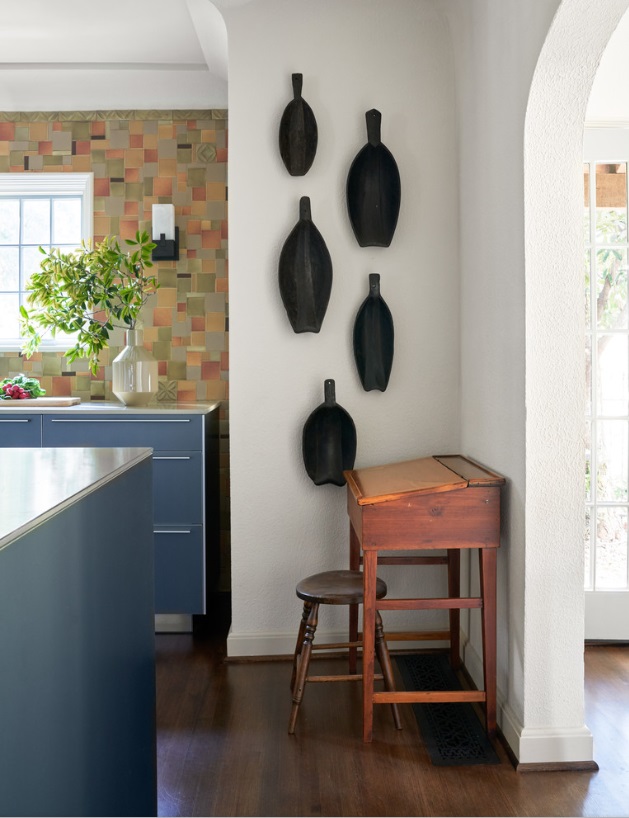
The owners of this home we designed in Kessler Park displayed their collection of African artifacts in the kitchen. The pieces are united in color, but have slightly different shapes and sizes.
Any repetition of elements in a room can create rhythm. For example, a group of art prints along the wall, a series of matching lighting fixtures, or a row of candles on a mantle all establish rhythm through repetition. However, not all of your repeating accessories need to be identical.
You can also create interest through progression, in which you line up your accessories from large to small, small to large, or even from light to dark in tone. A series of similar but differently-sized vases in an entrée way is a charming example of progression. Featuring a basic shape throughout the room is another opportunity to create rhythm. For example, an oval-patterned wallpaper can be accentuated by an oval-shaped mirror.
Keeping repetition and rhythm in mind will guide you to make smarter purchases as you furnish your home, because it encourages you to create cohesive groupings. If you’ve tried to incorporate rhythm, but the room still feels “off” somehow, remember to step back and let your eyes naturally follow the lines of the room. This can help you identify where changes should be made.

A pink, toile-patterned wallpaper adds movement and rhythm to the walls of this formal dining room in University Park, Dallas. This dining room is part of a home decorated in a traditional English cottage style.
Harmony:
Another way to achieve balance in your interiors is through harmony, in which all the elements of your space relate to each other in a pleasing way. When there are too many different colors, shapes, or textures in a room, the result is visual chaos. A room has harmony when almost everything in it is part of the same color family: in other words, a monochromatic color scheme.

The living room shown above is from a transitional home we designed in Plano, Texas. The color scheme for this house is made up of calming neutrals, while a variety of textures and patterns add interest to the space.
While a room with contrasting colors and rhythm is exciting, a room with harmony is especially restful. So monochromatic color schemes are a great idea for rooms you want to be able to relax in, such as the bedroom. A symmetrically designed room will also feel more harmonious than an asymmetrical room.
If you are just beginning to furnish your Dallas home and aren’t sure how to proceed, pick one item or visual element you definitely want in your room, and then design around it. Be careful not to get too carried away, and make sure to leave room for ‘negative space.’ Negative space gives interiors a calming quality, and too much clutter can take away from that.

This Dallas dining room is a great example of a room where negative space makes the room feel more open.
You don't have to make everything in your room all of one color to achieve harmony. Distributing similar textures throughout your room will achieve a similar effect: from coarse textures like brick and timber paneling, to smooth textures like polished concrete and glass.
The danger in creating a harmonious room is that without the right amount of contrast, you can end up with a boring design. A smart designer will know how to add just the right amount of variety while still maintaining a balanced look. If your monochromatic color scheme feels too “matchy-matchy,” you’ll want to introduce other colors.

Here is the formal living room from SMU’s Kappa Alpha Theta house that we featured earlier. We used a bright multi-color scheme for this room: golds, greens, and aquas are found throughout the room, and echoed again in the large floral painting over the sofa.
When it comes to multi-color schemes, many interior designers follow the 60-30-10 rule. This rule is designed to guide you in distributing the right amount of color in each room. 60 percent of the room should represent your dominant color, 30 percent should be your secondary color, and the last 10 percent is for accents.
Now that you've read about a few examples of rhythm and harmony, hopefully you can approach your interiors with a fresh eye and see where you can make improvements. If you’re overwhelmed by the size of your project and could use an expert opinion, consider reaching out to our interior design team for a consultation. You can contact us by sending an email to info@chambersinteriors.com or calling our Dallas office at 214-651-7665.