It’s important to leave some negative space on each shelf so that the items have “breathing room.”
Although shelves are rarely the focal point in interior design, it can’t be denied that cluttered, carelessly decorated shelves will distract from an otherwise immaculate space. If you’re redecorating your Dallas home and could use some help making your shelves look both clean and stylish, try following these five steps.
1: Edit Your Collections
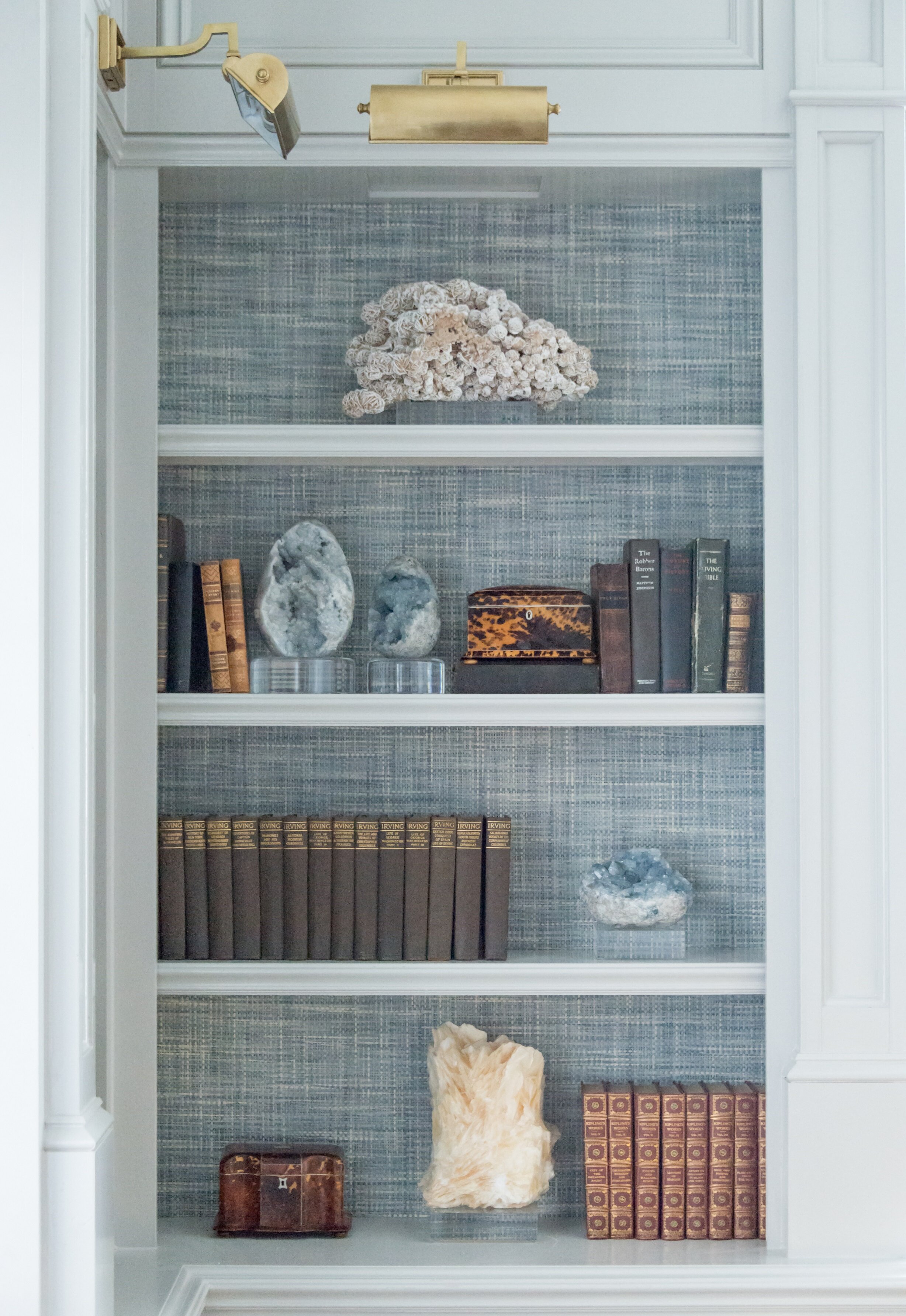
We used a grasscloth wallpaper in the back of this bookcase for added depth, texture, and color.
To start with, remove all of the items on your shelves and go through them. Edit out anything that you either don’t love anymore or that clashes with the rest of your decorating scheme. This is also a great time to look at your bare shelves and decide if those could use an update, too. I like to add fabric or wallpaper to the backs of bookshelves to give them more depth and flair.
For a professionally designed look, keep in mind that interior designers usually decorate shelves with fewer items than the average homeowner. Cutting down on clutter gives each object more impact.
If you’re starting with a clean slate and could use some shopping tips, look for trays, small bronzes, boxes, antique tea caddies, vases, picture frames, and small art prints in addition to your books. Leaning a framed art print or photo against the back draws the viewer’s eye deeper into the shelf.
Organic accessories, such as petrified wood, geodes, coral, shells, and rattan baskets help give your shelves a variety of textures. Small potted plants (whether faux or live) add some refreshing greenery to your shelves too.
2: Pick Your Main Colors
Bookshelves should have a unified color scheme whenever possible. I recommend picking two complementary colors, adding in one type of metal, and using any number of neutral colors in-between.
3: Place Your Largest Items First
After you’ve narrowed down your selections, place your largest items on the shelves first. These can include stacks of coffee table books, baskets, vases, sculptures and trays. Some of these pieces may be large enough that you can put them on a shelf standalone.
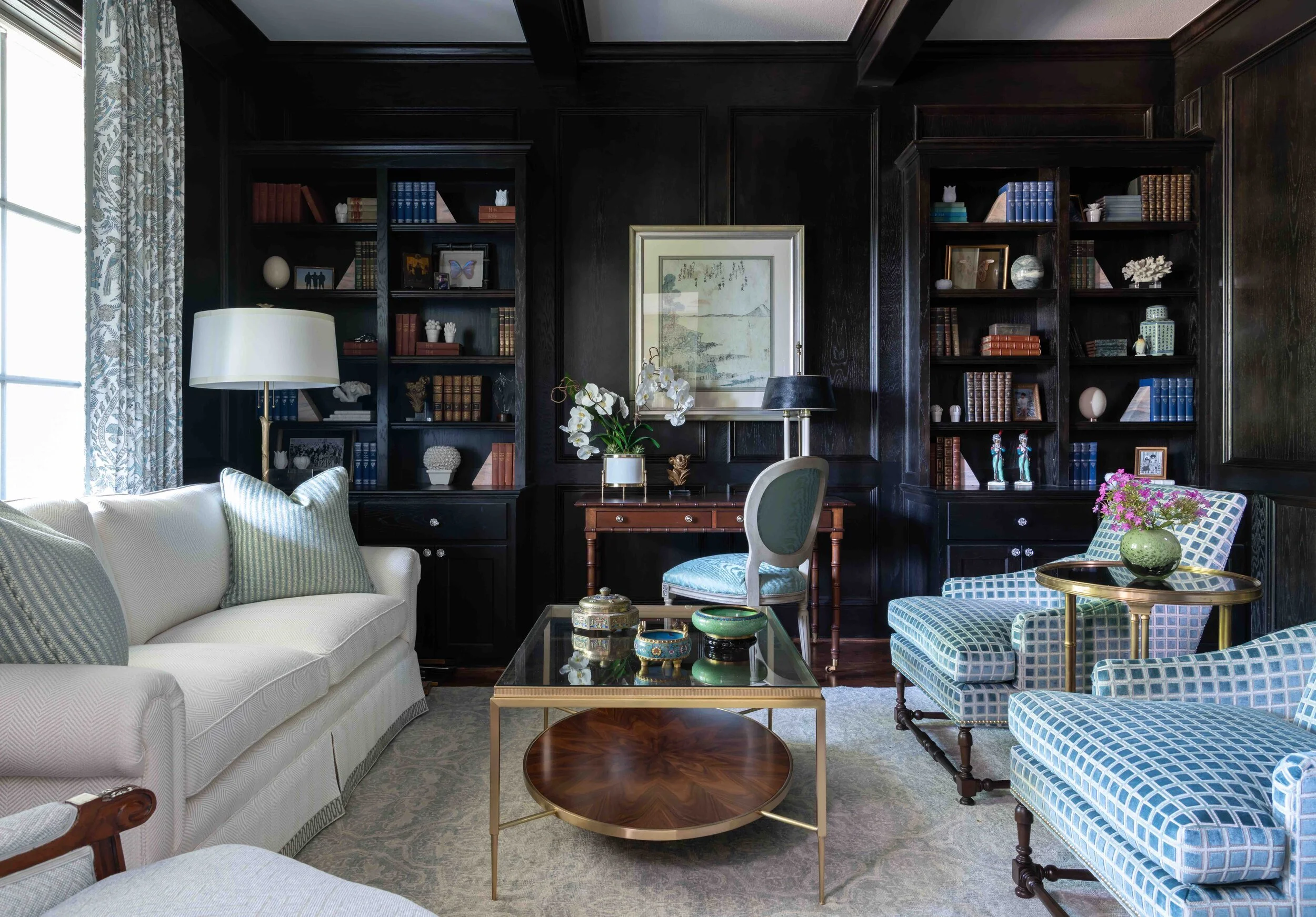
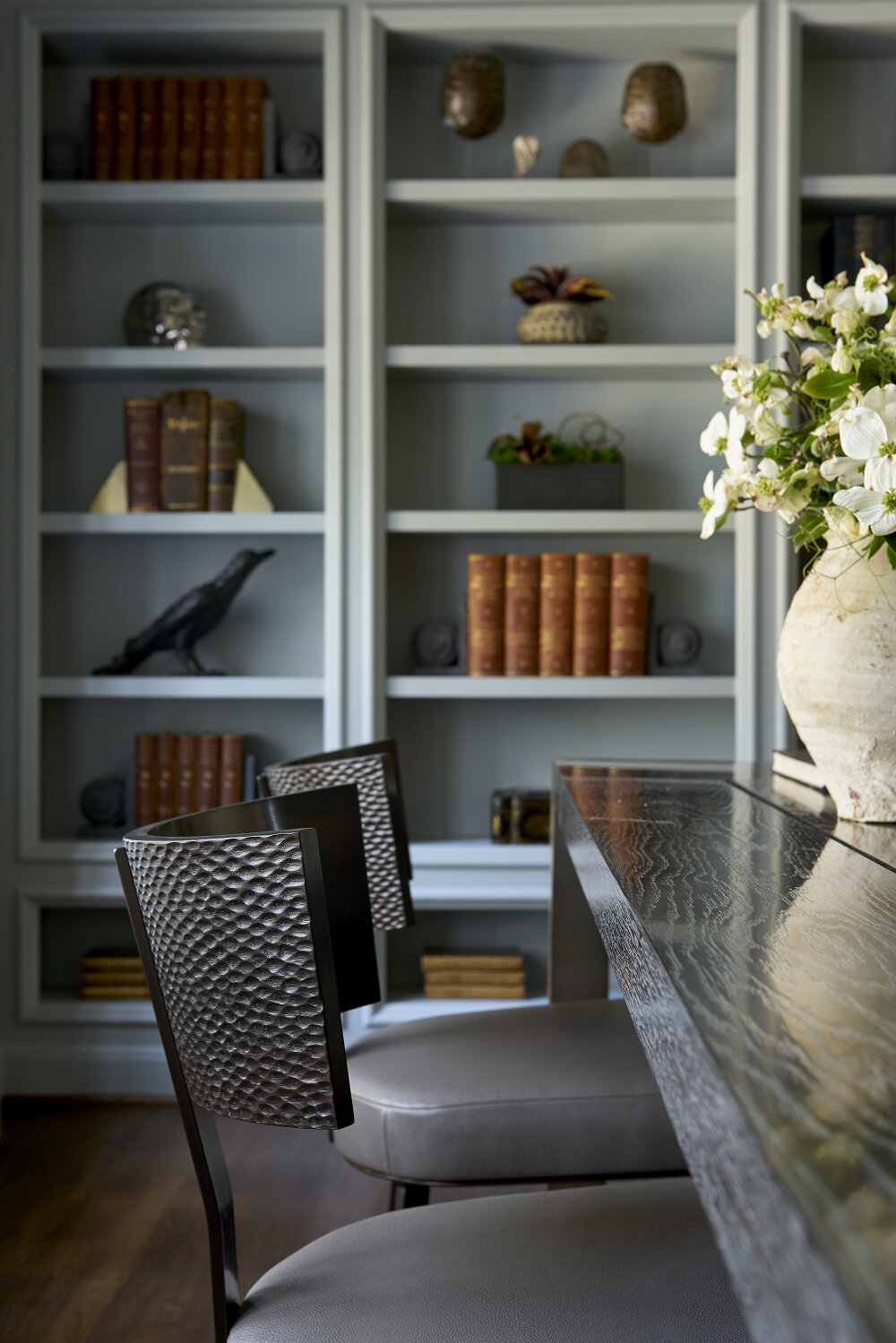
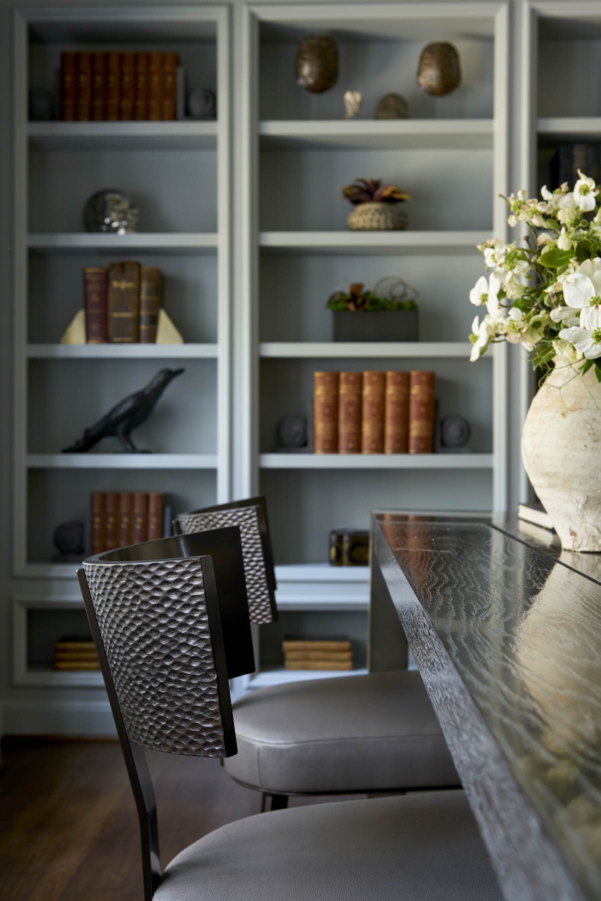
The shelves in this Preston Hollow library are stained black, creating a dramatic backdrop for the clients’ books and objet d’art.
4: Organize Your Books
Next, gather together all the books you’re using. If you have lots of books, you can group them by color.
Experiment with arranging books vertically, leaning them, or stacking them horizontally. A horizontal stack should have at least three books. If any of your books have unattractive spines or do not match your color scheme, turn them around so that the pages are facing out instead.

The blue-and-white china and the books on these shelves are all color-coordinated with the rest of the room.
Some formulas for combining books and accessories include:
· Putting books, a bookend, and a decorative bowl or basket together on a shelf
· Setting a ball-shaped accessory against leaning books and adding a vase
· Holding a set of books upright with a horizontal book stack that has a decorative object on top
5: Add the Finishing Touches
Once you’ve found a place for your large and medium items, use your small items to fill in any awkward gaps. That said, don’t fill out every shelf completely. A little negative space helps give your collections some “breathing room.”
As you arrange your shelves, make sure to vary the heights, pairing tall and short items together. Don’t be afraid to show your personality: shelves are the perfect place for travel mementos, family photos, and collectibles.
Before you finish decorating, take a step back to see how all the shelves in a room work together. It’s important to have some repeating colors or objects evenly distributed throughout the shelves, but it can be tricky to achieve the right balance. For example, if you have two gold objects on two adjoining shelves, you may want to move one of them to a further away shelf to balance things out.

A mixture of potted plants, porcelain jars, books, and picture frames fill these shelves we designed for a Plano home.
One way to balance a tall shelving unit is to fill the four corner shelves with similar objects. These corners create a visual “frame” that bring everything together in the center shelves. To style a long shelf, create distinct vignettes that gently touch each other around the edges.
None of these design rules are set in stone, so don’t be afraid to experiment until your shelves feel right to you. And most of all, don’t forget to have some fun too. Shelves are a great opportunity to express a story about yourself. The end result shouldn’t look too staged, but rather, tell the world about who you are.
Having trouble editing down your collections? Getting a professional second opinion from an interior designer is invaluable. To contact us, send an email to info@chambersinteriors.com or call our Dallas office at 214-651-7665.