We decorated this front porch on a Dallas home with faux bois benches by Currey & Company.
Balconies, porches, and patios are enviable design features for a home. But designing an outdoor space comes with its own challenges. You'll need to ask yourself: do you want to design around a view? Create privacy? How will you provide shelter from the elements?
Balconies, especially, are often small. Some people just put out lawn chairs and aren’t sure what else to include. If your Dallas home has an outdoor space that’s a little underutilized, here are some ideas on how to get the most out of it.
General Outdoor Space Guidelines:
A good first step to designing an outdoor space is to research outdoor-friendly furniture materials. Wrought iron, teak, and resin wicker are all common in outdoor decorating. You should also look for cushions that dry quickly and can stand up to the sun's rays.

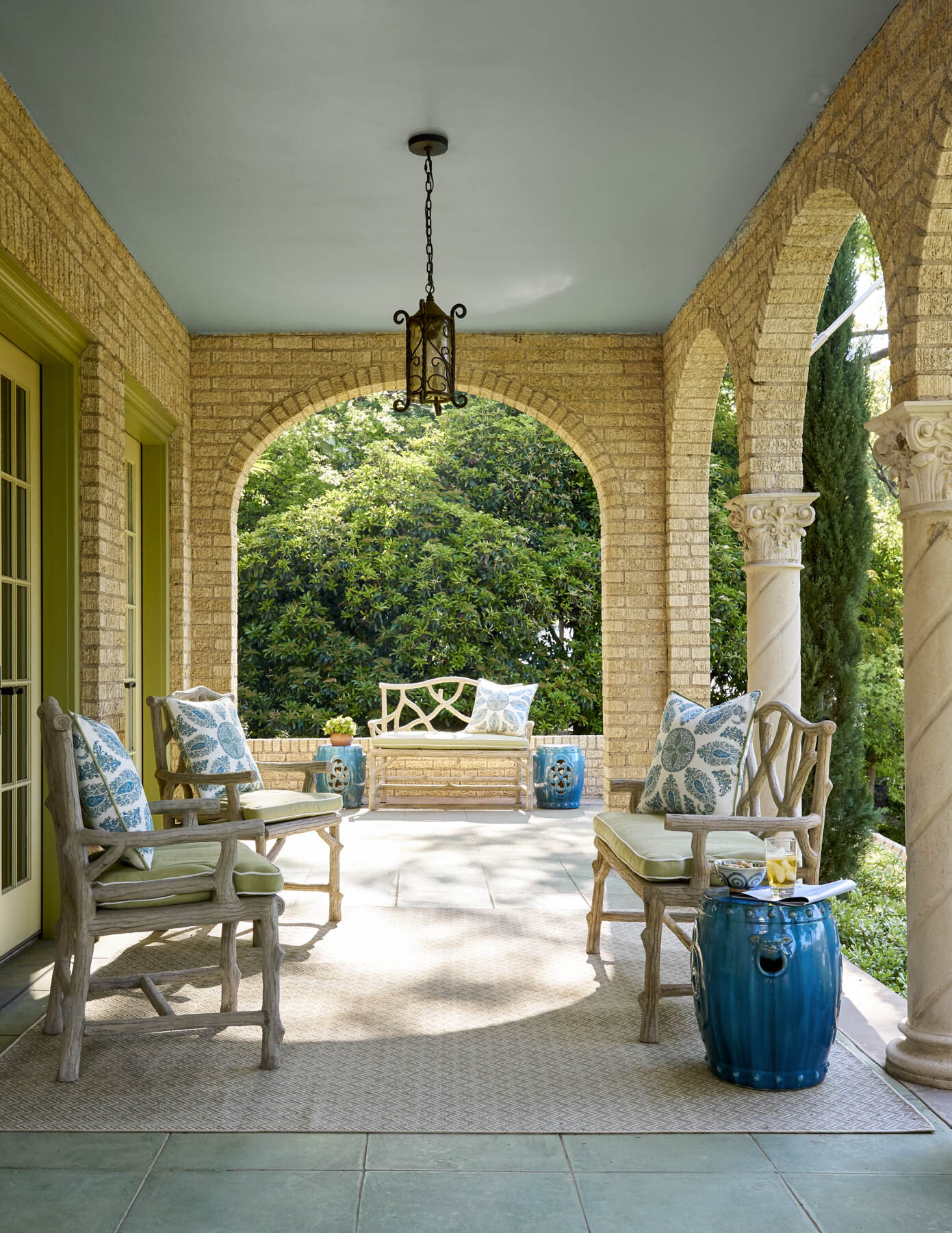
A lantern chandelier helps to illuminate this outdoor area we designed for a University Park chateau.
Lighting is very important for these spaces, especially if you like to enjoy your balcony, patio or porch as the sun is setting or in the evenings. Look into pendants, sconces, string lights, or lanterns, and remember that bulbs with a warm color are preferable here to bright white.
An easy way to add color to outdoor spaces is to decorate with vases, potted plants, and pillows. Don’t forget to dress up the floor too. A patterned area rug adds comfort underfoot, but graphic floor tiles can introduce a lot of flair too. If privacy is a concern, you may need to add a screen lattice with climbing plants, a tall potted plant, or a shrub.
Tips for Balconies:
Space is premium on balconies, so think about how you’ll be using yours and plan accordingly. If you like to eat dinner out on the balcony, then obviously you’ll need a table; if you’re only going to be reading or enjoying an occasional cocktail, you can get away with just a comfortable chair and a small ottoman or drink table.
Take the opportunity to install built-in seating if your balcony is still under construction. This way, you won’t have to worry about furniture being knocked over by the wind.
Tips for Porches and Patios:

The brown-and-white-striped cushions seen here complement the earth tones in the stone exterior of the house.
As with balconies, consider how you’ve used your porch or patio so far. This is especially important for front porches. Is yours a living space? Or is it a transitional space into your foyer? Either way, it’s important that your outdoor furnishings blend with your interiors and also complement the paint colors on the outside of your home.

An outdoor area, such as this one we designed in Kessler Park, should have a variety of seating options that are all equally comfortable.
Most people who have porches feel like they don’t use them enough. Make sure to buy seating that is comfortable for you and your guests, or else you’ll rarely use it. Porch swings with cozy pillows, deep-seated Adirondack chairs, and rocking chairs give you a variety of options that are both relaxing and durable. Your largest piece of furniture should face outwards, while the rest of your seating in a conversation group should face towards it.

The red painted door brightens this shaded porch and makes it feel more inviting.
A small front porch is still an important opportunity to make a good first impression. If your porch is shadowy, brighten things up by painting the door a lighter color than the rest of the home, then add a new door-knocker. The door should ideally be the focal point of the porch or patio, so flank it with symmetrical plants or furniture on either side. If your door is on the right or left rather than in the center, lead a visitor’s eye to your door with a lineup of potted plants.

A ceiling fan will help the residents of this Dallas home enjoy their outdoor seating area even during hot summers.
Swapping accessories out with the seasons adds a lot of charm to your porch or patio. Include throw blankets on the outdoor furniture so you can enjoy the cooler months outside, too. A ceiling fan is also a smart investment for making your porch comfortable in hot summers.
If you have trouble getting your outdoor space to harmonize with the rest of your home, consider hiring a designer. Despite being called ‘interior designers,’ many of us consult with our clients about their outdoor areas too. A professional will know the best way to take advantage of your space and create a porch, patio or balcony you'll enjoy in all seasons. You can reach out to us by calling our Dallas office at 214-232-9501 or sending an email to info@chambersinteriors.com.