
The antiqued gold pagoda mirror frame, patterned wallpaper, and warm colors all lend themselves to Bohemian style.
The French word bohémien originally referred to migrants from Bohemia, a region in the Czech Republic. Nowadays, we might call someone who is nonconformist, artistic, and well-traveled a bohemian. Bohemian interior design style is as free-spirited and unconventional as the people who inspired it.
Those who love Bohemian (“Boho” for short) style are drawn to it because it is colorful, approachable, carefree, and cozy. This is not a style for minimalists or people who don’t like color. If you’ve always wanted to try decorating your Dallas home in a Bohemian style, make sure to include the following elements.
1. Bold Patterns and Colors
When you study Bohemian rooms, you’ll notice that they often combine a neutral base color with jewel tones, earth tones, and metallic accents. The brightest colors can be anything from emerald green to mustard yellow and royal purple. Bright colors have been becoming more popular this year, making Bohemian a very current look too.

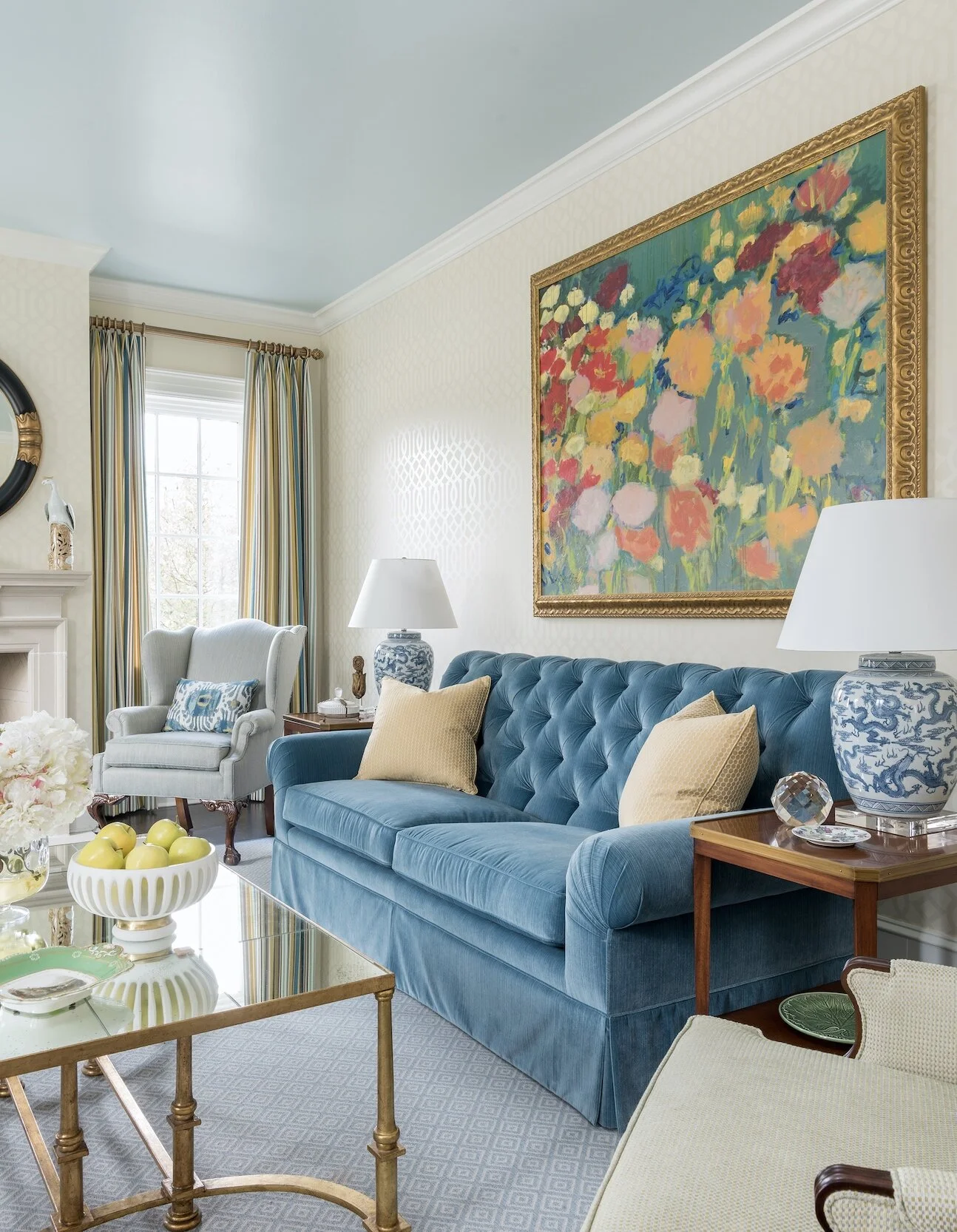
We filled this downtown Dallas high-rise with bold colors and multicultural art, especially African and Indian art.
For a truly Bohemian look, you’ll want some patterns too, especially patterned rugs. Any patterns you choose should fit into your overall color scheme, but don’t worry about mixing different regional styles. This is your opportunity to combine ikats, suzanis, and shiboris with Moroccan, Mexican and Persian patterns. You can even try hanging a tapestry or rug on the wall instead of art.
2. Low-Seated, Comfortable Furniture
Low seating is ideal for Bohemian rooms because it promotes an air of relaxation. As you furniture shop, look for floor pillows, poufs, ottomans, low-backed sofas, and low coffee tables that invite visitors to settle down and unwind.

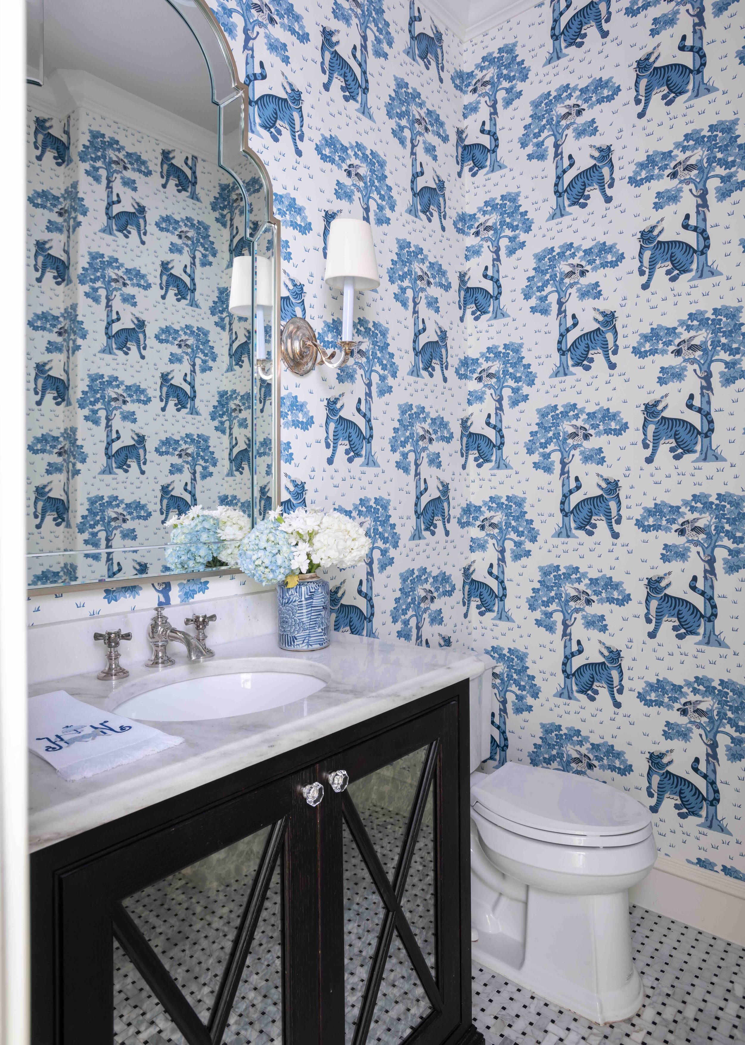
This north Dallas bedroom combines many different kinds of patterns in the same basic colors (blue and white).
Bohemian style is all about mismatched items that tell a story. This is definitely not the place for all-matching sets of furniture straight from the showroom! Pieces that are distressed and have history to them are ideal.

Although this guest bedroom is not colorful, the patterns on the bedding and curtains help to give it a Boho feel.
3. Touchable Textures
There is no such thing as “too much texture” in a Boho room. Unsurprisingly, organic materials, like rattan, stone, leather, and wood are especially prevalent here. Try to balance soft fabrics (like velvet) with smooth metals and rough textures (like distressed wood furniture and unglazed pottery).
Of course, not everything in your room has to look worn and casual. A touch of glamor is not unwelcome in a Bohemian space, so look into adding an ornate sunburst mirror or a beautiful chandelier.
4. Plants
Plants are another key fixture of Boho style. They can be live or faux, tall or short. Cacti, monsteras, and tropical plants are always at home in this setting, but really, almost any green plant will add some color and life to the room.
5. Ambient Lighting
Since Bohemian is a “light and bright” style, your room should be well-lit at all hours of the day. Layer a mix of different light sources, such as pendant lights, floor lamps, lanterns, and candles to create an ambient glow that is not too harsh.
6. Multicultural Art and Accessories
Boho is an eclectic, well-traveled look where a variety of items create one storied space. Multicultural art is perhaps the most important feature of this style. Don’t travel often? Visit your local antique store to find interesting pieces from around the world. An interior designer can also be a great resource for helping you find the perfect antiques and art.
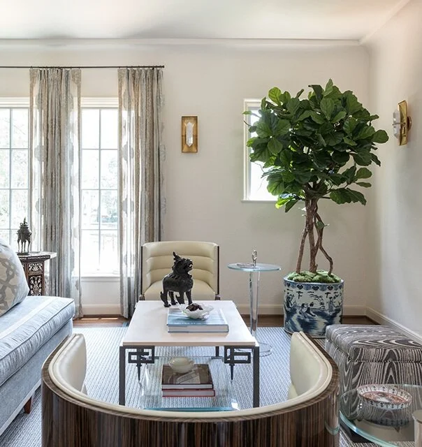
If you’re designing your living room in Bohemian style, putting a tall potted plant in the corner is a good idea.
If you like Bohemian but want your own home to look more restrained, it is perfectly fine to just include a few artsy and colorful accents into an otherwise orderly space. Even if you’re going for a very exuberant Boho home, your bedroom should be more pared-down to create a sense of calm.
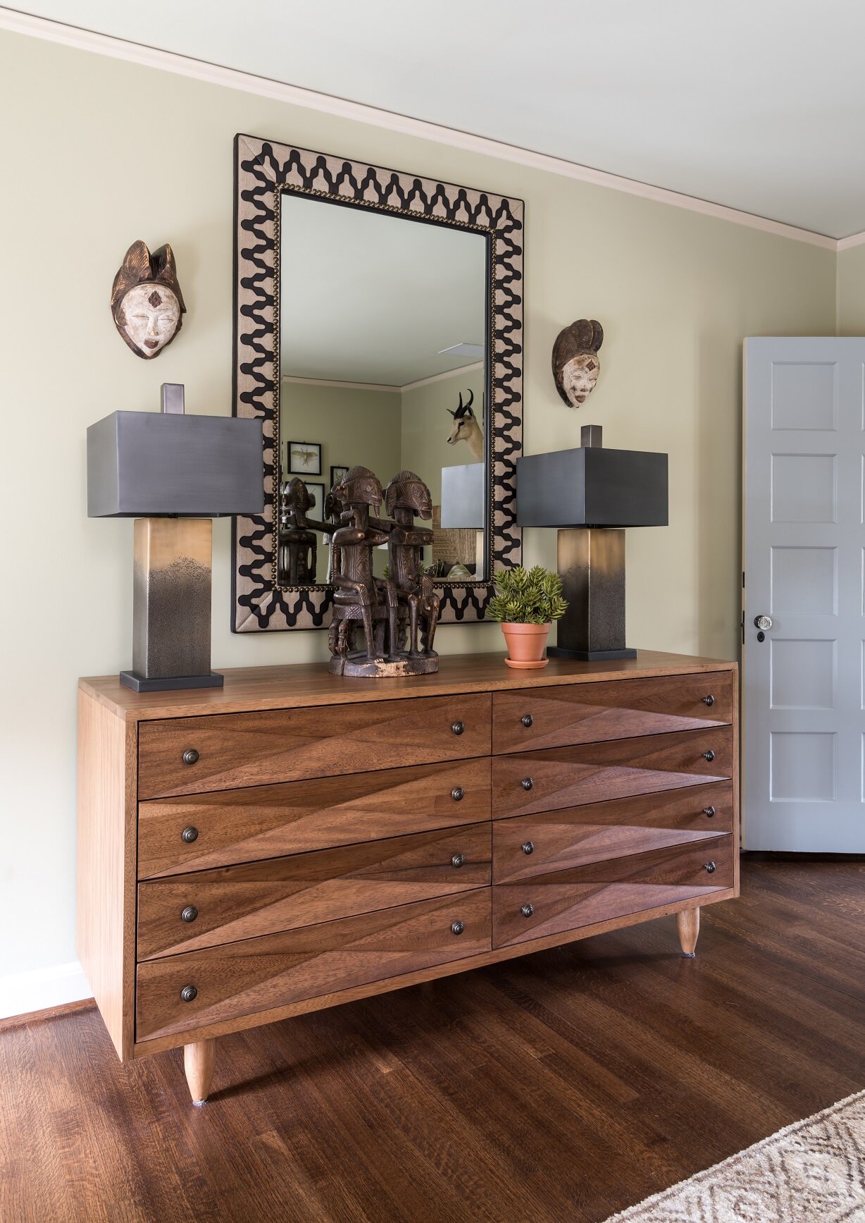
Here you can see a Bohemian guest bedroom from an Oak Cliff project that was decorated in a distinct African theme.
Although there are no hard and fast rules in Bohemian style, there are certain things that really capture its relaxed, free-spirited atmosphere. By breaking down Bohemian into its basic elements, I hope I’ve helped demystify this style so that you can design with a clear vision in mind.
And of course, if you could use some help sourcing antiques, art, and fabrics for your Bohemian space, working with an interior designer can save you a lot of time and trouble. To schedule a free consultation with us, call our Dallas office at 214-651-7665 or send an email to info@chambersinteriors.com.