Preston Hollow

4 Things You Should Know Before You Decorate Your First Home by Margaret Chambers

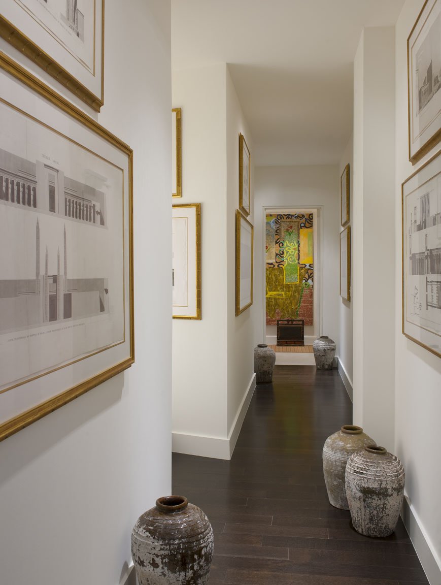
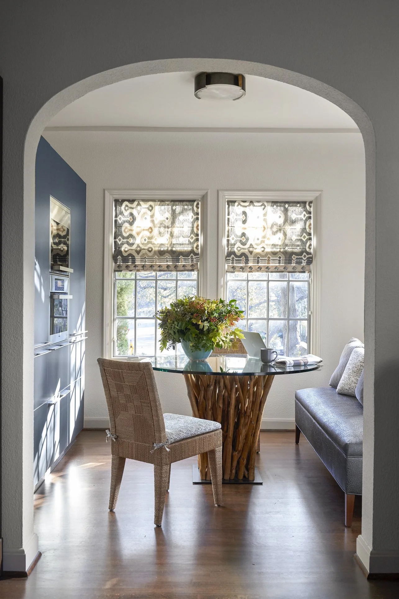
Even small spaces, such as this breakfast area with a custom banquette, can be very special and unique.

Buying your first home is an exciting milestone. For most people, it’s their first chance to truly make the space their own. However, first-time homebuyers might also find the prospect of decorating a whole home daunting. Below are some tips that I think all first-time homebuyers should know before they start decorating.

Plan Your Space in Advance

Get your hands on the plans for the house if possible. Having these will help you see ahead of time which of your furniture will fit and if you need to knock down walls to create a more open layout. If your house does need major renovations, bringing in a design team now will save you a lot of stress later.

An interior designer can also tour homes with you and tell you which of them have the best floor plans, or which homes will require the least amount of work. When I look at homes for sale, I see things most clients wouldn’t notice.

One of the most crucial, but often overlooked, aspects of home design is lighting. It’s especially important to make sure you have adequate lighting for your kitchen and bathrooms. Don’t forget to take natural lighting into consideration and decide how much privacy you’ll need for each room.

Identify Your Favorite Design Styles

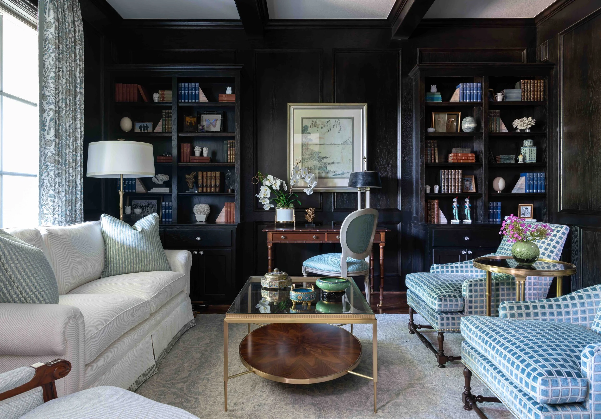
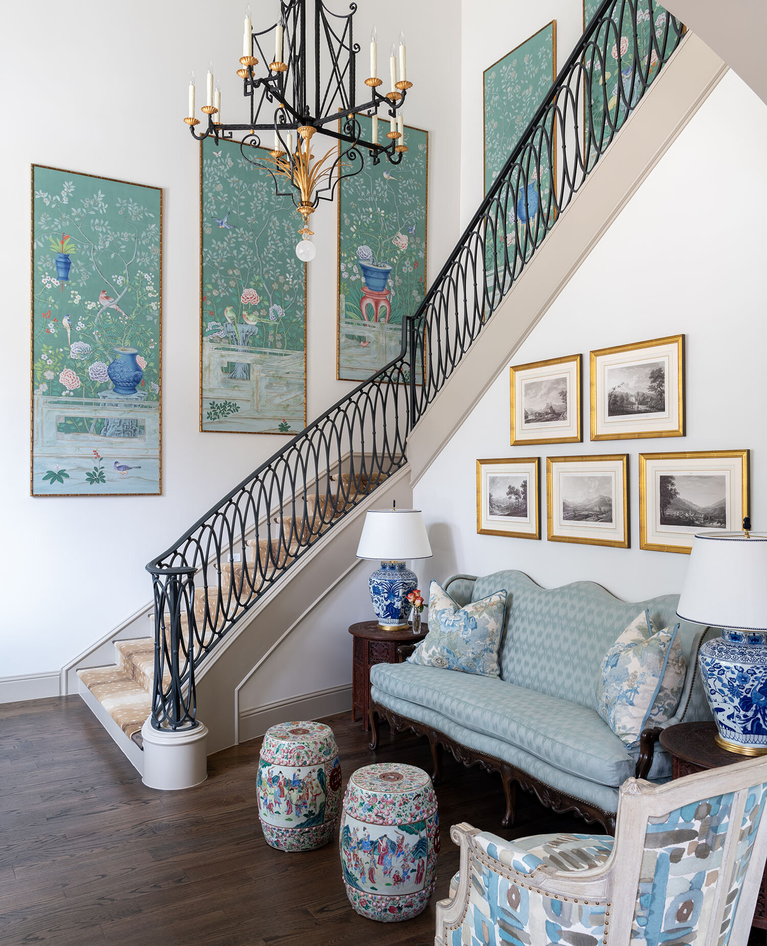
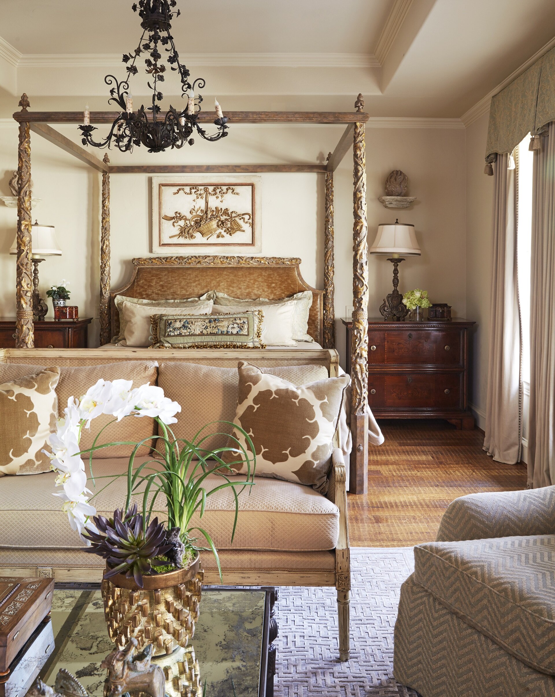
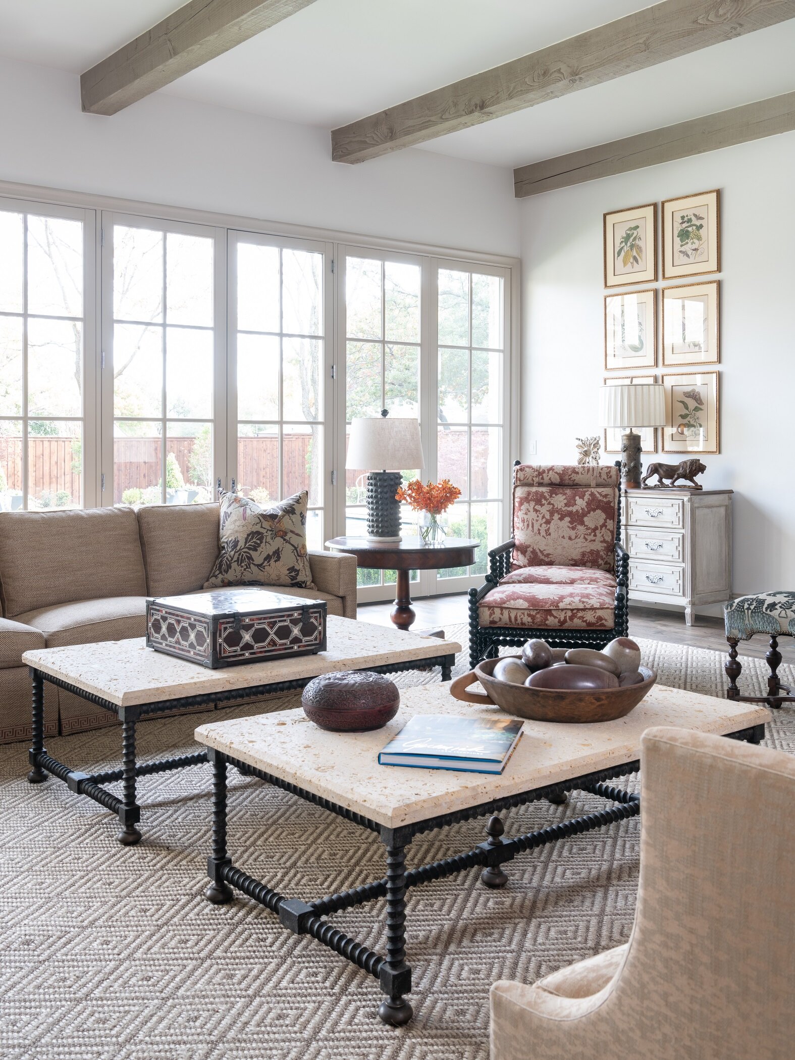
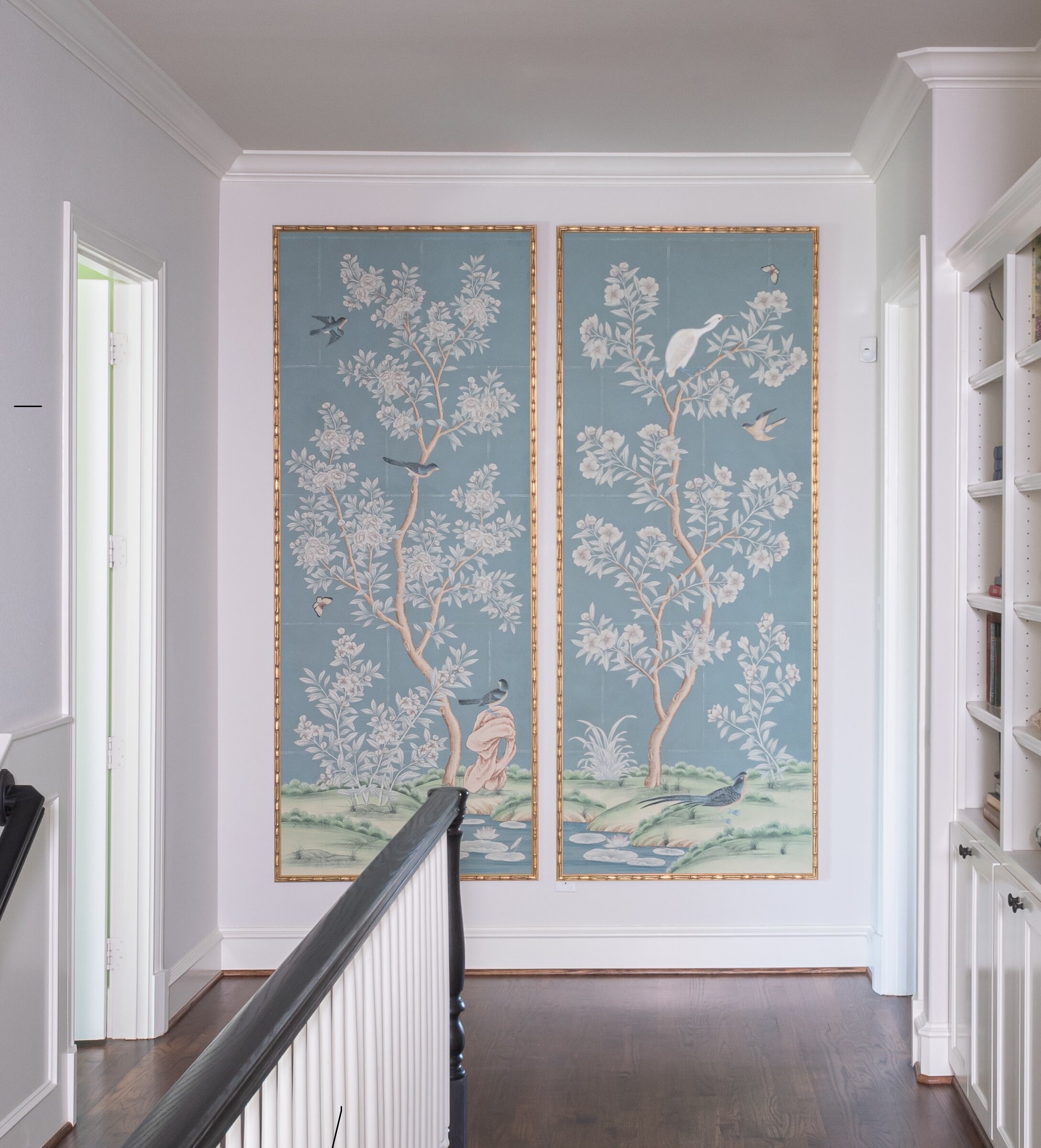
We went with a transitional style for this Preston Hollow home because its architecture is very simple. Blue-and white is always a popular color scheme.

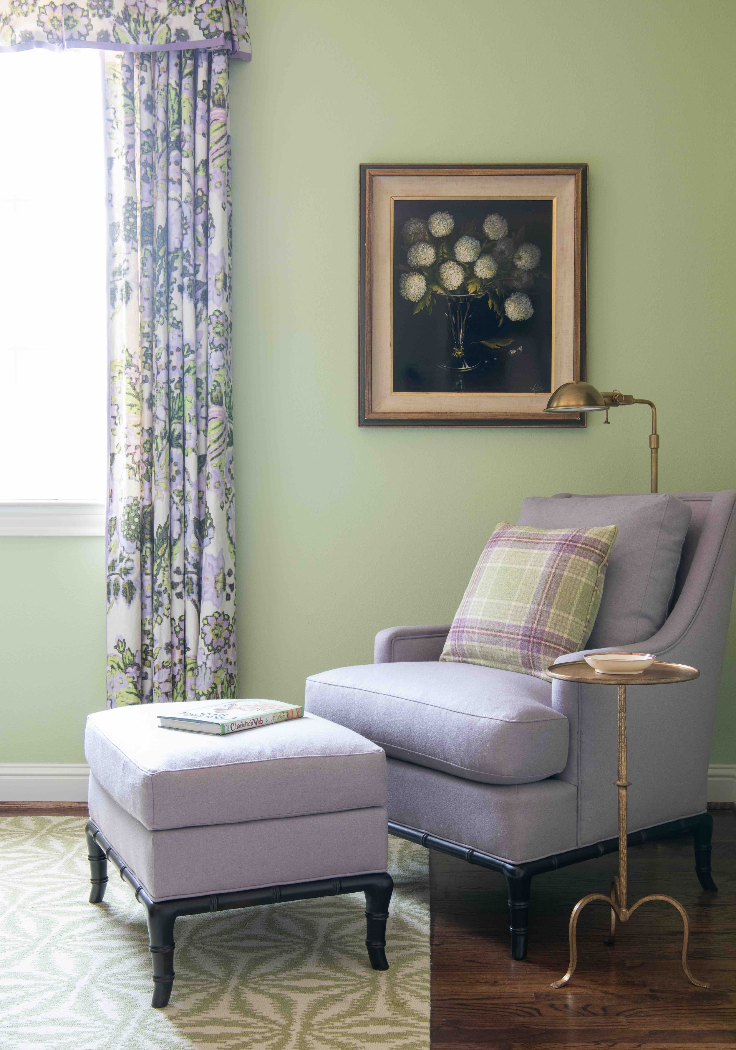
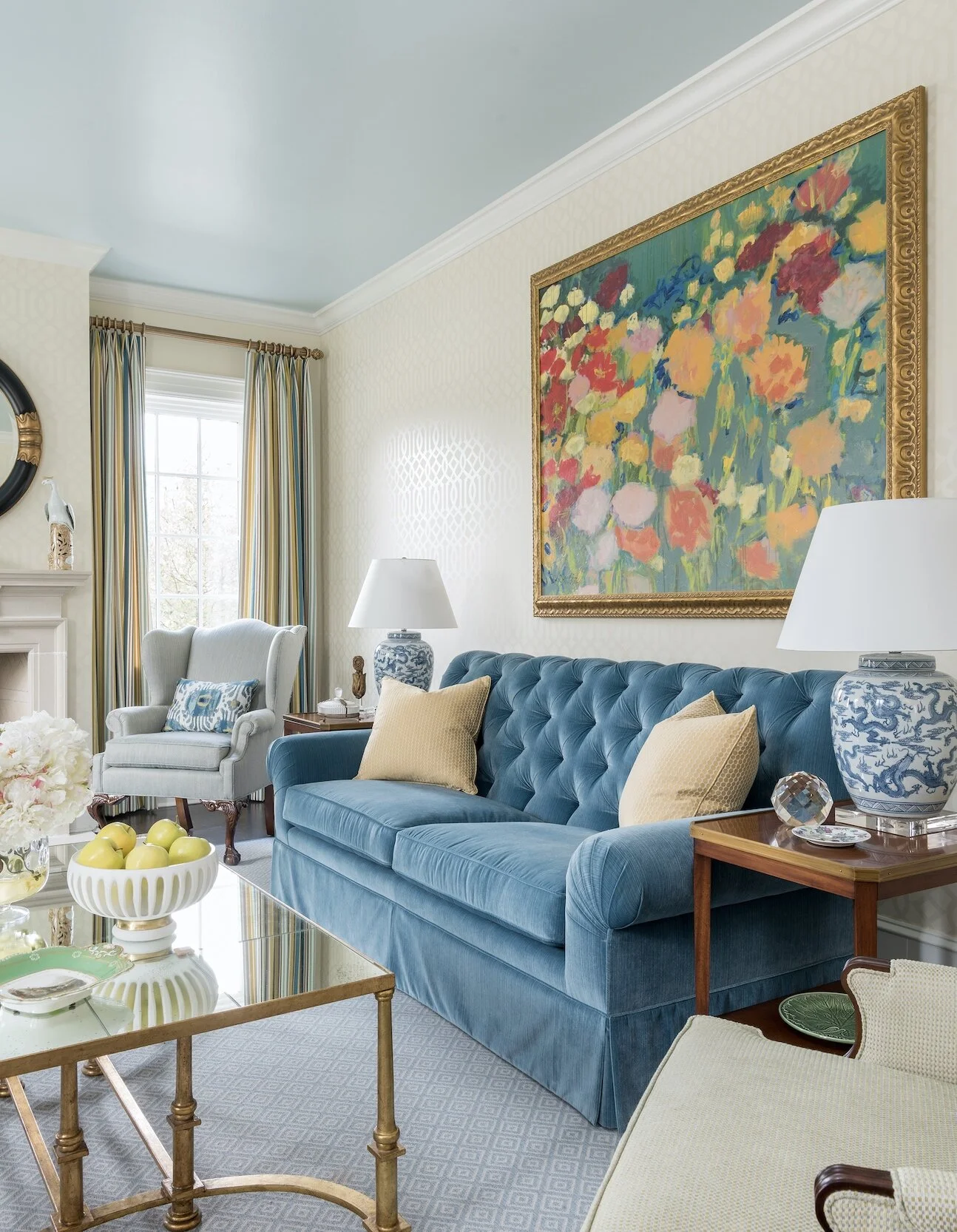
Most people have more than one interior design stye that inspires them. When in doubt, pick a style that is complementary to your home’s architecture. There’s no need to use the same style in every room. Just remember to have at least one design element in common (such as a color) that connects the rooms together.

Although looking at the internet or design magazines for inspiration can be a helpful starting point, don’t get caught up in trying to closely re-create someone else’s design. Your first home will go through a lot of transitions, and you should give yourself freedom to change things up as time goes on.

Start With the Rooms You’ll Use the Most

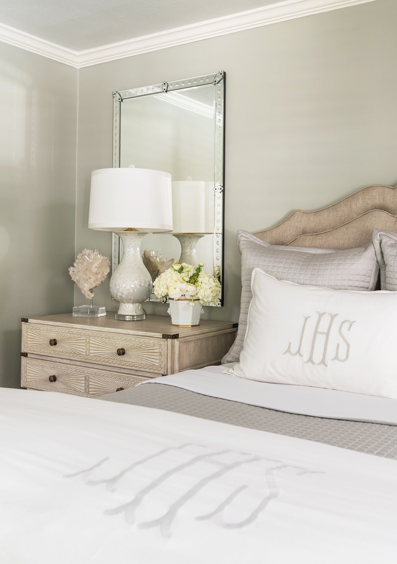
The best rooms to begin with are the ones you’ll spend the most time in. If you like to entertain, those rooms might be your living room and dining room. Your anchor pieces for each room (such as your bed, sofas, or dining table) should take priority in your budget. I generally recommend that my clients buy the best mattress and bedding they can afford. You can, and should, spend a lot less on accessories for the moment.

When designing your den, try to create as much seating as possible and make it a perfect place to watch TV.

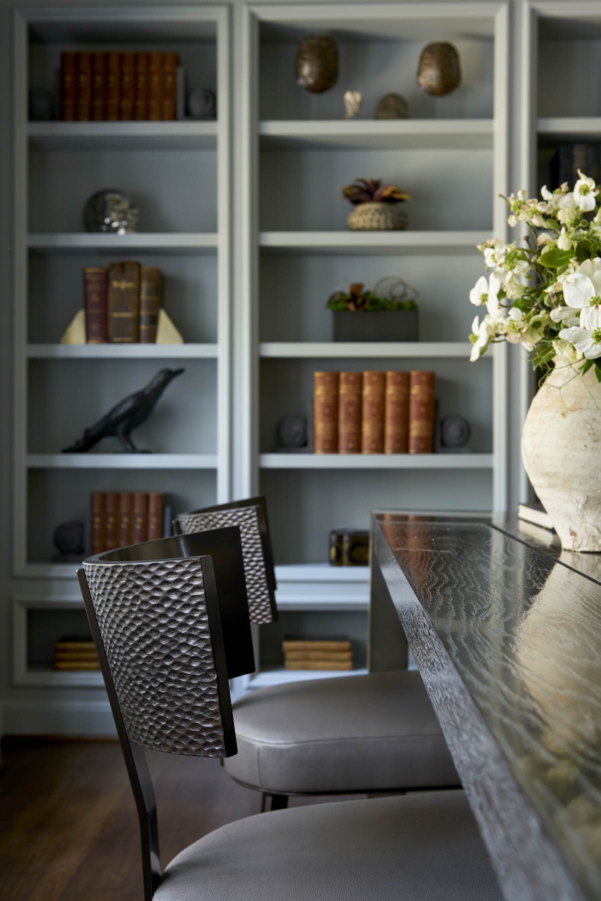
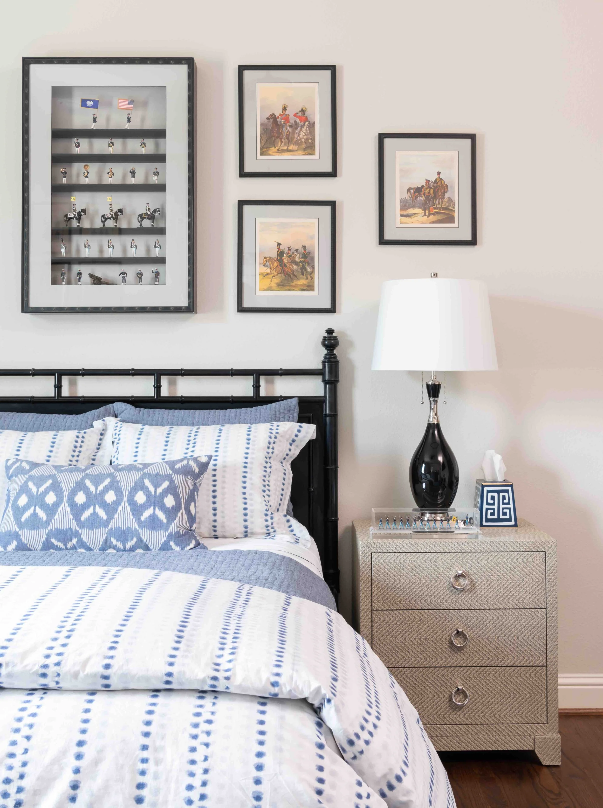
Your friends and family may also have some pieces in storage that they would love to give you. Before turning down a piece, take a moment to consider if it might work better for you if it was reupholstered or repainted. That said, don’t take any furniture that you know won’t fit your desired interior design style. You’ll eventually find yourself having to design around it, which may be more trouble than it’s worth. Hand-me-down or heirloom pieces that are in a neutral color are always easier to integrate into a home.

Layer Items Over Time Instead of Buying Everything at Once

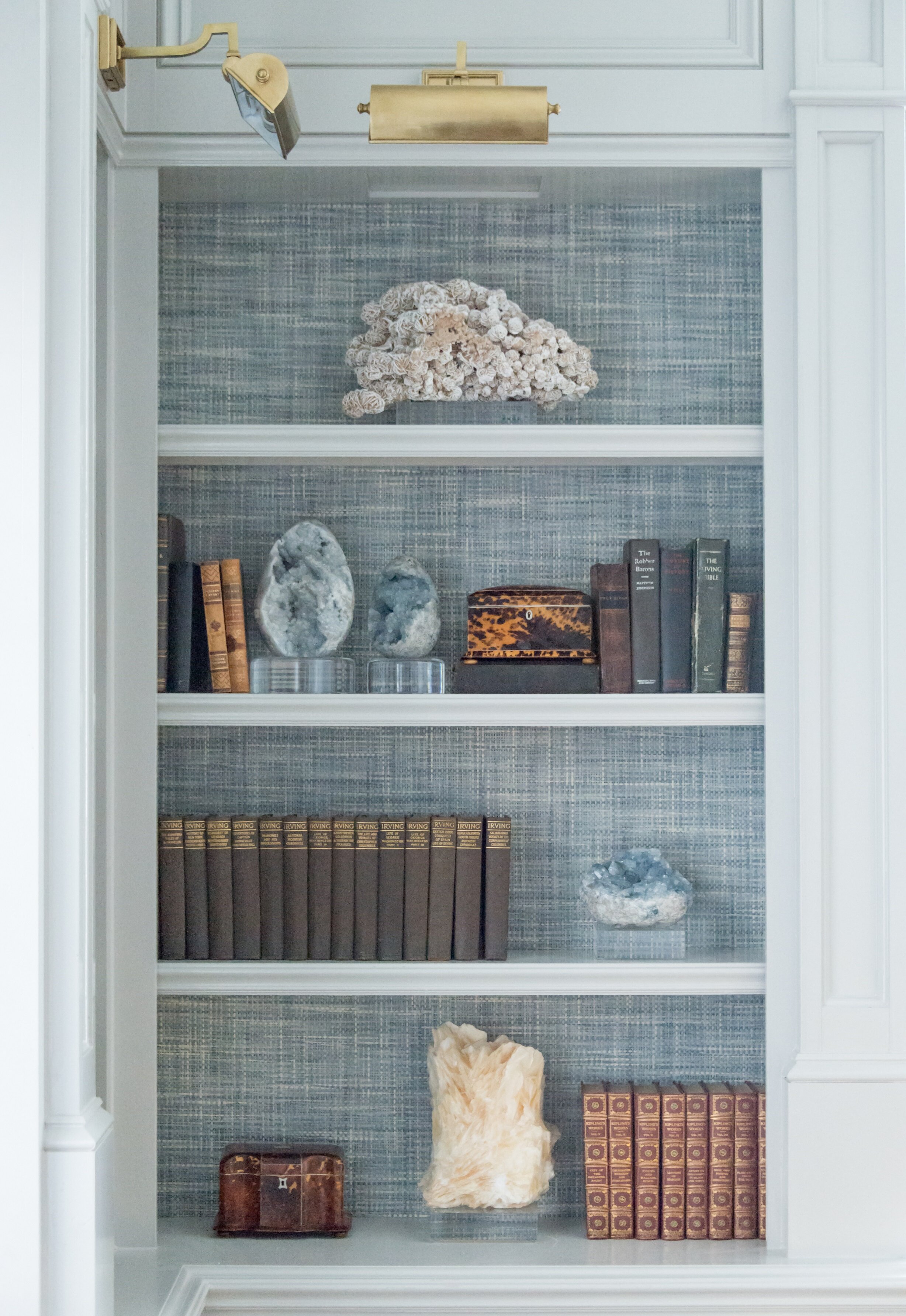
One mistake first-time homebuyers often make is rushing to buy everything at once and getting matching furniture sets. The best homes have a layered look that mixes old and new pieces together. Combine items that are complementary in color, material, and scale. Don’t be in a rush to pick your paint color, either: try testing out swatches instead.

Instead of using the matching chairs that came with your table, try using a different but complementary set.

Finally, remember that most people only stay in their first home for a few years. The items you prioritize in your budget should also be ones you can take with you to your next home. On the other hand, if you plan on enjoying your home for many years to come, consider hiring a professional designer. Designers like myself get to know you so that we can design a space that is perfectly suited for you and your family. If you're interested in working with Chambers Interiors, you can reach our Dallas office by calling 214-651-7665 or emailing us at info@chambersinteriors.com.

RELATED ARTICLES:

Stuck on a Room Design? Follow These Four Steps to Find Inspiration by Margaret Chambers

The vaulted ceiling in this Dallas home game room called for extra-large light fixtures.

Do you have a room in your home that you feel “stuck” on? Maybe you have an awkwardly shaped space with unused corners. Or perhaps you made a major purchase, like a dining table, that doesn’t mesh with the surrounding décor like you hoped.

When a client calls me, it’s usually because they’re stuck and afraid to make big decisions. As an interior designer, I like to take the following steps whenever I’m confronted with a challenging room.

Step 1: Make a list of what bothers you the most

Long hallways can be challenging to decorate. We filled these walls with a series of gold-framed antique Egyptian prints.

Take a moment to ask yourself if there are things in the room that you already know aren’t working for you and your family’s lifestyle. Then, put away the majority of your accessories, leaving just your largest pieces of furniture and anything else that you’re absolutely sure you want to work with. Paring a room down to its essentials is one way to encourage you to look at the space in a new light.

If the room feels “off” but you still can’t pinpoint the problem, try taking a photo or a video of the room. There are times where seeing the space in a photo can help you identify imbalances or problem areas that you may have overlooked in real life.

Step 2: Study rooms you love for ideas

At this stage, you’ll probably need some ideas on how to work with your mostly-blank slate. Whenever I’m having trouble with a room, I start looking through magazines and home decorating books for inspiration. I also ask my client to show me their favorite rooms so that I can make sure my design aligns with their tastes.

Although the unusual color combination in these curtains created limitations to work with, we were thankfully able to build a beautiful color scheme around them.

A piece of artwork, a fabric pattern, or something from nature can sometimes give me an idea for a color scheme. In one project I designed in Preston Hollow, the client asked me to use six fabric panels she inherited from her mother. The purple, green, and black colors on the panels created limitations to work with, but they also helped define the colors for the rest of the room. For example, we added a still life and a portrait that belonged to the client’s family, both of which had a lot of black in them. This guest bedroom, with its green wall paint color, purple chair, and black-washed night stands, ended up being one of my favorite spaces in the house.

Step 3: Experiment with pieces you already own

Before you run out to a home goods store, try “shopping at home” first. Take items from other rooms and put them in the blank areas of your problem room. You might be surprised to find that a console from your entryway or a painting from the living room looks even better in a new space.

Don’t be afraid to rearrange furniture into new configurations. After moving furniture around, you should be able to figure out what you can work with, and what will need to be replaced, repainted, or reupholstered.

Step 4: Identify your unique style, and only shop for items that fit it

If you own a lot of multicultural art, you can keep things cohesive by combining pieces that share similar colors.

Sometimes when a room isn’t coming together, it’s because it is filled with heirlooms from different design eras. Now’s the time to decide on what style you want to aim for and buy items that fit consistently into it.

Generally, if you’re going to invest in a new anchor piece, it should be timeless—preferably in a neutral color. Your tastes will evolve as trends change, so you don’t want to splurge on a “trendy” piece and have to replace it again a few years later.

If you’re still having trouble getting your room to look perfect, the next step is to bring in a fresh set of eyes. Have a relative or friend stop by. They might be able to identify the missing piece in your room’s equation. Even better, call in a professional designer. As a designer, I actually enjoy working with my clients’ most challenging rooms. Designing a room is like solving a three-dimensional puzzle, and challenging circumstances often result in the most unique and memorable room in the house. You can reach out to us by calling our Dallas office at 214-232-950 or emailing us at info@chambersinteriors.com.

To fill the high ceiling in this stairway hall in a Dallas home, we used framed, eight-foot-tall wallpaper panels.

Four Things You Should Know Before You Buy a Chandelier by Margaret Chambers

We put a 1950s Venini glass chandelier in this Kessler Park dining room. It adds a vintage touch to the space.

We put a 1950s Venini glass chandelier in this Kessler Park dining room. It adds a vintage touch to the space.

The earliest chandeliers were used in the medieval period to hang candles up and out of the way, reducing the risk of fire. Today, chandeliers are a mainstay in luxury interior design.

However, care must be taken in choosing the right chandelier. A poorly hung or poorly sized chandelier can throw a whole room off balance. Here are some things I personally take into account before I start shopping for my Dallas clients.

1. How to Determine the Right Size Chandelier for Your Room

I recommend following these equations to roughly estimate the size your chandelier should be.

Generally, the taller your ceiling, the taller your chandelier should be.

Generally, the taller your ceiling, the taller your chandelier should be.

Chandelier Diameter:

  • The length of your room + the width of your room (in feet) = The suggested diameter of your chandelier (in inches)

Chandelier Height:

  • The height of your room (in feet) x 3 = The suggested height of your chandelier (in inches)

2. How to Pick the Right Light Bulbs

These two large brass pendant chandeliers hanging over the island complement a brass range in the kitchen.

These two large brass pendant chandeliers hanging over the island complement a brass range in the kitchen.

Although chandeliers are beautifully decorative on their own, their primary purpose is to add ambient light to the room. The light sources you choose should not be an afterthought. For lumens, a good rule of thumb is to find bulbs that are 300-400 lumens for every 100 square feet of room you have.

Your chandelier also should not be the sole source of light in the room, or else you’ll have shadowy areas. Layer lighting throughout the room with a combination of recessed lights, lamps, or sconces. If you can, get a dimmer-compatible chandelier. Being able to dim the lights is especially important for a dining room chandelier, where high-wattage bulbs could create unwanted table glare.

LEDs produce less heat than halogen bulbs and last the longest of all light sources. These days, they are also available in a wider range of color temperatures. For my clients, I recommend LED bulbs that are in a neutral white, between warm and cool.

3. How to Choose a Chandelier Style That Complements Your Home

Although a modern chandelier can potentially work in a traditional home (and vice versa), it’s possible that over time, the mismatch will look dated. For a truly timeless look, stick to modern chandeliers in modern rooms and traditional chandeliers in traditional rooms. The metal and finish on a chandelier can cause it to lean more modern or more traditional. Many modern chandeliers have chrome or satin nickel finishes; meanwhile, bronze finishes are associated with transitional design.

Crystal chandeliers are great for traditional spaces with lots of antiques, like this Preston Hollow dining room.

Crystal chandeliers are great for traditional spaces with lots of antiques, like this Preston Hollow dining room.

Crystal chandeliers, with their romantic sparkle, are highly traditional. K9 crystal, which is mass-produced, and Italian crystal, which is molded and fire-polished instead of hand-cut, are on the affordable end of the scale. Swarovski crystal, Spectra crystal, and Egyptian crystal are all machine cut, with Swarovski being the finest quality. Rock crystal is the most expensive variety of all because it is formed naturally in ground.

4. How to Hang a Chandelier at the Correct Height

In a dining room, the chandelier should be hung about thirty to thirty-six inches over the table to leave enough room for your centerpiece. It might make more sense to use two or three small chandeliers rather than one if you have a long dining table. Most chandeliers come with three to six feet of chain, so take measurements ahead of time to see how much length you need. Although you can have a chain shortened, you can’t have it added on to.

For this transitional home, we used a lot of glass or crystal light fixtures, like this feather crystal chandelier.

For this transitional home, we used a lot of glass or crystal light fixtures, like this feather crystal chandelier.

If the chandelier is hanging over the open floor, make sure to leave seven feet of clearance over a person’s head. Your chandelier should also have enough breathing room from the surrounding walls—ideally, at least four feet on each side.

By taking your room size, existing furnishings, and lighting layout into consideration, you should have a pretty good idea of what chandeliers will work in your space. However, some homeowners may be dissatisfied with the options they see in stores. If you’re looking for the perfect chandelier but haven’t found the right match, call our Dallas office at 214-232-9501 or email us at info@chambersinteriors.com. Interior designers like myself have access to many more sources than the general public. At my design firm, we also have experience with reproducing antique chandelier designs and customizing them to the client’s specifications.

RELATED ARTICLES:

4 Things to Know Before You Update Your Bathroom or Powder Room by Margaret Chambers

A few accessories, like a soap dish or some fresh flowers, are all that's needed to complete a bathroom counter.

A few accessories, like a soap dish or some fresh flowers, are all that's needed to complete a bathroom counter.

Bathrooms and powder rooms are woefully overlooked areas in home design. Many people consider designing them an afterthought, or aren’t sure how to work with a small space. But no matter how small your powder rooms are, you deserve to have ones that are thoughtfully planned and tastefully designed. If you’re thinking about giving the bathrooms in your Dallas home a quick update—or an extensive remodel—you’ll surely find these tips useful.

Brunschwig & Fil’s iconic “Les Touches” wallpaper adds a playful touch to this bathroom we designed for a Dallas home.

Brunschwig & Fil’s iconic “Les Touches” wallpaper adds a playful touch to this bathroom we designed for a Dallas home.

2021 Bathroom Trends:

Although grey was a popular wall color for bathrooms the last few years, in 2021 it’s starting to go out of style. Instead, warmth is being brought into bathrooms through the use of gold or brass fixtures and wood accents. Wallpaper has also come back into style. If you do want to put up wallpaper, shop for the vinyl kind that is moisture-resistant.

While you’re updating, take a look into some of the latest developments in bathroom technology. These include smart showers that can be remotely set to start running, voice-activated lighting and temperature controls, and Bluetooth speakers for baths and showers. Heated floors have also been gaining popularity for some time now.

Layout Tips for Bathroom Remodels:

A common bathroom design mistake is to make your toilet the first thing a visitor sees when they enter the bathroom. Choose anything else as your focal point beside the toilet, such as your mirror, your bathtub, or your vanity. The toilet should be out-of-sight from the entrance whenever possible.

This area, with the freestanding tub and large antique mirror, serves as the focal point for this bathroom in Colleyville.

This area, with the freestanding tub and large antique mirror, serves as the focal point for this bathroom in Colleyville.

Bathrooms don’t have to be spacious to be appealing. To make a small powder room feel more luxurious, splurge on a few nice materials and finishes. If you prefer to take showers over baths, don’t take up too much floor space with a large tub.

When we remodeled this shower, we added glass doors, mosaic floor tiles, slabs of Carrera marble, and brass hardware.

When we remodeled this shower, we added glass doors, mosaic floor tiles, slabs of Carrera marble, and brass hardware.

You can maximize elbow room by installing a glass panel or shower curtains instead of a shower door. This way, you also won’t have to worry about your door swinging out and hitting the vanity.

Don’t forget to plan for storage space. Upper vanity cabinets along either side of the mirror are a smart solution for keeping toiletries out of sight. You can even build electrical outlets into the cabinets for plugging in your hairdryers and electric toothbrushes.

Choosing Flooring and Tiles:

There’s a reason why most bathrooms have tiled floors. Carpeting absorbs moisture and can develop mold, and if wood flooring becomes water damaged, it’s costly to replace. If you want the look of wood without the risk of water damage, I’d recommend porcelain tiles with a faux bois grain finish that emulate the look of real wood panels.

Improvements in manufacturing have paved the way for new and improved tile patterns, including chevron, diamond, hexagon, arabesque, and fish scales. I’m starting to see homeowners want to try new patterns instead of defaulting to subway tile.

The Best Lighting for Powder Rooms:

Lighting is always important for home design, and bathrooms are no exception. Older fluorescent light bulbs can cast an unflattering blue hue on skin, while dim lighting makes bathrooms feel small and closed-in. If the color tone of your bulbs is a cool white, update them with a warmer white.

The vertical cabinets in this vanity are great for storing toothbrushes, medications, etc. so they stay out of sight. The cabinets also contain electrical outlets, so everything can stay conveniently plugged in and ready to use.

The vertical cabinets in this vanity are great for storing toothbrushes, medications, etc. so they stay out of sight. The cabinets also contain electrical outlets, so everything can stay conveniently plugged in and ready to use.

As you update your lighting, make sure not to install the fixtures too far above your mirror, or else they’ll cast shadows on your face. Either bring the lights low enough so that they’re almost touching the mirror, or place sconces on either side of the mirror.

To make a bathroom feel light and airy, find a way to filter daylight in. A window to the outside or a skylight through the ceiling are both options. You can always put shutters over the window for more privacy.

We normally use tile in bathrooms, but the client wanted wood floors. To protect them, we added polyurethane coating.

We normally use tile in bathrooms, but the client wanted wood floors. To protect them, we added polyurethane coating.

For your finishing touches and decorations, keep things simple. Instead of cluttering counter space with lots of accessories, buy practical items—such as pretty soap dispensers—that are decorative and integrate into your overall design theme.

If your bathtub is next to a window, you can always add shades for privacy, like this motorized Roman shade we used.

If your bathtub is next to a window, you can always add shades for privacy, like this motorized Roman shade we used.

Many people in Dallas continue to work from home and are thinking about ways they can give their surroundings a facelift. Whether you’re planning a full bathroom remodel, or just want to make better use of the space and layout you already have, the designer tips above will come in handy.

For those of you who are looking to bring in a professional, you should know that Chambers Interiors has a lot of experience a bathroom remodels. To schedule a free consultation, email us at info@chambersinteriors.com or call our Dallas office at 214-651-7665.

RELATED ARTICLES:

Add Serious Style to Your Bookshelves With These Five Steps by Margaret Chambers

It’s important to leave some negative space on each shelf so that the items have “breathing room.”

It’s important to leave some negative space on each shelf so that the items have “breathing room.”

Although shelves are rarely the focal point in interior design, it can’t be denied that cluttered, carelessly decorated shelves will distract from an otherwise immaculate space. If you’re redecorating your Dallas home and could use some help making your shelves look both clean and stylish, try following these five steps.

1: Edit Your Collections

We used a grasscloth wallpaper in the back of this bookcase for added depth, texture, and color.

We used a grasscloth wallpaper in the back of this bookcase for added depth, texture, and color.

To start with, remove all of the items on your shelves and go through them. Edit out anything that you either don’t love anymore or that clashes with the rest of your decorating scheme. This is also a great time to look at your bare shelves and decide if those could use an update, too. I like to add fabric or wallpaper to the backs of bookshelves to give them more depth and flair.

For a professionally designed look, keep in mind that interior designers usually decorate shelves with fewer items than the average homeowner. Cutting down on clutter gives each object more impact.

If you’re starting with a clean slate and could use some shopping tips, look for trays, small bronzes, boxes, antique tea caddies, vases, picture frames, and small art prints in addition to your books. Leaning a framed art print or photo against the back draws the viewer’s eye deeper into the shelf.

Organic accessories, such as petrified wood, geodes, coral, shells, and rattan baskets help give your shelves a variety of textures. Small potted plants (whether faux or live) add some refreshing greenery to your shelves too.

2: Pick Your Main Colors

Bookshelves should have a unified color scheme whenever possible. I recommend picking two complementary colors, adding in one type of metal, and using any number of neutral colors in-between.

3: Place Your Largest Items First

After you’ve narrowed down your selections, place your largest items on the shelves first. These can include stacks of coffee table books, baskets, vases, sculptures and trays. Some of these pieces may be large enough that you can put them on a shelf standalone.

The shelves in this Preston Hollow library are stained black, creating a dramatic backdrop for the clients’ books and objet d’art.

The shelves in this Preston Hollow library are stained black, creating a dramatic backdrop for the clients’ books and objet d’art.

4: Organize Your Books

Next, gather together all the books you’re using. If you have lots of books, you can group them by color.

Experiment with arranging books vertically, leaning them, or stacking them horizontally. A horizontal stack should have at least three books. If any of your books have unattractive spines or do not match your color scheme, turn them around so that the pages are facing out instead.

The blue-and-white china and the books on these shelves are all color-coordinated with the rest of the room.

The blue-and-white china and the books on these shelves are all color-coordinated with the rest of the room.

Some formulas for combining books and accessories include:

·        Putting books, a bookend, and a decorative bowl or basket together on a shelf

·        Setting a ball-shaped accessory against leaning books and adding a vase

·        Holding a set of books upright with a horizontal book stack that has a decorative object on top

5: Add the Finishing Touches

Once you’ve found a place for your large and medium items, use your small items to fill in any awkward gaps. That said, don’t fill out every shelf completely. A little negative space helps give your collections some “breathing room.”

As you arrange your shelves, make sure to vary the heights, pairing tall and short items together. Don’t be afraid to show your personality: shelves are the perfect place for travel mementos, family photos, and collectibles.

Before you finish decorating, take a step back to see how all the shelves in a room work together. It’s important to have some repeating colors or objects evenly distributed throughout the shelves, but it can be tricky to achieve the right balance. For example, if you have two gold objects on two adjoining shelves, you may want to move one of them to a further away shelf to balance things out.

A mixture of potted plants, porcelain jars, books, and picture frames fill these shelves we designed for a Plano home.

A mixture of potted plants, porcelain jars, books, and picture frames fill these shelves we designed for a Plano home.

One way to balance a tall shelving unit is to fill the four corner shelves with similar objects. These corners create a visual “frame” that bring everything together in the center shelves. To style a long shelf, create distinct vignettes that gently touch each other around the edges.

None of these design rules are set in stone, so don’t be afraid to experiment until your shelves feel right to you. And most of all, don’t forget to have some fun too. Shelves are a great opportunity to express a story about yourself. The end result shouldn’t look too staged, but rather, tell the world about who you are.

Having trouble editing down your collections? Getting a professional second opinion from an interior designer is invaluable. To contact us, send an email to info@chambersinteriors.com or call our Dallas office at 214-651-7665.

RELATED ARTICLES:

Decorating With Bold Colors: Tips for the Color-Shy by Margaret Chambers

Artwork, like this floral painting over the sofa in SMU’s new Kappa Alpha Theta house in Dallas, is a great opportunity to add a burst of color to your room.

Artwork, like this floral painting over the sofa in SMU’s new Kappa Alpha Theta house in Dallas, is a great opportunity to add a burst of color to your room.

Although bold colors have been trending the last few years, many homeowners wonder, ‘how much is too much?’ In my own design work in Dallas, I’ve been including more color in projects lately. I thought that readers would appreciate some tips on how to work with bold colors in a balanced way.

Starting Small

If you’re new to using bold paint or wallpaper colors, try them in a smaller space like a powder room first. For powder rooms, however, I suggest staying away from bright green. Green casts an unflattering hue on you or your guest in the mirror.

We used a metallic butterfly wallpaper to give this powder room a “jewel box” feel.

We used a metallic butterfly wallpaper to give this powder room a “jewel box” feel.

Brightly colored accessories such as throw pillows, stools, artwork, ottomans, and blankets can be easily swapped out if you get tired of them. If you’d like to add some boldly colored furniture, consider having the furniture you own repainted rather than buying new furniture. Other easy ways to introduce color into the room include buying fresh flowers, getting new lampshades, or putting books with colorful covers on your shelf.

Picking the Dominant Color

The size of your room determines how much color you can comfortably accommodate. In a large room, it would be overwhelming to use a bold paint color on all four walls. In small and medium rooms, however, you can get away with a bold base color.

Some colors can function as neutrals even if they aren’t traditionally thought of as such. For example, navy blue and moss green are soothing to the eye and often used as base colors. The location and architecture of your home can also affect what colors look best in it. Rust red and navy typically look best in traditional homes. Blue-and-white rooms are often associated with coastal style (although you don’t necessarily have to live on the coast to use these colors).

This bedroom is an example of how you can use different shades of the same bold color—like light blue, cobalt, and navy—to create a balanced color scheme.

This bedroom is an example of how you can use different shades of the same bold color—like light blue, cobalt, and navy—to create a balanced color scheme.

Picking Your Secondary Colors

Before you commit to a bold color, pick out your secondary colors to go with it. One good formula is to have sixty percent of your room be in a neutral color, thirty percent in a stronger color, and save the last ten percent for your boldest colored accessories.

Usually the brighter a bold color is, the more challenging it is to work with. Bold colors that are toned down just a notch are a safer bet. For example, consider using burnt orange instead of pumpkin orange, soft yellow instead of highlighter yellow, and brick red instead of fire engine red.

The shades of orange we used in this north Dallas guest bedroom are just bright enough to give the room personality without making it too energizing.

The shades of orange we used in this north Dallas guest bedroom are just bright enough to give the room personality without making it too energizing.

The blue and white tiger wallpaper in this Preston Hollow powder room shows how bright colors can give small rooms more impact.

The blue and white tiger wallpaper in this Preston Hollow powder room shows how bright colors can give small rooms more impact.

Blue-and-white is a classic color combination that never goes out of style. You can get away with very vibrant shades of blue by pairing them with white. After all, it’s a color combination that our eyes are used to seeing—think of white clouds in a blue sky. If you want your room to be really energizing, decorating with one bold color and lots of black and white will give you the high contrast look you need. Placing bright artwork and accessories against a mostly white backdrop is another appealing combination.

For balance and depth, use different, less-intense tones of your boldest color throughout the room. When it comes to patterns, choose either a bold color in a subtle pattern or a busy pattern in a muted color. Chaotic patterns in bright colors are the most difficult to work with.

Coordinate the Rest of Your Home

While not every room in your home needs to have the same color scheme, it’s important that the colors flow naturally. So, if you have one room with a bright pink and teal color scheme, don’t decorate the next one with navy and red. One way to ensure the colors in your rooms flow together is to invert your color combination for adjoining rooms. For example, if your sitting room has green walls and white accents, the next room over could be mostly white with bright green accents.

Vivid colors can be beautiful in both contemporary and classical homes. We decorated this traditional cottage in University Park with bright pink colors.

Vivid colors can be beautiful in both contemporary and classical homes. We decorated this traditional cottage in University Park with bright pink colors.

Although every year sees new colors come into fashion, try not to focus exclusively on what’s trending. A room with a well-balanced, aesthetically pleasing color scheme will always look great no matter the year.

By following some of the tips outlined above, you’ll hopefully have the knowledge you need to start incorporating bold colors in your home. However, if you’re still not confident that you can integrate your favorite eye-popping fabrics, wallpapers, and paint colors, consider giving us a call. As you can see from the photos of recent projects featured here, we have a lot of experience working with color. Call our Dallas office at 214-232-9501 or send an email to info@chambersinteriors.com to schedule a free consultation.

RELATED ARTICLES:

Design a Balcony, Patio, or Porch that You’ll Love to Use by Margaret Chambers

We decorated this front porch on a Dallas home with faux bois benches by Currey & Company.

We decorated this front porch on a Dallas home with faux bois benches by Currey & Company.

Balconies, porches, and patios are enviable design features for a home. But designing an outdoor space comes with its own challenges. You'll need to ask yourself: do you want to design around a view? Create privacy? How will you provide shelter from the elements?

Balconies, especially, are often small. Some people just put out lawn chairs and aren’t sure what else to include. If your Dallas home has an outdoor space that’s a little underutilized, here are some ideas on how to get the most out of it.

General Outdoor Space Guidelines:

A good first step to designing an outdoor space is to research outdoor-friendly furniture materials. Wrought iron, teak, and resin wicker are all common in outdoor decorating. You should also look for cushions that dry quickly and can stand up to the sun's rays.

A lantern chandelier helps to illuminate this outdoor area we designed for a University Park chateau.

A lantern chandelier helps to illuminate this outdoor area we designed for a University Park chateau.

Lighting is very important for these spaces, especially if you like to enjoy your balcony, patio or porch as the sun is setting or in the evenings. Look into pendants, sconces, string lights, or lanterns, and remember that bulbs with a warm color are preferable here to bright white.

An easy way to add color to outdoor spaces is to decorate with vases, potted plants, and pillows. Don’t forget to dress up the floor too. A patterned area rug adds comfort underfoot, but graphic floor tiles can introduce a lot of flair too. If privacy is a concern, you may need to add a screen lattice with climbing plants, a tall potted plant, or a shrub.

Tips for Balconies:

Space is premium on balconies, so think about how you’ll be using yours and plan accordingly. If you like to eat dinner out on the balcony, then obviously you’ll need a table; if you’re only going to be reading or enjoying an occasional cocktail, you can get away with just a comfortable chair and a small ottoman or drink table.

Take the opportunity to install built-in seating if your balcony is still under construction. This way, you won’t have to worry about furniture being knocked over by the wind.

Tips for Porches and Patios:

The brown-and-white-striped cushions seen here complement the earth tones in the stone exterior of the house.

The brown-and-white-striped cushions seen here complement the earth tones in the stone exterior of the house.

As with balconies, consider how you’ve used your porch or patio so far. This is especially important for front porches. Is yours a living space? Or is it a transitional space into your foyer? Either way, it’s important that your outdoor furnishings blend with your interiors and also complement the paint colors on the outside of your home.

An outdoor area, such as this one we designed in Kessler Park, should have a variety of seating options that are all equally comfortable.

An outdoor area, such as this one we designed in Kessler Park, should have a variety of seating options that are all equally comfortable.

Most people who have porches feel like they don’t use them enough. Make sure to buy seating that is comfortable for you and your guests, or else you’ll rarely use it. Porch swings with cozy pillows, deep-seated Adirondack chairs, and rocking chairs give you a variety of options that are both relaxing and durable. Your largest piece of furniture should face outwards, while the rest of your seating in a conversation group should face towards it.

The red painted door brightens this shaded porch and makes it feel more inviting.

The red painted door brightens this shaded porch and makes it feel more inviting.

A small front porch is still an important opportunity to make a good first impression. If your porch is shadowy, brighten things up by painting the door a lighter color than the rest of the home, then add a new door-knocker. The door should ideally be the focal point of the porch or patio, so flank it with symmetrical plants or furniture on either side. If your door is on the right or left rather than in the center, lead a visitor’s eye to your door with a lineup of potted plants.

A ceiling fan will help the residents of this Dallas home enjoy their outdoor seating area even during hot summers.

A ceiling fan will help the residents of this Dallas home enjoy their outdoor seating area even during hot summers.

Swapping accessories out with the seasons adds a lot of charm to your porch or patio. Include throw blankets on the outdoor furniture so you can enjoy the cooler months outside, too. A ceiling fan is also a smart investment for making your porch comfortable in hot summers.

If you have trouble getting your outdoor space to harmonize with the rest of your home, consider hiring a designer. Despite being called ‘interior designers,’ many of us consult with our clients about their outdoor areas too. A professional will know the best way to take advantage of your space and create a porch, patio or balcony you'll enjoy in all seasons. You can reach out to us by calling our Dallas office at 214-232-9501 or sending an email to info@chambersinteriors.com.

RELATED ARTICLES:

8 Design Ideas for Rooms with High Ceilings by Margaret Chambers

Tall drapes with valances, a modern chandelier, and a painting all help to fill the space under this high ceiling.

Tall drapes with valances, a modern chandelier, and a painting all help to fill the space under this high ceiling.

Although high ceilings are a sought-after feature for most Dallas home buyers, they can also present some unique design challenges. People are often stumped trying to figure out what to do with all that extra wall space over door frames.

The key is to bring everything together by visually connecting your furniture, walls, and ceiling. Read on for eight design solutions that help make high-ceilinged rooms feel more inviting and intimate.

1. Find the Perfect Artwork:

A series of framed de Gournay wallpaper panels add drama to this tall staircase in a Dallas home we designed.

A series of framed de Gournay wallpaper panels add drama to this tall staircase in a Dallas home we designed.

One way to fill your extra wall space is with artwork. One large statement piece, a gallery of smaller pieces, or a tapestry are all good options for high ceiling rooms.

Artwork should be hung at eye-level, unless you have a particularly tall and narrow piece. If you want to hang something above eye level, I recommend a wall clock.

2. Install Custom Drapes:

Very tall ceilings call for very tall window treatments, which usually have to be custom ordered through a designer.

Very tall ceilings call for very tall window treatments, which usually have to be custom ordered through a designer.

The rule of thumb for tall windows is to hang your draperies at ceiling height. On the other hand, if your windows don’t go all the way up to the ceiling, you may want to add valances to make them more proportional. Either way, the drapes should hang so that they almost touch the floor.

Depending on how high your ceilings are, you may need to order custom drapes. Although costly, this is an option worth considering. The softness of drapes helps to make a high ceiling room feel cozier. Don’t worry about the tall draperies being too much: as long as you choose a solid color fabric or a subtle pattern, the effect will be spectacular.

3. Add Architectural Details:

The wood ceiling beams in this kitchen complement the hardwood floors while also contrasting against the sleek metals.

The wood ceiling beams in this kitchen complement the hardwood floors while also contrasting against the sleek metals.

One way to create a sense of depth in a tall ceiling is to add exposed beams or large crown molding. Although beams are usually associated with rustic homes, they can fit into a contemporary style home as well.

4. Use Statement Lighting:

Hanging a statement lighting fixture, such as a chandelier, is a classic solution to drawing the eye towards a ceiling. Generally, chandeliers should be hung over the coffee table or dining table in the center of the room.

For this north Dallas project, we repurposed the dining room chandelier from our clients’ old home and hung it over a seating area in their new master bedroom.

For this north Dallas project, we repurposed the dining room chandelier from our clients’ old home and hung it over a seating area in their new master bedroom.

5. Create a Feature Wall:

Another way to visually connect the upper and lower levels of the room is to turn one wall into a feature wall. There are a few different ways to do this. Painting one wall in a solid, dramatic color from floor to ceiling; wallpapering a wall; or extending the brick or stonework around your fireplace upward are some ideas.

6. Break the Walls into Thirds:

An alternative to the floor-to-ceiling feature wall is to follow the rule of thirds and visually divide the walls into three sections. As an example, the lowest third of your wall could be paneled, the middle third could be for artwork, and the highest third could be left as-is.

The wainscoting seen here, plus the two rows of framed prints above it, divide the wall into visual thirds.

The wainscoting seen here, plus the two rows of framed prints above it, divide the wall into visual thirds.

That said, not everything in your room needs to align with these three segments. Breaking up the visual “horizon” of the room (by including a few bookcases, for example) adds variety to the topography of the space.

If you want to make your walls feel shorter and the ceiling closer, paint your walls in two tones, one color on top of another.

7. Install Shelving:

Some homeowners make use of the extra wall height in their rooms by installing floating shelves or buying tall bookcases. If you like greenery, you can also add a tall potted plant in the corner of your room.

8. Use the Correct Scale Furniture:

A room with tall ceilings needs furnishings and accessories that fit comfortably into its scale. To that end, do not fill your room with collections of small objects or small-scale furniture.

A custom canopy bed and a large area rug are proportionally appropriate choices for this high-ceilinged bedroom we designed.

A custom canopy bed and a large area rug are proportionally appropriate choices for this high-ceilinged bedroom we designed.

Your furniture should be grouped together into multiple seating arrangements and anchored with an appropriately sized rug. Spacing the furniture far apart will make the room feel unbalanced and uncomfortably expansive.

Having high ceilings is an enviable problem many would love to have. That said, there’s no denying that taking advantage of the extra height can be tricky without a designer’s know-how.

By working with a professional interior designer, you can have access to their resources, which include custom window treatments, fine artwork, gorgeous chandeliers and other design elements that bring out the best in a high-ceilinged room. To schedule a free consultation with us, call our Dallas office at 214-232-9501 or email us at info@chambersinteriors.com.

RELATED ARTICLES:

The Top Six Interior Design Trends for 2021 by Margaret Chambers

This powder room we designed is a perfect example of three 2021 trends: bold colors, wallpaper, and global influences.

This powder room we designed is a perfect example of three 2021 trends: bold colors, wallpaper, and global influences.

Over the course of my interior design career, I have watched many trends come and go. Some looks are timeless and never seem to go out of style. Others fall in and out of favor in decades-long cycles. In this article, I’ll touch upon the six trends I am seeing come back for 2021: colorful interiors, antiques, globally-inspired rooms, home offices, brass hardware, and wallpaper.

Color:

Starting around the 2010s, designers and homeowners alike gravitated towards neutral interiors with cool grays, dark hardwood floors, and all-white walls. Recently, I’ve started to see things swinging back in the other direction. Colors, especially rich colors (like ocean blues), are finally back. I think this is due in part to Instagram, where colorful interior photos seem to attract more attention than neutral ones. While I have designed many white-and-gray homes at my clients’ request, I’ve always preferred color and am excited to see homeowners favoring it once again.

For this Preston Hollow dining room, we decorated the wall with antique Rose Medallion plates.

For this Preston Hollow dining room, we decorated the wall with antique Rose Medallion plates.

Antiques:

Contemporary design has enjoyed precedence for quite a while now; meanwhile, Old-World styles went out of fashion. Nowadays, however, people are wanting to mix old and new pieces again. Since people are spending a lot more time at home, buyers are more attracted to comfortable furniture with rounded curves and traditional detailing instead of sharp lines and sleek metals. Antiques add history, warmth, soul, and character to a house.

This older project from our portfolio still looks current today due to the use of bold colors and multicultural art.

This older project from our portfolio still looks current today due to the use of bold colors and multicultural art.

Although antiques are not as valuable as they once were, I predict that buyers will begin to seek them out again this year. Antiques and vintage items also appeal to young homeowners because they are a more sustainable option than newly-produced furniture.

Globally-Inspired Rooms

Another trend that design experts are predicting for 2021 is globally-inspired and travel-inspired rooms. This makes a lot of sense, since many of us have spent the year yearning for travel. With the right décor, it’s possible to make any room feel like a tropical getaway, coastal oasis, or luxury hotel room. Some interior designers are also seeking to include influences from Africa and India in their work.

Home Offices

The patterned wallpaper we placed on this dining room ceiling helps to create the illusion that the ceiling is taller.

The patterned wallpaper we placed on this dining room ceiling helps to create the illusion that the ceiling is taller.

Global Workplace Analytics, a research and consulting firm, predicts that twenty-five to thirty percent of the workforce will continue to work from home for multiple days of the week by the end of 2021. Although most people will be working outside of the home this coming year, the trend of renovating home offices is here to stay. This year will also see many people turning their rooms into multi-purpose spaces, such as combining a living room with a home office.

Brass Hardware:

For many people, brass hardware screams ‘the 80s.’ Interestingly, it’s been making a comeback for the last few years. This may be related to last decade’s trend of tonal gray rooms: brass added some much-needed contrast and warmth to those otherwise cool spaces. One newly popular brass finish is “living finish,” which starts out bright and patinas naturally over time.

Wallpaper:

Wallpaper has been back for four or five years now and is still going strong. Lately, I see a lot of wallpapered ceilings and bathrooms. The one area of the house where it’s still considered “too dated” for wallpaper is the kitchen.

This north Dallas project we designed features framed de Gournay wallpaper prints.

This north Dallas project we designed features framed de Gournay wallpaper prints.

The trendiest patterns include botanicals, geometrics with metallic colors, textured wallpapers, and trompe-l'œil wallpaper (such as faux bois or faux tiled patterns). Some people also frame wallpaper panels and display them as pieces of artwork.

If you’ve been wanting to redecorate but have worried that your love for color, brass, antiques, or wallpaper dates you, fear not. Now is the perfect time to capitalize on those looks, so reintroduce them into your home to your heart’s content.

Is one of your new year resolutions to update your home for 2021? You can make the process easier and smoother by enlisting the help of a professional interior designer. To schedule a free consultation with us, call our Dallas office at 214-232-9501 or send an email to info@chambersinteriors.com.

RELATED ARTICLES:

Styling a Bed 101: How to Make Every Bed in Your Home More Inviting by Margaret Chambers

Seen above is the master bedroom from a chateau we designed in University Park, Dallas.

Seen above is the master bedroom from a chateau we designed in University Park, Dallas.

Although there are dozens of ways to style a bed, some methods are more tried-and-true than others. If you’re looking for a way to refresh your bedding without committing a style faux-paus, you’ll want to take a look at these guidelines. In this article, I’ll cover classic formulas for making a bed as well as the most popular colors, patterns, and materials for bedding.

Foolproof Formulas for Making a Bed

The four standard size pillows in the back and smaller decorative pillow up front are just the right proportion for this queen bed.

The four standard size pillows in the back and smaller decorative pillow up front are just the right proportion for this queen bed.

The number and size of the pillows you should use depends on the size of your bed.

For a queen bed, you’ll need: two queen-size pillows, two sham pillows, and an accent pillow between 22 and 26 inches. For a king bed, you’ll want to use the following pillow formula: two king-size pillows, three king-sized sham pillows, and an accent pillow between 24 and 26 inches.

The stylistically safest way to arrange these is to put the pillow shams in back, your sleeping pillows in the middle, and then your accent pillows in front. Here are some alternative formulas for beds that are also very balanced:

  • Four sleeping pillows in back, one lumbar pillow in front

  • ·Two sleeping pillows in back, one lumbar, and one accent pillow in front

  • Four sleeping pillows and two to three differently shaped and sized accent pillows in front

If you have a pretty headboard, you may want to go with fewer pillows to show it off. For lumbar pillows, consider placing a round decorative pillow in front; it’ll contrast nicely with the rectangular shape behind it.

We made sure to use lumbar pillows here so that the hand-blocked pattern on the upholstered headboard would be visible.

We made sure to use lumbar pillows here so that the hand-blocked pattern on the upholstered headboard would be visible.

Duvet and Sheet Tips

Top sheets should be put in finished side down so that the sleeper can enjoy the soft texture. This way, the finished side will also be visible when you fold the banding back.

When you fold your duvet, I recommend folding it in half, and then pulling it back towards you into thirds, past the rows of pillows. Pulling it back gives the pillows more “breathing room” and creates more depth. Regardless of bed size, any blanket or quilt you put on the bed needs to be long enough that both ends could drape off the sides.

Here, the grey quilted coverlet is folded back to expose white sheets, giving more depth to the bed in this Dallas bedroom.

Here, the grey quilted coverlet is folded back to expose white sheets, giving more depth to the bed in this Dallas bedroom.

Choose Bedding Materials Wisely

Since the bed is the main attraction in any bedroom, it makes sense to prioritize it in your budget. Look for the highest quality bedding you can afford. That said, there is no need to break the bank on your next mattress; a good mattress topper can make even the most uncomfortable mattresses feel great. Make sure to get a mattress cover too. It helps you get the most longevity out of your mattress.

Many people change their bedding with the seasons. Percale sheets are nice and cool in the summer, flannels will keep you warm in the winter, and linen is a good in-between material for both spring and fall. Its hollow fibers trap the optimal amount of body heat to keep you warm at night while also being soft and supple.

Color and Pattern Combinations You Can’t Go Wrong With

All-white bedding is popular because it promotes a feeling of relaxation. Even when your duvet and pillows are colorful, it’s strongly recommended to choose white sheets and sleeping pillows. The white pillows and folded-down top sheet (if visible) will help break up the areas of color and give the eye a place to rest. Blue is probably the next most popular color scheme for bedding. While white is elegant and refined, blue has more of a casual and coastal feel.

White and blue is a classic color combination. It can instantly give bedding a refreshing and uplifting feel.

White and blue is a classic color combination. It can instantly give bedding a refreshing and uplifting feel.

Love patterns? Make sure to break up the patterns in your bedding with some solid colors too so that the bedding is not too “busy.” To unite different patterns, make sure both patterns share at least one color. If you’re using a subtle tone-on-tone look for your colors and patterns, you’ll need to go in the opposite direction and introduce contrast with a variety of textures.

The busy patterns on the curtains and decorative pillow in this bedroom are balanced out by the neutral bedding.

The busy patterns on the curtains and decorative pillow in this bedroom are balanced out by the neutral bedding.

A beautifully made bed makes a world of difference for the bedroom. Regardless of whether you want an upscale or a casual look, combining the right patterns, fabrics and colors will help you create a look that makes you (or your guest) want to dive right in.

In this master bedroom, you can see an example of a heavily-patterned, tone-on-tone bedding set.

In this master bedroom, you can see an example of a heavily-patterned, tone-on-tone bedding set.

Could the bedding sets in your home use a refresh this year? Consider bringing in an interior designer to give your bedrooms that extra ‘wow’ factor. To schedule a free consultation with Chambers Interiors, call our Dallas office at 214-651-7665 or send an email to info@chambersinteriors.com.

RELATED ARTICLES:

Kitchen Design Basics by Margaret Chambers

All-white kitchens have an open and airy feel to them. This kitchen is from a home we designed in Preston Hollow.

All-white kitchens have an open and airy feel to them. This kitchen is from a home we designed in Preston Hollow.

In the past, kitchens were usually set apart from the rest of the home. Homeowners today, however, often prefer their kitchens to be a hub where they can work and entertain guests at the same time. Following are some general guidelines for designing a kitchen that can do it all—whether you're renovating your Dallas home or starting from scratch.

The first floor of this Dallas home has an open concept layout. The kitchen connects to the living room on the right.

The first floor of this Dallas home has an open concept layout. The kitchen connects to the living room on the right.

Identify Your Goals

Everyone has different needs for their kitchen, so begin the design process by identifying your top priorities. If you love to cook and entertain, make sure you have more than just one stove. If you don't cook often, there's no need to invest in restaurant-quality burners.

Choose a Layout

The size of your kitchen is another important factor in how you should lay things out. When you've got a small space to work with, you may consider installing an island with storage, overhead pot racks, and cabinets that run all the way up to the ceiling. Running cabinets up to the ceiling eliminates the gap that normally just collects dust. By making storage space a design priority, you can store away as many kitchen appliances as possible. This has the advantage of leaving your countertops uncluttered.

As with any small room, you can help a small kitchen feel more expansive by painting the wall colors in a light shade, and letting in as much natural light as possible. Large kitchens allow for more leeway with amenities (such as the number of ovens), as well as dramatic colors and decorative effects. A midsize kitchen can feel more like a big kitchen if you open it up to the family room. One word of caution, however: you might not want kitchen messes to be in your line of sight whenever you’re in the family room!

We worked with Helene’s Luxury Kitchens on this remodel. You can see how the sink, island, and stove form a triangle.

We worked with Helene’s Luxury Kitchens on this remodel. You can see how the sink, island, and stove form a triangle.

Regardless of whether your kitchen is large or small, it’s worthwhile to plan out pathways. Many designers use the ‘kitchen triangle’ method to plan an ergonomic design. In this method, the fridge, sink, and stove form the three corners of a triangle. Your flatware and dining ware should also be stored close to the dishwasher to make unloading faster and easier. If you want your kitchen to be a ‘hangout’ space, make sure to provide seating that is set away from your work area triangle. Island seating and breakfast tables are two common solutions to this problem.

The stainless steel cabinets and kitchen island (by Bulthaup) share the same gray-blue color in this Kessler Park home.

The stainless steel cabinets and kitchen island (by Bulthaup) share the same gray-blue color in this Kessler Park home.

Pick Complementary Paint Colors and Materials

Speaking of islands, I recommend painting your island the same color as your cabinets to create a unified look. The exception to this rule would be large kitchens, which can visually accommodate a wider variety of paint finishes and colors.

Glass cabinets can help give your kitchen depth and make it feel more spacious. However, remember that your dinnerware will all be on display. If you have dining ware that doesn't match with the rest of your collection, you might want to install frosted glass panes instead.

While there's nothing wrong with stainless steel, make sure to not overuse it. You should also take into consideration the visual flow and rhythm of your kitchen when you choose stainless steel. Putting it everywhere can break up the kitchen's design, making it feel uneven. Stainless steel also scratches easily, so it may not be the best material for counters where you’ll be doing cooking prep. If you have a lot of stainless steel visible in your kitchen and would like to introduce variety, you can have wood fronts installed on your dishwasher, refrigerator, or cabinets.

Glass door cabinets help to highlight the client's beautiful crystal and china collection, as seen above.

Glass door cabinets help to highlight the client's beautiful crystal and china collection, as seen above.

Renovating or designing a kitchen can be a lengthy process. Yet regardless of how much cooking you do, you’ll want your kitchen to be a room you enjoy spending time in. A beautiful, thoughtfully-designed kitchen is always worth the trouble!

Just because you have a historical home doesn't mean you can't enjoy the most up-to-date appliances and modern furnishings. If you think it’s time to update your kitchen, consider reaching out to Chambers Interiors. Our design team is familiar with historical home renovation and can help you update appliances while staying faithful to your kitchen’s aesthetic. Contact us by calling our Dallas office at 214-232-9501 or sending an email to info@chambersinteriors.com.

RELATED ARTICLES:

Quick and Easy Ways to Decorate Your Coffee Table by Margaret Chambers

The flowers on this coffee table are baby blue, matching perfectly with the blue and white china in the room.

The flowers on this coffee table are baby blue, matching perfectly with the blue and white china in the room.

You should never underestimate the impact that a coffee table has on the rest of the room. Coffee tables are important because they’re usually the centerpieces of the living room or the den, so they have an effect on a visitor’s first impression. Fortunately, they’re also pretty easy to style once you know the tried-and-true methods for decorating them.

An antique dog statue adds interest and character to this contemporary Dallas living room.

An antique dog statue adds interest and character to this contemporary Dallas living room.

How you decorate your coffee table depends largely on what shape it is. The six basic coffee table shapes are: round, oval, square, rectangular, hexagonal/octagonal, and “amorphous.” Rectangular coffee tables tend to be easier to decorate because they have more surface area than a similarly sized round or oval table. If you have a round table, try arranging items in a triangular shape, and make sure to include at least one round object on the table.

The classic go-to accessories for a coffee table are stacks of books, something tall (such as a plant or a candle), a storage tray or dish, and one unusual accessory. Don’t push any of the objects out to the corners of the table; it looks better if everything is loosely centered.

Books:

Coffee table books look best when stacked in groups of two to four each. Photography, art, fashion, or interior design books are all great choices. Whenever possible, try to select books with covers that complement the color scheme of the rest of the room.

We filled the decorative bowl on this coffee table with Shiva Lingams, which are egg-shaped river stones polished by hand and originally from India.

We filled the decorative bowl on this coffee table with Shiva Lingams, which are egg-shaped river stones polished by hand and originally from India.

Plants:

A coffee table without a single plant (whether faux or live) can feel a little staged. Plants add an organic touch and some texture to the tablespace. As with everything else, the plant needs to be the correct proportion for the table. For example, you wouldn’t want an oversized plant that overwhelms the table, but a tiny potted succulent in the middle of a large table wouldn’t work either. Plants should not be so large that they get in the way of conversation or watching television. For special occasions, you may enjoy swapping out your potted plants with some fresh flowers.

The flowers spilling out of a shallow bowl over this glass-top coffee table add color to the otherwise neutral space.

The flowers spilling out of a shallow bowl over this glass-top coffee table add color to the otherwise neutral space.

Trays and Bowls:

Trays can help organize functional items, such as coasters. Make sure to pick one that doesn’t occupy more than half of the tabletop space, and don’t place it right in the center either. Clear trays and flower vases fade into the background, making your table look a little more spacious. Although many homeowners use their coffee table tray to store remotes, I recommend storing those out-of-sight in drawers or a decorative box instead.

Decorative Objects:

Coffee tables are also a great place to show your personality, since they’re an appropriate spot for unusual collectibles and antiques. Examples can include pretty jewel boxes, antique tea caddies, glass orbs, or small sculptures. To vary the heights of your objects, place decorative objects or plants on top of your stacked books.

Although not every coffee table has to have each of these elements (books, trays, plants, and small accessories), these are usually what you’ll see on a professionally styled coffee table. If your table is smaller, you may want to restrict yourself to just three objects of interest.

The best coffee tables are artfully designed, but functional too: leaving plenty of space for homeowners to set down a magazine or a drink with a coaster. By following these tips, you can design a coffee table that’s not only useable, but also adds some serious style to your Dallas home.

Seen here is a round coffee table from the foyer in SMU’s Kappa Alpha Theta house, which we designed in 2016.

Seen here is a round coffee table from the foyer in SMU’s Kappa Alpha Theta house, which we designed in 2016.

If you need help finding charming accessories for the coffee tables in your home, you may want to consult a professional interior designer. At Chambers Interiors, we know the best places to find antique tea caddies, statues, porcelain plates, and other great accessories for coffee tables. Call our Dallas office at 214-651-7665 or send an email to info@chambersinteriors.com for more information.

RELATED ARTICLES:

7 Tips for Designing a Stylish, Yet Comfortable Living Room by Margaret Chambers

This living room is from a home we recently designed in Bent Tree (north Dallas).

This living room is from a home we recently designed in Bent Tree (north Dallas).

Living rooms can be challenging to design because they need to be so many things: inviting, comfortable, stylish, and functional all at once. Pristine living rooms that are only for entertaining guests are now a thing of the past. These days, it’s more common to have the living room be both a family space and an entertaining space.

As a designer, I’m also starting to see living rooms be combined into other spaces, including music rooms, studies, and libraries. A good-size room can even be all of these things. Whether you’re updating your home or moving into a newly built one, it’s helpful to think seriously about all the different ways you plan to use your living room.

A bright pink velvet sofa is the star of this living room in a Park Cities English cottage.

A bright pink velvet sofa is the star of this living room in a Park Cities English cottage.

Tip 1: Start With the Sofa

The best place to start is with the sofa. Sofas can make or break a room, so if your existing sofa is not the right style for the room you want, or not the right size for your space, unfortunately you’ll probably have to replace it. Take the time to plan your layout first, as buying the wrong sofa is an expensive mistake. Sofas available through designers tend to be built to last longer than those available from mainstream retailers. Another thing to keep in mind is that simple sofas are easier to style than ones with ornate details.

Tip 2: Use the Rule of Thirds

An easy way to make sure the major elements of your living room are balanced against each other is to follow the rule of thirds. For example, your sofa should generally be two-thirds the width of your area rug, and your coffee table should be two-thirds the width of your sofa. While your major furnishings should be timeless in style, you can safely follow trends for smaller pieces like throw pillows, as these probably won’t be a long-term investment.

This zebra rug adds an element of surprise to the living room for this Dallas ranch home we designed.

This zebra rug adds an element of surprise to the living room for this Dallas ranch home we designed.

Tip 3: Choose the Right Rug Size

Most living room rugs will need to be 9-by-12-foot, 10-by-14-foot, or 12-by-15-foot for a large room. If you have a small room and are having trouble finding a rug that’s just the right fit, try a rug with an unusual shape, such as a zebra rug. These kinds of “amorphous” rugs can fit into a variety of spaces.

Tip 4: Contrast Light Against Dark

The walls of this Plano home are all painted grey. We used black and white accents to create more drama in each room.

The walls of this Plano home are all painted grey. We used black and white accents to create more drama in each room.

A living room that’s all-white can seem too formal and cold. Meanwhile, an all-dark living room tends to feel cave-like, which is an ambiance you might want for your bedroom but not for entertaining guests. The safest color scheme is in the middle: a living room with both light and dark elements.

Tip 5: Shop for Durable Fabrics

If you have young children or pets, you’ll definitely want to choose durable fabrics, such as outdoor fabric lines or Crypton. You should also steer clear of white fabrics that show stains. It’s easy to wipe away spills on leather, but leather also scratches easily, which is something to consider if you have pets.

Tip 6: Mix Old and New

To give your living room some character, try mixing both new and old items. I personally always incorporate antiques into my designs. Including antiques or vintage items is a surefire way to avoid the “showroom” look. Also, mixing different kinds of seating not only makes your living room more interesting, but also gives guests different seating options for their comfort. Make sure to plan your seating around creating conversation groups, rather than have all of the seating facing the TV. Ottomans are one of my go-to’s for extra seating.

Tip 7: Blend Your TV Into The Room

TV’s are a reality of modern life (and sometimes even the focal point in living rooms), so you’ll need to plan around yours. A TV stand is a common solution, but some alternatives you may not have considered include: projecting onto a blank wall, placing a flatscreen TV on a wall and surrounding it with artwork in black frames, or concealing the TV in a large cabinet.

We mixed modern furnishings (art deco chairs) and antiques (incense burners and foo dog statues) in this living room.

We mixed modern furnishings (art deco chairs) and antiques (incense burners and foo dog statues) in this living room.

If there’s one room in your home that you really need to get right, it’s the living room. Not only does it shape the way guests see your home, but it’s a room you’ll want to enjoy for yourself, too. Regardless of whether you want your living room to be formal or casual, it’s worth your time to plan a space that’s welcoming for family and friends alike.

Of course, not everyone has the time to plan their living room design in detail. Hiring an interior design firm is the best way to ensure your home has that professionally designed touch. Schedule a free consultation with Chambers Interiors by emailing us at info@chambersinteriors.com or calling our Dallas office at 214-651-7665.

RELATED ARTICLES:

Step-by-Step Guides for Designing Masculine or Feminine Spaces by Margaret Chambers

Pictured is a masculine library with a blue and gray color scheme.
Shown here is a feminine formal living room with a pink color scheme.

Have you ever noticed how some rooms feel more feminine, while others feel masculine? Flipping through an interior design magazine, you can probably point to which rooms fall on either side of the spectrum (along with a few rooms that are a little bit of both). But perhaps you’ve never stopped to think about exactly why those rooms feel “gendered.”

For interior designers, it’s an important skill to know how to convey masculinity or femininity in a room. After all, we design for men, women, and families; we need to know how to make anyone feel at home in the spaces we design. Here are my personal designer tips for decorating the perfect masculine or feminine space.

How to Style Masculine Rooms

When you think of “masculine spaces,” the stereotypical man-cave probably comes to mind: dark walls, sports memorabilia, movie posters, a big TV, and a couch that’s seen better days. But there’s no reason that men should get the short end of the stick in home design.

Maybe you’re a bachelor wanting to give a facelift to your pad. Maybe you’re a wife who’s making sure that your husband feels included in the design process. Or maybe you’re someone who’s always been attracted to moody, gentlemanly spaces and would love to have a whole home that recreates that aesthetic. If any of the above applies to you, this design guide should come in handy.

The wood paneling in this study is stained black. The dark color gives the space masculine sophistication, while the furniture (which is more on the feminine side) brings balance to the space.

The wood paneling in this study is stained black. The dark color gives the space masculine sophistication, while the furniture (which is more on the feminine side) brings balance to the space.

Step 1: Choose Your Color Palette and Patterns

Most masculine rooms you see in professionally designed interiors will feature one of the following color schemes: black-and-white, warm neutrals, or dark, rich colors. While deep reds, blues, greens, browns, and grays are great choices, avoid painting the walls black, which puts the ‘cave’ in ‘man-cave!’

Pastels, pinks, purples, and oranges are usually associated with femininity, so these should be avoided as paint colors. Deep purple and rust-orange can sometimes be included as accent colors in a masculine room. For your accent metals, try “cool” metals such as silver, pewter, gunmetal, and chrome.

There are few patterns that you couldn’t work into a masculine space, but in general, geometric patterns will be more at home here. Masculine furniture tends to have strong, clean lines rather than curves and ornate details; the same logic applies to patterns, as well. Animal print is another option if you prefer something more organic.

Step 2: Select Furniture

This den we designed for a home in Kessler Park is subtly masculine with its tonal gray fabrics and angular furniture.

This den we designed for a home in Kessler Park is subtly masculine with its tonal gray fabrics and angular furniture.

Something I notice when I study masculine rooms is that everything is a little more massive in scale. The patterns are bigger and the furniture is beefier. Although a masculine room can be either traditional or contemporary, either way, you should select furniture with boxy silhouettes and little ornamentation. Some historical styles of furniture that lend themselves easily to this look include Art Deco, neoclassical, Biedermeier, and midcentury modern.

No masculine space is truly complete without at least one leather piece of furniture. Thankfully, leather can be purchased in multiple colors (including brown, black, or white), making it easy to incorporate into any color scheme. The overall layout of your furniture should be orderly, preferably symmetrical.

Step 3: Add Texture

The wooden desk, hammered metal chair backs, and leather seats in this study help to give the room its masculine feel.

The wooden desk, hammered metal chair backs, and leather seats in this study help to give the room its masculine feel.

Designing a masculine room is a great opportunity to play with contrasting textures. Rough textures such as unfinished wood, brick, concrete, and stone bring masculinity to mind, but so do smooth textures such as metal, leather, and lacquer.

To prevent the room from feeling cold and uncomfortable, add fabrics such as mohair, wool, tweed and cashmere. All of these materials are traditionally associated with menswear.

Step 4: Pick the Right Accessories

A masculine room doesn’t necessarily need to be minimalist. To add character to the room, don’t forget to incorporate accessories such as vintage books, pottery, or small male busts of famous leaders. Another example of an accessory I might include in a masculine room would be a large bowl of alabaster balls.

Add art or photography prints to the walls for a touch of sophistication. Art can also be your method of introducing bright accent colors to a masculine room, if you want them, since your wall colors will probably need to be more subdued.

Before you design a masculine room for the first time, you might feel like your options are limited. But there are many different ways to convey masculinity, just as there are many different ways to be a man. The ideal masculine space conveys strength, sophistication, and warmth—qualities that anyone with great taste can appreciate.

Black-and-white architectural prints, such as these seen here, are traditionally considered masculine rather than feminine.

Black-and-white architectural prints, such as these seen here, are traditionally considered masculine rather than feminine.

Four Steps for Creating a Glamorous Feminine Space

In the early 2010s, solemn, masculine spaces were considered to be the cutting-edge of interior design. Rooms with floral patterns and lightweight furniture—feminine rooms—were not taken quite as seriously in the art and design world. After 2015, however, designers such as myself began to notice that feminine design was making a comeback, this time with a modern edge.

Step 1: Pick Your Paint Color and Main Patterns

We painted this formal living room ceiling aqua with a high-gloss paint finish. The rest of the room is filled with softly feminine colors.

We painted this formal living room ceiling aqua with a high-gloss paint finish. The rest of the room is filled with softly feminine colors.

While dark walls are a popular choice for masculine rooms, in a feminine room, you’ll usually want to go for “light and bright.” Appropriate neutrals include beige, dove grey, cream and white. Pastels such as pink, peach, soft yellow, mint green, lavender, or aqua are also options for those who prefer color. To give the room some extra shine, consider using a high-gloss paint finish for your walls and ceiling.

If your heart is set on a dark wall color, rose red is probably the most feminine choice. Dusty pinks are an alternative to pastel pink: they can give your room a mature, classy feel that isn’t too juvenile.

As far as patterns go, florals and damasks are classically feminine. To avoid your room ending up with a grandmotherly vibe, pair these patterns with unusual color combinations. Geometric patterns are not off the table here: some geometrics, such as stripes or trellis patterns, can also be right at home in a feminine room.

Step 2: Choose a Style of Furniture

This English cottage style home is in University Park, Dallas. The curved lines and glossy finish of the sideboard seen here, along with the pink wallpaper, are classically feminine.

This English cottage style home is in University Park, Dallas. The curved lines and glossy finish of the sideboard seen here, along with the pink wallpaper, are classically feminine.

Western ideas about what constitutes feminine design are heavily influenced by European trends in art. For example, Louis XV and Louis XVI furniture have the curved profiles and carved details that we associate with femininity today.

However, you don’t have to be an antique collector to design the perfect feminine space. Midcentury modern, beach-themed, and eclectic interiors can also evoke feminine delicacy and sophistication. There is no “right” style when it comes to decorating for a feminine room: what’s important is that you find the style that makes you feel the most at ease and comfortable.

While most of the furniture in your feminine room should have curved silhouettes, break things up with at least a couple of pieces with straight lines. Sleek and sinuous objects, like tall, slender lamps can also pair nicely with your other furnishings.

Step 3: Mix in Different Textures

As with any room, your feminine room should have a variety of textures. Soft fabrics, such as velvet, silk, satin, and chenille will give your room a luxurious feel, but make sure to contrast them with other textures. For a feminine room, I recommend smooth textures such as metals, glass, and lacquer.

The formal living room of the English cottage we designed features both soft textures (the velvet sofa) and smooth textures (the mirror and glass top coffee table).

The formal living room of the English cottage we designed features both soft textures (the velvet sofa) and smooth textures (the mirror and glass top coffee table).

Step 4: Find the Perfect Accessories

In a masculine room, you need to be sparing with the details. Not so with a feminine room: the accessories are really key here. For a glamorous look, add crystal, Lucite, mirrors, porcelain or marble. Fresh flowers and decorative throw pillows will also add an instant touch of femininity to any room.

Our clients in this Preston Hollow home asked us to use six curtain panels that originally belonged to the client’s mother. The unusual color combination (apple green, purple, and black) defined the color scheme for the rest of this guest bedroom. T…

Our clients in this Preston Hollow home asked us to use six curtain panels that originally belonged to the client’s mother. The unusual color combination (apple green, purple, and black) defined the color scheme for the rest of this guest bedroom. The still life painting has a dark background to match the black in the curtains.

The kinds of art you’ll usually see in a feminine space include still lifes, portraits, and colorful abstract paintings. In most cases, you’ll want your accent metals to be warm rather than cool—yellow gold, rose gold, or brass, for example. Yellow gold is considered feminine because it is such a popular metal for jewelry.

For your chandelier (because you’ll definitely want a chandelier in a feminine space), scrolled or crystal chandeliers would be suitable choices in a traditional setting. For contemporary, look for something simpler, such as a drum-shade chandelier. Pinch pleated drapes or sheer curtains are both good options for window treatments, depending on how much light you want to let into the room.

Ideally, most of the rooms in your home should be a balance of both masculine and feminine design traits. There are certain situations, however, where a strongly feminine room is desirable. A young girl’s bedroom; an adult woman’s dressing room; or an entertaining space for the lady of the house and her friends, for example. Anyone who is drawn to environments that are calm, comforting, and elegant can benefit from studying up on the elements of feminine design.

Interested in bringing in an experienced design team to help you create a gentlemanly study, an ultra-feminine bedroom, or a formal living room with the best of both worlds? Call us at 214-232-9501, or email us at info@chambersinteriors.com to schedule a free consultation!

Related Articles:

The Best Ways to Display Your Art Collection by Margaret Chambers

The abstract painting with pops of color pictured here is a perfect match for this neutral seating area with green and blue pillows.

The abstract painting with pops of color pictured here is a perfect match for this neutral seating area with green and blue pillows.

Have you ever purchased a piece of artwork, and then weren't sure how you should display it when you got home? Art is subjective, and there are no hard rules for displaying it either. That said, here are some suggestions on how to make your art look its best in your Dallas home.

Most artwork should be hung at eye level with the center-point around sixty inches above the floor. On the other hand, if you're hanging art in your dining room, you may want to display it a touch above the eye level of seated diners. In rooms with tall ceilings, some artwork can fill the empty space far above eye level, even above doorways.

Tall, narrow framed wallpaper panels are just the right shape to fill this wall at the end of an upstairs hallway.

Tall, narrow framed wallpaper panels are just the right shape to fill this wall at the end of an upstairs hallway.

While a large painting or photo can bring drama to a room, don't discount the appeal of smaller artwork. A series of small prints has its own charm, inviting the viewer to step closer. Small, standalone works of art can also be a delightful surprise when displayed in unexpected places, such as bathroom vanities, kitchen shelves, and windowsills.

When you hang multiple pieces of art together, try to keep each of them at least two inches apart. If you want to display a collection over a piece of furniture (like a sofa), there’s no need to space them across the entire width of the furniture. Instead, center the whole collection in a tight grouping.

In this Preston Hollow home, we displayed these whimsical animal prints closely together to leave plenty of negative space on the rest of the walls.

In this Preston Hollow home, we displayed these whimsical animal prints closely together to leave plenty of negative space on the rest of the walls.

Homeowners with multiple collections may feel like they don’t have enough space to display them all. In this case, put some of your collections in storage and cycle them out with the change in seasons.

You can help blend your artwork into the room by picking up accent colors in the painting and pairing them with accessories of a similar color. Or, you can have your artwork command attention: a colorful piece in a neutral-toned room will always make a statement. Especially tall artwork should be hung about fifteen inches off the floor.

For the formal living room in the SMU Theta sorority house, we placed an abstract floral painting over the sofa. The bright colors and large size of the piece make it a stunning focal point.

For the formal living room in the SMU Theta sorority house, we placed an abstract floral painting over the sofa. The bright colors and large size of the piece make it a stunning focal point.

Traditional frames are best for classical subjects like landscapes and portraits. Modern art and photography, on the other hand, usually call for frames with clean lines. Large photos often look their best when mounted in plexiglass or acrylic. Small dimensional pieces will also look great in plexiglass display boxes, which give them a “gallery” feel.

Neutral-Dallas-Guest-Bedroom.JPG
Bamboo frames, such as the ones we used in the vignette above this bed, are a good choice for natural imagery.

Bamboo frames, such as the ones we used in the vignette above this bed, are a good choice for natural imagery.

Of course, not all art pieces in a collection have to be perfectly matching. Hanging together differently sized pieces that share a common element, such as a style or color, can also create interest. A gallery wall in a hallway is a great way to show off a variety of art.

Do you have a themed collection that’s still growing? If so, you can leave wall space by putting up the pieces you have so far in the center of the wall, and filling the surrounding space as your collection expands. Try to plan out ahead of time how you’d like the final arrangement to look, so that you won’t need to rearrange pieces and patch over holes later.

Decorative plate collections can look fantastic displayed together on a wall.

Decorative plate collections can look fantastic displayed together on a wall.

Another thing to keep in mind is that artwork and photos on paper will fade in direct sunlight. If you still want to display this kind of artwork in rooms with lots of natural light, having them protected by UV plexiglass or UV glass is an option. Always use acid-free mats for your artwork. Rag matting, which is made from cotton, is 100% acid free and the go-to mat for museums. Your older art pieces may be in an acidic mat, so it’s worthwhile to have those placed in acid-free mats over time.

When you live with art, you want to show it off to its best potential. Hopefully some of these guidelines can help you find a perfect place for all your prized collections.

An interior designer can also help you find accessories to go with even your boldest pieces. To schedule a free consultation, call us at 214-232-9501 or send an email to info@chambersinteriors.com. We would love to help you get the most out of your art collection!

Designing a Luxury Guest Bedroom by Margaret Chambers

Adding ottomans to the end of this bed gives guests another place to set their bags or fasten their shoes.

Adding ottomans to the end of this bed gives guests another place to set their bags or fasten their shoes.

Do you plan to host your friends or family this year, but feel like your guest bedroom could use an update? With the right look and the right shopping list, you can recreate the feel of a luxury hotel in your own home. To update an existing bedroom, here are some guidelines for achieving the most comfortable experience:

It’s not uncommon for old, tired bedding sets to be relegated to the guest bedroom. Consider investing in new sheets with a high thread-count. If your mattress is uncomfortable or lumpy, you can put on a memory foam topper or mattress pad to make it feel like new. A thick area rug under the bed will give guests something soft to step on when they rise for the day, especially if you have hardwood floors.

Although this guest bathroom has many different patterns, the cool white-and-gray color scheme helps it feel calming rather than busy.

Although this guest bathroom has many different patterns, the cool white-and-gray color scheme helps it feel calming rather than busy.

Sooner or later, most homeowners are tempted to use their guest bedroom closets for overflow storage. If you do, don’t forget to make space for your guests’ things before they arrive. When sheets and towels have been left undisturbed for a long time, they may develop a slight musty smell. Change the sheets and pillowcases, and wash and dry the towels in the bathroom too.

Your room should be well-lit so guests can comfortably read. However, you’ll also want it to be as dark as possible at night so guests can get a good night’s sleep. To achieve this, you can either install blackout curtains or leave a sleep mask on the bedside table.

Just because you don’t have a designated guest bedroom doesn’t mean you can’t create a restful guest space. An attic can be a perfectly good guest bedroom: if your ceiling is sloped, make sure to choose furniture that sits low to the floor to make the ceiling seem taller. To repurpose your home office as a guest bedroom, add a daybed, or include a full-sized bed that is partitioned off with a curtain. Even if you do have a guest bedroom, consider adding a work desk anyway. A small desk, lamp, and chair give your room a “hotel” feel.

Pictured is a seating area from a guest bedroom we designed. With the drink table on one side and a pharmacy lamp on the other, it makes an excellent reading corner.

Pictured is a seating area from a guest bedroom we designed. With the drink table on one side and a pharmacy lamp on the other, it makes an excellent reading corner.

If you’re designing a guest bedroom from scratch, here are some additional points to consider:

Think ahead about who you’d like to invite over. Will you be hosting couples, or family members with children? Make sure you can accommodate their storage needs and sleeping arrangements.

If you anticipate having families with children over, or a pair of single friends, you’ll probably want to fit in twin beds rather than a single queen or king-size bed. Another consideration: will you be allowing guests to bring a pet? If so, keeping food and water dishes and a pet bed on hand is a thoughtful extra touch.

If you can, include at least one comfortable sitting area or reading nook. Guests will appreciate having a place to retreat to and relax besides the bed that isn’t in a communal living space. Padded benches at the end of the bed are another option: they add a place for guests to sit and tie their shoes or set down their bags.

Guest bedrooms should be as self-contained as possible. Include a TV and full-length mirror if you can. For the ultimate in luxury, look into having heated floors installed in the guest bathroom.

Having a landline phone on the bedside table is helpful for guests when their cell phones are low on battery, or when you live in a remote area with spotty cell phone service. Include some books (preferably light reading) or recently published magazines on the bedside table too. Some people have trouble sleeping in unfamiliar beds, and those guests will appreciate having the reading material available. Your bedside table lamp should also be bright enough to read by.

Of course, the best hotel rooms are not only comfortable but tastefully designed. You’ll want yours to be a beautiful room that guests remember, too. A distinctive or unusual headboard is one way to make a statement. Decorative pillows, rugs, and throw blankets are also a good opportunity to add a burst of color.

The fabric on the curtains you see in this Preston Hollow guest bedroom originally belonged to the client’s mother. The purple, apple green, and black in the curtains was a challenging color scheme for us to work with, but ultimately lead us to crea…

The fabric on the curtains you see in this Preston Hollow guest bedroom originally belonged to the client’s mother. The purple, apple green, and black in the curtains was a challenging color scheme for us to work with, but ultimately lead us to create a unique result.

Other ways to add personality to your guest bedroom include decorating the wall with a gallery of artwork, choosing a colorful wallpaper, or picking a theme for the room (nautical is a popular theme for guest rooms). For an extra luxurious feel, outfit your window treatments with rope tiebacks or simple valances. When it comes to color schemes for guest bedrooms, you can either go light and bright for a clean and refreshing look, or dark for a cozy, cave-like feel. To design a romantic bedroom, choose deep, rich colors.

The key to being a great host is to anticipate your guest’s needs before they do. Here is a checklist of items to include that help you go the extra mile:

·         Bathrobe, slippers

·         Water bottle and drinking glasses

·         Fresh flowers

·         Luggage rack

·         Pen and paper

·         Books and magazines

·         Note with your Wi-Fi password

·         Small clock (make sure it doesn’t tick loudly)

·         Hair dryer, travel-size toiletries

·         Snacks (such as a bowl of fruit)

·         Charging station for electronic devices

·         Coffee pot

·         Ironing board and iron

When your bedroom is close to complete, stay a night to test it out. Did you sleep as comfortably as you would in your master bed? Were you missing anything?

Inviting guests into your home gives them a glimpse into your own lifestyle. If you keep these design tips in mind, your guests will not only enjoy their stay, but admire your great taste too.

If you could use a professional touch to help your guest bedroom go the extra mile, consider hiring an interior designer. To schedule a free consultation with us, call our Dallas office at 214-651-7665 or send an email to info@chambersinteriors.com.

Related Articles: