Color schemes

8 Exterior Home Makeover Ideas for Budgets of Any Size by Margaret Chambers

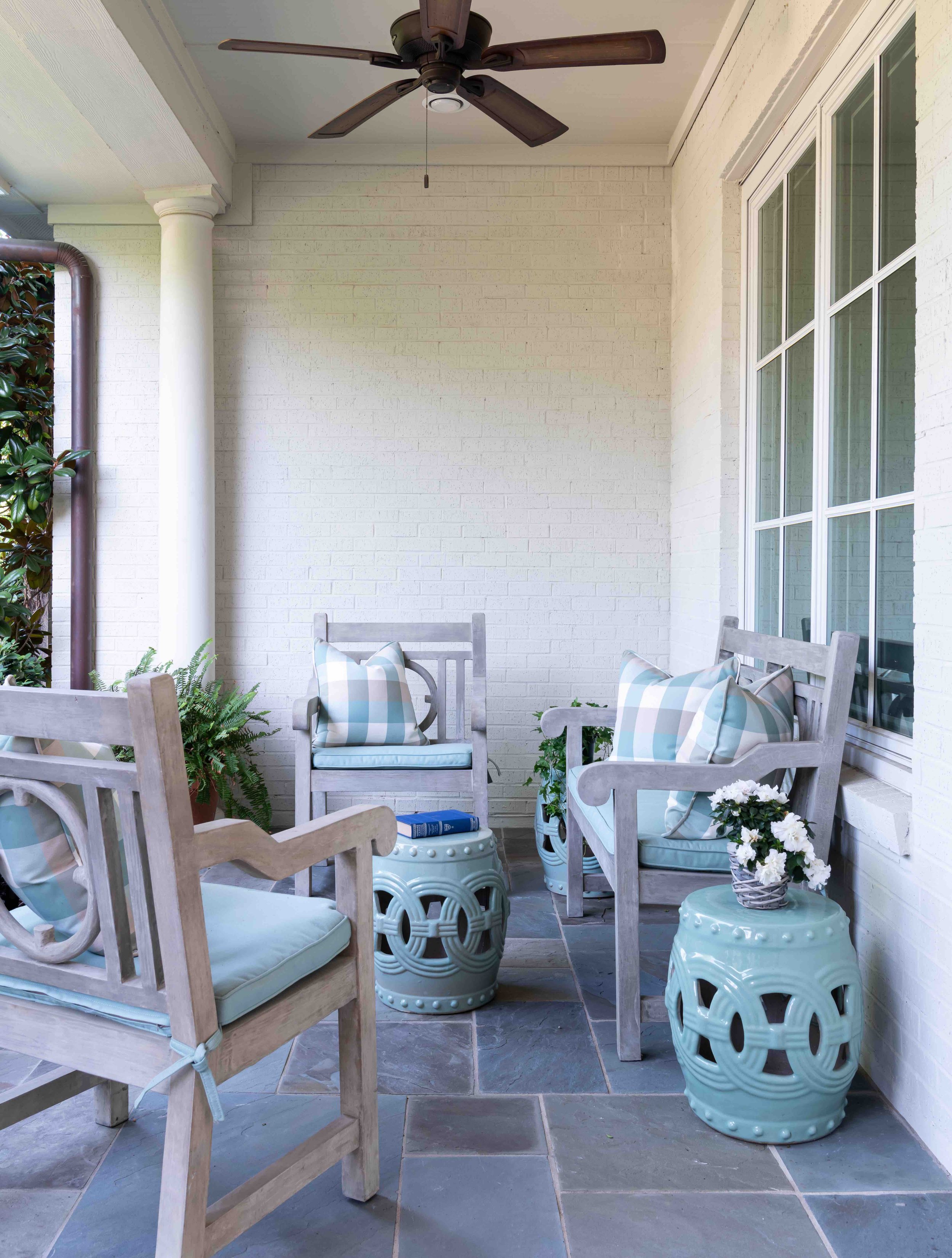
The concrete patio furniture that we used for this sitting area is very sturdy and won’t be knocked over in inclement weather. We chose aqua as the color for the gingham cushions and the garden stools because it complements the patio floor and the interior color scheme.

Whether you are selling your Dallas home or plan on enjoying it for years to come, it’s important to make the exterior just as inviting as the interior. Making a good first impression is especially crucial for home sales. If you look at listings online, you’ll notice that the vast majority of home listings feature the exterior as the main photo. However, many homeowners are daunted by the costs and decision-making involved in a renovation, especially if they haven’t made any updates since they first moved in. Below, you’ll find my top designer tips for getting your home looking its best this summer.

1. Start by Making a Budget

Any successful renovation project starts with making a budget and a checklist. After you’ve made a list of your most wanted upgrades, do research on how much each of them will cost, making a note of which you can do yourself and which you would need to hire a specialist for. You’ll also want to make sure you don’t overbuild for your neighborhood or create a design that will clash with adjacent homes.

The projects that tend to drive up costs the most include repainting the whole exterior, adding an outdoor living area, replacing the roof, replacing the garage doors, or redoing the landscaping. However, these upgrades also tend to have the biggest return on investment. Some less expensive ways to freshen up your home’s exterior include:

  • Removing fallen branches and dead plants, then planting new flowers

  • Washing the exteriors of your windows

  • Sweeping and decluttering your porch

  • Weeding the driveway

  • Replacing hardware with new fixtures in matching metal colors

2. Get Your Front Façade Sparkling Clean Again

Power washing is not recommended for homes with vinyl siding, shingles, or weathered brick. Shingles and weathered brick can be easily damaged, while vinyl siding is pliable, allowing water to possibly get trapped behind it. You can save money on a pressure washer by renting one from your local appliance store instead of buying one. To clean your windows, use a microfiber cloth with water and a few drops of dishwashing detergent on a pole.

3. Consider New Paint Colors

Just because the paint on your house hasn’t begun to peel doesn’t mean that it couldn’t benefit from a fresh coat, especially if the color has become dull over time. Although repainting a home can cost between $6000-$12,000, you can also give your home a more affordable facelift by only repainting the trim or shutters and front door.

Test any new paint colors by painting a small swatch. I generally recommend doing paint swatches in the back instead of in the front, unless you plan on repainting the whole house soon. You don’t want those paint swatches to be visible from the street, especially if you’re not going to commit to painting the house for another six months to a year.

If you own a brick home and the brick is starting to look tired, you can consider painting it a new color. That said, I prefer to leave the brick unpainted, as long as it’s an attractive color. The problem with repainting brick is that once you paint it, you have to repaint every 10 to 15 years to maintain it. When I do paint brick, I like to use paint with an eggshell finish, which stays fresh-looking for longer and helps dirt to wash off.

Repainting your front door in a bold color, like the red paint seen on the front door of this Preston Hollow home, is an easy way to make your front porch more eye-catching.

4. Take a Look at Your Front PorcH

One of the most impactful ways you can update your front porch is by either repainting or replacing the front door. Before replacing the door entirely, consider choosing a new design that will let in more light, have more or less architectural detail, or will be made of a different material. Whether you are repainting or replacing, make sure that the door still complements your home. If you’re replacing your hardware such as your house numbers, doorknocker, or doorknobs, try to match the fixtures to the style of your house — simple, modern fixtures for a modern house, or ornate fixtures for a traditional house.

Some types of home, such as ranch homes, have small entry areas. A popular renovation trend right now is visually enlarging these front door areas by widening the front steps or adding glass inserts on either side of the front door.

5. Have Your Roof Inspected

It’s generally recommended to have your roof inspected twice a year, especially after a big storm. The average lifespan for a roof in Texas is 15-20 years, but the actual lifespan of your roof depends on a number of factors, such as the material and the amount of damage it has taken. If your roof needs to be replaced, you may want to update it with architectural shingles instead of traditional asphalt shingles. Architectural roof shingles have more dimension and reflect UV rays, which helps to keep the house cooler. Nowadays, roof tiles can also be made of concrete, which is more durable than clay tiles.

This landscaping for a University Park home is beautifully manicured and full of variety, between the trimmed bushes, the ivy on the balustrades and the house, the pansies on the left and right, and the Japanese maple.

6. Freshen Your Landscaping

Fences aren’t just for security — they define your property and are another opportunity to add style to your landscape. Adding a gate to the fence gives your home even more presence. Before putting in new landscaping, try to choose plants that are suitable for your climate in all seasons. Shrubs can help hide less attractive features of your home, but make sure not to cover up any windows or other light sources.

Take a look at your hardscape to see if there are ways you can give it more charm and style. Exposed aggregate, colored concrete, or textured concrete are finishes that are becoming more popular for stone walkways. You can also use ground pavers and bricks to add a decorative finishing touch to your driveway. Another trend is retaining walls that are multipurpose and serve as planters.

7. Upgrade the Garage Doors

Although replacing the garage doors is an expensive project, it may be worthwhile if you’ve been having issues with your garage doors anyway, such as them getting noisier over time. Carriage style doors, carved doors, and contemporary style doors all have more personality and visual appeal than flat garage doors.

8. Brighten the Home with New Windows and Shutters

Many newly built homes in Dallas have nonfunctional, fixed shutters that are less attractive than traditional shutters. Consider updating your shutters with country or midcentury modern style shutters, depending on what kind of architecture you have. You may even want to enlarge the windows themselves. Enlarging windows allows more light to filter in while adding dimension to your front façade.

There are plenty of ways you can update your house’s exterior, no matter your budget. If you’re planning on making a serious overhaul, consulting an interior designer is not a bad idea. As the owner of a full-service interior design firm, I’m often involved with both the outside and inside of a house design. An interior designer like myself can keep your project on track and help you create a new look that stands the test of time. To schedule a free consultation with us, call our Dallas office at 214-651-7665 or send us an email at info@chambersinteriors.com.

RELATED ARTICLES:

4 Things to Consider Before Buying a Sofa by Margaret Chambers

This blue sofa with yellow throw pillows perfectly matches the colors we chose for this SMU Theta sorority house in Dallas.

Sofas are one of those “anchor pieces” that define the look of the whole room. Since they aren’t inexpensive, you’ll want to find one that you can enjoy sitting on and looking at for years to come. Following is a checklist of four things that I, as an interior designer, would suggest that people keep in mind as they shop.

1. Scale

Consider the different ways that you sit or lounge on a sofa. Do you like to sit with your legs up? Make sure that the sofa is deep enough to accommodate. Do you lie down sometimes? Your sofa will need to be long enough for you to stretch out. If you’re tall, you may also want to look for a sofa with a higher back for better back support. For couples, sofas that are between 80-90 inches are an appropriate width. Families should seek sofas that are 90 inches or wider.

Sectionals look best in large rooms, so for a small living room, I would recommend a pair of two-seater sofas instead. That way, you don’t have a large block of the same color fabric dominating one side of the room.

Sectionals, like the gray L-shaped sectional we used in this Kessler Park den, look best in large rooms.

When you’ve found a sofa that you like, try cutting out the shape of it from newspaper and placing it on your floor to serve as a visual guide. Check to see if you have enough space to walk around it and that any open doors or shelves won’t swing into it. Measure your doorways too to make sure you can fit your newest purchase into the house. If you’re going to have difficulty getting a sofa into the house, you can look for sofas with a low back style or removable legs, or modular sofas that can be brought in piece by piece.

To leave enough room for a side table, add about 20 inches of width to your measurement. You should also leave 20 inches of space between the edge of your coffee table and the front of your sofa. Don’t forget to measure the sofa’s height too, especially if you plan on having it in the middle of an open concept living space. You want the back of the sofa to be low so that it doesn’t cut across sightlines in the room.

When the seat is too low, it makes the sofa more difficult to get out of, especially as we age. 15 inches or less is considered a low seat height. 

2. Comfort

For a casual living room, opt for comfortable cushions, but for a formal sitting area, you want cushions that are firm and keep their shape. Feather-filled cushions have a cloud-like feel; however, they need to be fluffed once a week to retain their shape. Foam-filled cushions are less plush, but they hold their shape better. Cushions with inner springs that are wrapped in both foam and down feathers are my top pick because they keep their crown longer.

3. Fabric

For families with small children, I suggest choosing stain-resistant outdoor fabric brands like Sunbrella or Crypton. These fabrics won’t fade in sunlight either, so they can be placed near windows. Leather is easy to clean but also scratches easily, so it might not be a good option for families with pets.

We used a combination of different upholstery textures to create variety for this seating area in a North Dallas home.

In choosing your fabric color, ask yourself: is this room intended to be calming, playful, or elegant? A colorful or patterned sofa can inject energy into a room. A neutral, solid color sofa provides harmony. Make sure to bring home a sample swatch. With a swatch, you can see how the scale of the pattern looks in your living space or how the light in the room changes the color of the fabric.

4. Style

When it comes to sofas, some people prioritize comfort over style, so they end up bringing home a sofa that looks completely out of place. It’s worth your time and money to find a sofa that matches your home and feels great.

Although it’s possible to mix different styles of furniture, the safest bet is to pick a sofa that matches the style of the rest of the room. Modern sofas often have tapered legs, track arms, block feet, and grid-tufted cushions. Traditional sofas tend to have a skirt with tape on the bottom, rolled arms, and contrasting cording. Modern sofas will be a lot sleeker, deeper, and lower to the ground than traditional sofas.

Finding the perfect sofa isn’t easy. However, arming yourself with a checklist of your top priorities will make the shopping process faster and easier. If you could use more guidance, try reaching out to an interior designer like myself. Interior designers have access to the most durable upholstery fabrics on the market. And once we see your space, we’ll know exactly what style and size of sofa will fit right in.

You can reach us by sending an email to info@chambersinteriors.com or calling us at our Dallas office: 214-651-7665.

RELATED ARTICLES:

How to Tastefully Update a Period Home by Margaret Chambers

This dining room features dentil crown molding along the ceiling. We went with a clean, elegant, geometric wallpaper pattern that wouldn’t distract from the home’s architectural details.

Period homes (generally defined as any home built before WWI) tend to have high ceilings, beautiful detailing, and architectural features you don’t often see in new homes. For many homebuyers, the creaks, the cracks, and the repair costs of a period home are well worth it.

You might wonder how an interior designer like myself would approach a historic property. In my opinion, the architecture should tell you the design direction that you go, and the furnishings should reflect the period of the house. I personally think it’s kind of disturbing to obliterate the interior and redecorate in a minimalist style.

Of course, there’s no need to turn your house into a museum, either. Here are some tips for decorating a period home in a way that’s sympathetic to the house’s history, but still looks current:

1. Choose Fresh Colors

Start by doing research on how homes in the period were originally decorated, then pick and choose the elements that look the most timeless. As with any home, it’s better to make a period home as timeless as possible. After all, it’s expensive to do a home: if you only follow the latest trends, in ten years, those trends are gone and we’re all off to something else.

Don’t be afraid to use soft, contemporary paint colors in a Georgian, Federal, or Neoclassical house. If you use saturated wall paint colors, keep the period detailing (such as the cornicing) in more understated tones for contrast. Keep in mind that if your home is in a historic part of Dallas like Swiss Avenue, Hollywood Heights, or Munger Place, you may need to use a traditional color for the exterior.

Patterned wallpaper is a luxurious touch, but choose a print with more modern and understated colors to keep your space from looking too dated. I suggest hanging mirrors instead of art over wallpaper because their simplicity gives the eye a place to rest.

Light and pastel colors, like the pinks that we used in this Park Cities English cottage, can help a traditionally decorated room feel fresh.

2. Highlight Traditional Architectural Features

Sadly, many period homes have had their original sash windows, fireplaces, molding, ceiling medallions, and baseboards ripped out and replaced with cheaper materials. Regardless of whether or not original fireplaces are still in working order, they are part of the charm of the home and should be celebrated.

Instead of replacing sash windows, consider repairing them, waterproofing them, or even upgrading them with double glazing. The wall around a stained-glass window should ideally be painted white or another neutral color to let the colors of the glass stand out.

If the original wood flooring is heavily worn down, consult a renovation expert before tearing it out. It may be possible to patch or repair it. I would also advise against changing the detailing in the house, and instead restore it by repainting it.

You can create an interesting contrast with original molding and ornate ceilings by hanging contemporary light fixtures. If you want to keep any original light fixtures, such as sconces, you can always have them rewired.

3. Play to Your Period House’s Strengths

One of the advantages of period homes are the high ceilings. You will probably want a large lighting fixture, such as a chandelier, to take advantage of the extra ceiling height. On the other hand, one of the downsides to period homes is that they sometimes have dark, narrow hallways. Hang mirrors, which reflect more light into the space, or add sconces in your hallways. High gloss paint can also be a good choice for brightening the walls of a period home. Just remember that your walls have to be extremely smooth, like glass, or a glossy paint finish will highlight every imperfection.

This formal living room we designed for a classically French home in University Park is traditional without being fussy. To the right is a piece of contemporary artwork that matches the color scheme of the room.

4. Find the Right Balance of Traditional and Contemporary

When it comes to furnishings, I think juxtaposing modern and traditional elements is best. If you’re using traditional art, mirrors, and wallpaper patterns, mix contemporary furniture into the room. The simple lines of the furniture will stand out beautifully against the traditional backdrop. Likewise, if you use a lot of antique furniture, you may want to use updated colors for the walls as well as contemporary art, which adds an element of surprise. Make sure to reupholster antique furniture using current fabrics.

An alternative to buying a period home is to work with a classically trained architect (like Larry Boerder, Robbie Fusch, or Stephen Zepeda, to name a few), who can build you a new home in a period style. If you already own a period home and need help deciding which parts should be kept as is, restored, or torn out, it might be time to consult an interior designer. A professional designer can help make sure that your renovation doesn’t go too far, and will be connected with lots of restoration experts who can breathe new life into the home. To schedule an appointment with Chambers Interiors, send an email to info@chambersinteriors.com or call our Dallas office at 214-651-7665.

RELATED ARTICLES:

Why Homeowners and Designers Alike Are Embracing English Style This Year by Margaret Chambers

English style can work with both warm or cool colors. Pink adds a whimsical touch to this English cottage we designed.

English style has been making a comeback lately. If I had to make a guess as to why, I think it’s because English furniture is a little bit simpler than French or Italian style furniture. It mixes really well with a modern home.

If you’re drawn to English style but are worried that incorporating it will date your interior design, you’ll be glad to know that an English-inspired home can still look very current. In this article, I’ll give an overview of the key characteristics of English style and how I’ve been using English furniture and accessories successfully in my own design projects.

Traditional English homes, whether they are cottages or manors, tend to be comfortable, warm, and inviting. The color schemes are classic and understated rather than bold and vibrant. For example, these colors can include rust red, robin’s egg blue, pale green, pink, or gray. The flooring in an English home is usually wood with rugs over it, especially oriental or sisal rugs. The window treatments could be drapes, curtains, or shades, but never blinds.

Even a relatively modern or transitional English style home should be layered with antiques or traditional art to give the home a sense of history. That said, most designers are not using as many antiques as we did ten or twenty years ago. Back then, I would occasionally do entire rooms in English style, but nowadays, I use English antiques as more of an accent, scattering them throughout the home.

Another way to help an English-inspired room feel more current is to choose contemporary colors and simple draperies. For example, in one project with English antiques I used an aqua paint color to make the room feel fresh.

Aqua paint helps this English antique-filled dining room seem light and airy as opposed to dark and dated.

If you don’t already own English antique furniture, you’ll definitely want to brush up on the different periods of furniture making, such as the Tudor, Georgian, or Edwardian periods. Thomas Chippendale is the most famous English furniture maker: anything that was originally made in his workshop belongs in a museum today.

English furniture is usually made with very dark wood, such as mahogany, and has less carving than French or Italian pieces. Another interesting thing to know is that the English liked as many reflective surfaces in their homes as possible to brighten things up. As a result, they used shiny finishes on both their wood furniture and their hardware, with the hardware often finished in shiny brass.

English antiques are often made of dark woods with shiny finishes, like these in a University Park home we designed.

An easy way to capture the ‘English look’ is to learn about iconic furniture designs from England and incorporate them into your rooms. Some of these “staple” pieces include the Windsor chair, the Queen Anne chair, and the Chesterfield sofa. Four-poster beds with heavy drapes were traditionally used in English homes to insulate against the night chill.

I would also encourage anyone serious about English antiques to see collections in person if they can. Here in Dallas, the DMA has a whole wing of fine pieces of American furniture. American furniture is worth looking at as well: American and English antique furniture are so similar to each other that it can take an expert to distinguish the two. Another large collection of American furniture is in the Winterthur Museum in Delaware.

As far as accessories go, the English liked to use chinoiserie. Europeans in general have long been fascinated with Asian porcelains. Other accessories commonly seen in the traditional English home include needlepoint pillows, antique clocks, and oil paintings of family portraits, dogs, or horses.

Traditional paintings featuring dogs and horses, especially in hunting scenes, are classic English style.

Even if full-blown English interiors are considered outdated by some today, I still love to work with English furnishings and antiques. Balancing them with a modern or contemporary interior is a fun and rewarding challenge.

An interior designer like myself, especially one well-versed in European antiques, can be a valuable partner in both sourcing the antiques and figuring out the best way to use them in your home. To schedule a free consultation with us, send an email to info@chambersinteriors.com or call our Dallas office at 214-651-7665.

RELATED ARTICLES:

Design a Beautiful Dining Room You’ll Use Year-Round by Margaret Chambers

Almost everything in this dining room follows a neutral palette, from the English firework chairs to the feather crystal chandelier.

Whether your dining room is used often or reserved for special occasions, it's an important area in your home and deserves to be beautifully designed. Following are some interior design tips for dining rooms, drawing on my years of experience as a professional designer.

With dining rooms, it's helpful to consider the style of adjacent rooms, any heirloom pieces you intend to use, and the ambiance you want to create. If you own heirloom furniture or have furnishings you don't plan on replacing, such as built-in cabinets, you should pick a color palette that harmonizes with them.

Light colors, like the pale blues and creams we used in this Preston Hollow dining room, make a space feel more open.

Is your dining room small or large? If the room’s size is making it difficult for you to work with, you can use color to make the space appear more open or more enclosed. For example, choosing a deep color for your walls gives your dining room an elegant and cozy feel. Cream and pale colors can help open up a small dining room. If you're putting your dining table in a corner area, combining a banquette with dining chairs is a great way to make the best use of your space. Use the same upholstery fabric on both the banquette and chairs to tie the mixed seating together.

To avoid overcrowding, make sure there is enough room for people to move in and out of their chairs once they've been seated. A good rule of thumb is to leave three feet of room between the dining chairs and surrounding furniture or walls.

In order to seat eight in the relatively small room, we custom designed a round table that was a good fit for the space.

Consider how many people you will want to host before you buy new dining furniture. While rectangular tables are suited to hosting a large party in a rectangular room, round tables are great for square dining rooms and encourage conversation. Forty-two inches is the ideal width for a rectangular table. You should also make sure to take measurements before you buy new chairs for an existing dining table. If the chairs are the wrong height for the table, it makes things uncomfortable for guests. You can add some interest to your seating arrangement by using contrasting chairs for the head and foot of the table.

The textures and colors of your furnishings should be compatible with the style of your home. Steel and glass are a good fit for contemporary, while polished wood can have a formal look, and rougher textures like pine or distressed finishes convey rustic charm. Bring all your furnishings together with an area rug or a chandelier. With an area rug, it’s important to leave enough space on all sides for guests to scoot their chairs out without running over the edge of the rug—at least two feet out from the edge of the table. If your dining room does not have enough space for a rug, it’s preferable to not have one at all.

The table setting in this Dallas kitchen we designed exudes rustic comfort with a touch of class.

Make sure your lighting will create the ambiance you want for your dining room. Don’t hang downlights directly over chairs, or else you’ll create dark shadows on guests’ faces. A chandelier should be hung twenty-eight to thirty-four inches above the table to prevent bulb glare from being visible in the eyes of seated guests.

Sconces, buffet lamps, and wall washers are useful for adding ambient light to the room or highlighting artwork and architectural details. A dimmer is also great to have. Not sure what to decorate your dining room walls with? Aside from artwork, you might consider using photography, wallpaper, mirrors, a plate collection, or decorated shelves.

If you're having trouble making the best use of your furniture and your space, you can always consult an interior designer. After all, you'll want your dining room to be a room you love and use often, whether you plan on entertaining or using it as a family hangout space. To schedule a free consultation with us, send an email to info@chambersinteriors.com or call our Dallas office at 214-651-7665.

RELATED ARTICLES:

Find Your Happy Place with These 4 Vacation Home Design Tips by Margaret Chambers

Seen here is a charming vignette from a Hill Country style second home we designed in Prosper, Texas.

If you’re like many Dallas urbanites, you’ve always dreamed of having another place to escape to, such as a mountain cabin, lake house, or beach house. However, designing one home is already a big project. It’s no wonder that many people would feel weary just thinking about styling and furnishing a second home.

There are certain things that I think people should keep in mind before they design their first vacation house. Regardless of whether or not you already own a vacation property, or are making plans to buy one, these designer tips should help you get started.

1. Choose the Appropriate Design Style for Your Location

This guest bedroom and bathroom in a Dallas home have a nautical theme to give guests that "getaway" experience.

Now is the time to create a look that’s entirely different from your city home. To start with, I think a second home should reflect the area it is in. Farmhouses and mountain homes tend to be rustic, while coastal homes are usually more casual. For example, a mountain home could have photographs of local scenery or wildlife on the walls. If your second home is by the shore, you’ll definitely want nautical accessories, like seashells or nautical paintings. A lake home should almost always be decorated in light and cool colors, such as blues, whites, and aquas.

2. Make Sure to Create an Oasis

Your vacation home should be a place that you want to escape to. No matter the budget, there needs to be at least some touches of luxury in the home to give you that “resort” feel. It’s up to you where you want to splurge—in unique accessories, luxurious fabrics or in natural materials, to give some examples. One way to make your bed feel more inviting is to choose an extra tall or extra wide headboard. Your bathroom should also be bright and well-lit to create a spa-like atmosphere.

While some accessories are necessary to give the home personality and charm, remember that clutter also creates more stress (and all of those pieces will need to be dusted, too). I wouldn’t include anything that is too delicate or precious in a vacation home. This is especially true if small children or pets will be spending time at the house, in which case you should choose a durable flooring, like polyurethane-coated hardwood or tile, instead of carpeting.

Instead of delegating worn out bedding sets to your second home, make quality bedding one of your budget priorities.

3. Keep Things Interesting with Texture

Vacation homes are usually in a beautiful natural setting, so you’ll want to ‘bring the outdoors in’ by using natural materials. If you look at professionally designed vacation homes, you’ll see a lot of wood furnishings. Some other natural materials you can think about including are slate floor tiles and natural fiber rugs. Don’t forget to combine your rough textures with soft fabrics, like those made of sheepskin, wool, or linen. Since you won’t be using your vacation home year-round, you probably don’t want to buy live plants. Instead, add some greenery with realistic-looking faux plants.

Since this vacation home is a farmhouse, we made sure to include lots of natural materials, especially wood.

4. Plan Ahead for Your Guests

Most people who own a second home intend to let their friends or relatives use it too. If you do plan on entertaining, make sure that your living and dining areas will have enough seating space. A round table makes it easier to squeeze in additional chairs if needed. A vacation home table should also have plenty of space to play games or work on puzzles. Consider adding bar seating to your kitchen island so that guests can visit and chat with you while you cook. If you’re loaning out the home to people you don’t know very well, have an area where you lock up and store your own personal belongings.

As you can imagine, there are certain design styles that are better suited than others for vacation homes. Depending on where your second home is located, the list of fitting styles gets even narrower. Knowing more about these styles will make it much easier for you to envision and design your dream home.

The striped green curtains in this girl's room bring the colors of the outdoors in.

If you don’t have the time or energy to do it yourself, that’s where an interior designer such as myself could come in. My firm has a lot of experience with vacation homes, and I personally enjoy finding ways to bring local color and regional accessories into them. You can reach out to us by sending an email to info@chambersinteriors.com or calling us at 214-651-7665.


RELATED ARTICLES:

How to Use Décor to Highlight Your Hardwood Floors by Margaret Chambers

The neutral colors and orange accents in this modern Dallas home complement the light wood floors.

In my last design article, I discussed the different kinds of hardwood flooring available and the pros and cons of each. This follow-up article is aimed at homeowners who already have hardwood flooring but could use some help complementing it with the right décor. If you’ve ever wondered which wall paint colors go best with dark wood floors, which colors are best for light floors, or when to use rugs (and when not to), look no further: I’ll answer these questions and more here.

Start by Identifying Your Wood’s Color Tone

Ideally, the color scheme for a room should harmonize with the wood floor’s undertone color. Depending on its species or finish, wood can have tints of gray, red, orange, or yellow. Oak, for example, can be red or white (I personally prefer white oak because I think it makes a prettier brown). Pastel blue, cream, or apricot are good wall paint colors for a room with red oak floors. Meanwhile, charcoal gray or light gray are attractive wall colors for rooms with white oak floors.

How to Make Dark Wood Floors Shine

Grey paint, as seen here in the library of a Kessler Park home, is a good wall color to go with dark hardwood floors.

Rooms with dark wood floors need to have light walls to prevent the room from becoming too dark and cave-like. That said, this still leaves a wide variety of paint color options, from cream, to light gray, bronze, light blue, or pale green. Some people will also use painted furniture in light colors to create contrast against the dark floor. A more formal look can be achieved by using dark wood furniture that is a slightly lighter shade than the floors.

Incorporating plants is also a good idea: the bright greenery will really pop against the dark base. Natural light also reflects beautifully against the grain of dark-stained wood, so try to let in as much natural light as possible.

Tips for Working with Light Hardwood Floors

The best wall colors for rooms with light hardwood tend to be neutrals. Off-white will give the room an airy feel, cool gray will create an aura of relaxation, and warm gray will make the room seem cozy and inviting.

White furniture, a sandy brown rug, colorful accents, and gold or silver accessories are a winning combination for light hardwood floors. Some other area rug colors to consider are earth tones, burgundy, and peach. For the furnishings, you could go with grey or black furniture.

Almost every home with hardwood floors should use rugs.

A Word About Area Rugs

Area rugs are almost always a must for hardwood floors. They protect your floors from daily wear and tear while also softening footfalls. If you have wood furniture that is similar in color or tone to your wood floors, you can use a contrasting rug to create a buffer between them so that they don’t blend together.

Parquet floors are one of the only types of hardwood floors that I wouldn’t recommend using rugs on. Sometimes, the inlaid wood pattern is so busy that it would be overwhelming to break it up even further with rugs.

If your home has wood floors, don’t use all wood furniture. You can introduce more variety by including upholstery and pieces made of glass or metal.

Don’t Forget to Mix Up Materials

Though hardwood floors can complement other woods in the same color family, you’ll also need to mix things up by incorporating other materials in the room. Woven fabrics, leather, metal, and upholstery introduce an appealing variety of textures in a room.

As an example, rich brown hardwood goes well with organic materials, such as a natural stone fireplace. If your wood floor has a bright sheen, you can add some softness into the room with upholstered, curvaceous furniture. Metallics and glass will bring a sleek touch to a modern or contemporary home with white oak floors.

Hardwood is the most sought-after kind of flooring, so if you have it, you’ll naturally want to show it off. By harmonizing your hardwood floors with the right paint colors, furnishings, and fabrics, the process becomes much easier. Those who still find the prospect intimidating would do well to work with a designer.

An experienced designer like myself can take one look at a room with hardwood floors and know exactly which colors and style of furnishings will work best with it and its architecture. If you'd like to work with Chambers Interiors, give us a call at 214-651-7665 or send an email to info@chambersinteriors.com.

RELATED ARTICLES:

Stuck on a Room Design? Follow These Four Steps to Find Inspiration by Margaret Chambers

The vaulted ceiling in this Dallas home game room called for extra-large light fixtures.

Do you have a room in your home that you feel “stuck” on? Maybe you have an awkwardly shaped space with unused corners. Or perhaps you made a major purchase, like a dining table, that doesn’t mesh with the surrounding décor like you hoped.

When a client calls me, it’s usually because they’re stuck and afraid to make big decisions. As an interior designer, I like to take the following steps whenever I’m confronted with a challenging room.

Step 1: Make a list of what bothers you the most

Long hallways can be challenging to decorate. We filled these walls with a series of gold-framed antique Egyptian prints.

Take a moment to ask yourself if there are things in the room that you already know aren’t working for you and your family’s lifestyle. Then, put away the majority of your accessories, leaving just your largest pieces of furniture and anything else that you’re absolutely sure you want to work with. Paring a room down to its essentials is one way to encourage you to look at the space in a new light.

If the room feels “off” but you still can’t pinpoint the problem, try taking a photo or a video of the room. There are times where seeing the space in a photo can help you identify imbalances or problem areas that you may have overlooked in real life.

Step 2: Study rooms you love for ideas

At this stage, you’ll probably need some ideas on how to work with your mostly-blank slate. Whenever I’m having trouble with a room, I start looking through magazines and home decorating books for inspiration. I also ask my client to show me their favorite rooms so that I can make sure my design aligns with their tastes.

Although the unusual color combination in these curtains created limitations to work with, we were thankfully able to build a beautiful color scheme around them.

A piece of artwork, a fabric pattern, or something from nature can sometimes give me an idea for a color scheme. In one project I designed in Preston Hollow, the client asked me to use six fabric panels she inherited from her mother. The purple, green, and black colors on the panels created limitations to work with, but they also helped define the colors for the rest of the room. For example, we added a still life and a portrait that belonged to the client’s family, both of which had a lot of black in them. This guest bedroom, with its green wall paint color, purple chair, and black-washed night stands, ended up being one of my favorite spaces in the house.

Step 3: Experiment with pieces you already own

Before you run out to a home goods store, try “shopping at home” first. Take items from other rooms and put them in the blank areas of your problem room. You might be surprised to find that a console from your entryway or a painting from the living room looks even better in a new space.

Don’t be afraid to rearrange furniture into new configurations. After moving furniture around, you should be able to figure out what you can work with, and what will need to be replaced, repainted, or reupholstered.

Step 4: Identify your unique style, and only shop for items that fit it

If you own a lot of multicultural art, you can keep things cohesive by combining pieces that share similar colors.

Sometimes when a room isn’t coming together, it’s because it is filled with heirlooms from different design eras. Now’s the time to decide on what style you want to aim for and buy items that fit consistently into it.

Generally, if you’re going to invest in a new anchor piece, it should be timeless—preferably in a neutral color. Your tastes will evolve as trends change, so you don’t want to splurge on a “trendy” piece and have to replace it again a few years later.

If you’re still having trouble getting your room to look perfect, the next step is to bring in a fresh set of eyes. Have a relative or friend stop by. They might be able to identify the missing piece in your room’s equation. Even better, call in a professional designer. As a designer, I actually enjoy working with my clients’ most challenging rooms. Designing a room is like solving a three-dimensional puzzle, and challenging circumstances often result in the most unique and memorable room in the house. You can reach out to us by calling our Dallas office at 214-232-950 or emailing us at info@chambersinteriors.com.

To fill the high ceiling in this stairway hall in a Dallas home, we used framed, eight-foot-tall wallpaper panels.

Four Pointers for Teenage Bedroom Design by Margaret Chambers

Wall art is an important asset for giving a teenage bedroom its individuality.

Designing a teenage bedroom can be an interesting challenge. At this point, the nursery décor your teen grew up with has got to go. On the other hand, you can’t simply decorate the room the same way you would with an adult bedroom. Striking the right balance between casual and formal is key here. Your teen will also want to be included in the design process, so it’s important to keep their interests in mind.

Every teen bedroom should be a unique expression of that teen’s personality. However, there are also some general guidelines that can be applied to any teenage bedroom. Before you begin with your interior design project, keep these pointers in mind.

1. Create Separate Zones for Resting, Studying, and Socializing

Colors like pastel green and purple are excellent alternatives to pink for a teenage girl bedroom’s color scheme.

Chances are, this is the room your teen will spend the most time in. Any teen bedroom needs to be a refuge, a home study, and also a hangout space for them and their friends. Make sure there’s a designated zone for each of these. One thing to remember is that your teen might want to take their furniture with them when they move out, so don’t break the budget on furnishings. 

A comfortable work desk will help your teen stay focused and on-task. If the room is too small for a separate seating area, you could also create a lounging space on the floor with pillows and a rug, or add ottomans to the foot of the bed. For a teenage girl’s bedroom, you’ll probably want to include luxurious fabrics, like velvet pillows, soft blankets and bedding, gauzy curtains, or thick-pile rugs.

Navy blue and brick red are both great colors for a boy’s room, like this one we designed for a Preston Hollow home.

2. Use Your Teen’s Favorite Colors in a Sophisticated Way

One of the easiest ways to differentiate between a child and a teenage bedroom is through color choices. While nurseries usually have pastel colors, and most adult bedrooms are in neutrals, teens tend to gravitate to bold color combinations. Even if the majority of the furniture in the room is neutral, there should ideally be a burst of your teen’s favorite color somewhere.

For teen boy bedrooms, navy blue or warm neutrals (such as warm gray) are popular wall colors. Today’s teenage girls usually prefer green, purple, grey, or blue over pink as the dominant color in their rooms. Purple is a versatile color in that some shades can be whimsical (like lavender) while others are romantic (like deep purple). While touring homes, I’ve noticed that teenage girls’ rooms often have a lot of white furniture.

3. Plan for Plenty of Storage Space

If you have a teen who keeps their room tidy, you have a rare teen indeed. That said, including enough storage space and shelving in the bedroom can go a long way towards helping your teen keep clutter out of sight. The room’s overall design should also be clean and minimal, but not too fussy. Remember that your teen will almost certainly want a room with a more casual and approachable vibe.

A bedside table with pullout drawers is a good choice for adding storage to a small teen bedroom.

4. Design Around Accents and Art that Express Your Teen’s Individuality

Before you begin decorating in earnest, ask your teen if they have art pieces or prints in mind that express their personality. You can potentially use art pieces as a focal point or as a source of stylistic inspiration for the rest of the room. Some other ways to set your teen’s room apart from those of their friends include: incorporating an unusual piece of furniture that makes a conversation piece, adding wallpaper to the ceiling, or wallpapering an accent wall.

Your teen will appreciate having something fun and unique in the room, such as these framed insects on the wall.

Sometimes even when you follow recommended design guidelines, it can still be difficult to bring everything together. In cases like these, your next step should be to consult a professional designer. When I work with clients with teens, I ask my clients to provide examples of rooms that inspire them. An experienced designer such as myself will know how to accommodate both the parents and the teenager’s requests and deliver a result that will wow them and visitors alike. To schedule a free consultation with us, send an email to info@chambersinteriors.com or call our Dallas office at 214-232-9501.

RELATED ARTICLES:

Don’t Let Your Kitchen Backsplash Be a Missed Opportunity by Margaret Chambers

This backsplash around the window in this catering kitchen is made of the same marble that we used for the countertops.

Although kitchen backsplashes have a functional purpose—protecting walls from water, grease stains, mold, and mildew—these days, they are also treated as an important design element. After all, the backsplash is right on the wall, so a visitor’s eyes naturally rest there. Despite the fact that backsplashes can make great focal points, many Dallas homeowners save picking their backsplash tiles for last.

Your kitchen design will look more impressive if you pick your backsplash tile early on and design around it. For those of you who are designing a new home or planning on remodeling your current kitchen, you should find the following tips useful.

A backsplash should cover the wall space between the countertop and upper cabinets above your range. Lately, I’ve noticed that the newest trend is to have the backsplash continue up beyond the upper cabinets, sometimes even up behind the vent hood. To figure out how much square footage of tile you’ll need, multiply the width of your wall by the height. Then, increase that number by ten percent just to make absolutely sure you’ll have enough.

When possible, we like to continue the backsplash behind the vent hood, like in this example from a Dallas kitchen.

Ceramic, stainless steel, porcelain, and stone backsplashes are great against oil and grease. Glass tile is perfectly water-resistant, so if you create a lot of steam when you cook, that’s something to consider. You should also think about how much maintenance you’re willing to accept for your backsplash. Ceramic tile doesn’t need to be resealed, but natural stone will.

Even if you’re saving money on your tile choice, don’t cut corners with your grout choice. You need a high-quality grout to make sure the tiles stay on the wall over time. Most tile backsplashes have a grout joint size of one-eighth of an inch, but sizes of up to a quarter inch are also possible.

Since replacing tile is expensive, you can never be too careful making your choice. Purchase a lot of different tile samples to take home (it’s cheaper than buying a lot of the wrong tile), then tape them to your wall and leave them up for a while. You can see how the color shifts as the lighting changes through the day.

Subway tile, like the gray tile we used in this bar area, is a classic choice for kitchen backsplashes.

Recently, my design firm has been using the same material for both the countertop and kitchen backsplash. Whether you use the same material or not, try not to create too much contrast between the two surfaces. For example, if your countertops are a cool gray, your backsplash should also be in a cool color.

The gray and terracotta colors in this mosaic tile backsplash match other colors we used in this Kessler Park home.

Mosaic tile patterns often incorporate multiple colors, allowing you to pick up on some of the other accent colors you’re using in the kitchen. If you have countertops with a unique pattern or color running through them, it’s a good idea to pick a neutral backsplash tile so you don’t draw attention away from your countertops. Of course, if your countertops are understated, you have more room to be creative and showy in your backsplash tile choice.

Choosing a timeless backsplash is important if you’re planning on selling your house. White subway tile is one option, but also consider penny tiles, picket tiles, square tiles, or hexagon tiles. White subway tile is also perfect for kitchens that have a lot going on, visually. Although it’s normally laid out in a brick pattern, a newer trend is to lay the tiles diagonally or vertically. Another thing to keep in mind is that larger tiles tend to look more contemporary, while smaller tiles feel more traditional.

Although there is no one-size-fits-all solution to finding the perfect backsplash, some tile choices will work in your kitchen better than others. By taking into account your budget, your lifestyle, and the rest of your kitchen’s aesthetic, you can easily narrow down your selections.

We used this fireplace screen with animal figures as a kitchen backsplash. It helps to complete the farmhouse theme.

Designers like myself also have established relationships with showrooms which gives us more leeway to request a tile and then return it on short notice. A designer can be a great resource whether you are just beginning your kitchen design project or nearing the end. If you'd like to work with us, you can reach us by calling our Dallas office at 214-232-9501 or sending an email to info@chambersinteriors.com.

RELATED ARTICLES:

How to Set a Gorgeous Table for the Holidays by Margaret Chambers

The table setting for this University Park dining room is garden-themed. The china has hand-painted botanical and butterfly motifs.

Although certain images and colors come to mind for holiday table settings, there is plenty of room for you to get creative too. In this article, I’ll go over best practices for table settings, so you can dress a great table any time of the year.

General Tips for Table Settings:

Step 1: Laying a Foundation

If you’re at a loss on where to begin, try picking a visual element that you enjoy—such as a color, type of flower, or a pattern—and basing the rest of your design around it. Another good starting point is choosing your tablecloth (which forms the foundation of your design) first. That said, many homeowners today prefer to use placemats and chargers instead of a tablecloth.

This green-and-white ikat tablecloth is custom-made from Vervain Fabrics.

You can also consider if you want to use a table pad under your tablecloth. Table pads protect your table from heat and spills. Your runner should have a color that matches at least one other element in the room, such as the upholstery on the dining chairs or the paint color on the walls.

Step 2: Place Settings

How you set the table depends on whether your event is a casual or formal one. For a formal dinner, there are certain guidelines to keep in mind in regards to silverware and stemware placement. Don’t be afraid to adjust the arrangement a bit if it makes more sense for your table. For example, although bread plates usually go on the upper left, they may look better on the lower left for your table setting.

If you’re buying a new set of dishes, go with a neutral color and an understated pattern. That way, your plates will mix and match with a variety of different tablescapes in the future. Old and new china patterns can coordinate as long as they share the same color scheme.

There are many ways to fold a napkin, the easiest of which is to pass the napkin through a pretty napkin ring. If your napkins have detailing on the ends, make sure that the details will still be visible after folding. Monogrammed napkins are particularly popular right now.

Step 3: Choosing a Centerpiece and Accessories

Most people use a large flower arrangement as their table centerpiece, but it’s not the only option. For contemporary dining rooms, a clay or metal abstract sculpture can be a good alternative.

This ginger jar contains paper lanterns, bittersweet, and willow branches, which add a burst of orange to the table.

A single centerpiece won’t be enough to balance a large table. You’ll want to even things out by scattering small vases or baskets across the table with a variety of greens. Regardless of what you use to decorate the table, nothing should be so tall that it blocks conversation between seated guests.

Decorating with fresh fruits is another way to add something organic to the table. Lemons, limes, oranges, pomegranates, and red currants all make beautiful table decorations.

Design Advice for Holiday Table Settings

By using natural materials, earth tones, and reds, we were able to give this table setting a cheerful autumnal feel.

Your holiday colors don’t have to be red, green, blue, or white—in fact, those colors may clash with the rest of the décor in your dining room. If you’d like to branch out, try jewel tones like raspberry, teal, or deep purple. You can also give your holiday table setting a more upscale touch by including metallic accents. As an example, you can pick a tablecloth or runner with a subtle gold pattern and use bright gold chargers on top.

Adding a woodsy element, like branches or pinecones, is one way to give a Christmas table setting a more rustic feel. Candles are a common table accessory any time of the year, but during the holidays, they’re a must. Stay away from scented candles, however: they can interfere with the aromas of the meal you serve.

Table settings are often one of the last home decorating projects that people do during the holidays. However, there is no need for yours to be a last-minute scramble. By picking your theme and ordering flowers in advance, you can make setting the table a more enjoyable and stress-free process this year.

Need some extra help getting ready for the holidays? Some of my clients ask me to come back and decorate their homes for Christmas, so my firm has a lot of experience with holiday decorating. Schedule a free consultation with us by calling our Dallas office at 214-232-9501 or emailing us at info@chambersinteriors.com.

RELATED ARTICLES:

Four Crucial Steps for Designing an Open Concept Space by Margaret Chambers

This project has an open concept space where the dining room, kitchen, morning room, and living room are all connected.

This project has an open concept space where the dining room, kitchen, morning room, and living room are all connected.

There’s a reason why open floor plans have become so ubiquitous in Dallas homes over the last few decades. Open concept interior design promotes a feeling of togetherness, which is especially attractive to young families with busy schedules.

However, people who are furnishing an open concept home for the first time may be intimidated by all the extra room. How do you make sure that your home feels warm and inviting instead of empty and cold? How do you balance the lighting and ensure that you’re getting the most use out of the space? For answers to these questions and more, read on.

Step 1: Choosing Flooring and Paint Colors

If you’re building a new home or having one remodeled, you should try to use the same flooring material throughout your open concept space. For paint colors, we as designers suggest choosing a neutral color for the walls. Some open concept homes feature an accent wall painted in a different color. Even in this case, I would recommend painting the trim all in the same color (or even the same color as the walls) for a feeling of continuity in the room.

If you have a high ceiling, you might also consider painting the ceiling a darker shade, which helps the room feel cozy and cave-like. Regardless of what paint colors you choose, don’t leave your walls bare: make sure to fill all that open wall space with art and mirrors.

Large windows filter light into this open concept kitchen during the day, while chandeliers illuminate it at night.

Large windows filter light into this open concept kitchen during the day, while chandeliers illuminate it at night.

Step 2: Plan Your Lighting Ahead of Time

It’s very important that your open concept space be well-lit at all times of the day. An open floor plan that is shadowy in spots feels unbalanced and unwelcoming. The easiest way to create an even coverage is by installing overhead lights and scattering lamps across the space. When I design an open concept space, I make sure to plan the positions of the furniture and floor outlets ahead of time. That way, we can plug the lamps in the floor outlets without running the cords across the floor.

Step 3: Furniture Shopping

If you have an especially large open floor, you’ll want to “anchor” it with appropriately sized furniture, such as a large dining table and large sofas. You can then pair your bulky pieces with slender furniture. Whenever you can, include multifunctional pieces. Putting a writing desk in your den area makes that space also function as a home office.

This Dallas living area features the same rust, beige, green, and cream colors that we used in the open concept kitchen.

This Dallas living area features the same rust, beige, green, and cream colors that we used in the open concept kitchen.

It’s generally not advised to push your furniture up against the walls, so keep in mind that your furniture will be seen from all sides. Make sure to buy pieces that you think look great at any angle.

Step 4: Use Furniture and Rugs to Divide the Space

Once you have your color scheme, furnishings, and lighting fixtures ready to go, the next step is to use them to divide the floor into functional spaces. A good place to start is by identifying a focal point in your room and then organizing a seating area around it. Examples of focal points in an open concept space include gallery walls, large windows, and fireplaces.

Seen here is an open concept morning room. The swivel chairs can be turned towards the fireplace or the kitchen.

Seen here is an open concept morning room. The swivel chairs can be turned towards the fireplace or the kitchen.

Rugs are one of your best tools for visually breaking up a large space and marking off seating areas. By having the legs of your furniture touching a single area rug, it helps bring them together. You can also create separate areas in your space by using shelving units, decorative screens, sectionals, or console tables.

To prevent each of these areas from clashing too much, coordinate them by using similar colors and materials in each zone. It’s not necessary to use the same colors and patterns throughout your whole house, but in the open concept space, everything within eyesight needs to harmonize.

Learning how to decorate an open concept space is an important skill even if you’re not currently living in one. After all, most newly built homes these days have a floor that connects the family room and kitchen area, so it’s likely that your next home will be open concept.

By planning the space thoughtfully, or working with an interior designer who is experienced with open concept design, you can create a space that feels spacious but also comforting. If you're interested in working with Chambers Interiors for your upcoming project, call our Dallas office at 214-232-9501 or send an email to info@chambersinteriors.com.

RELATED ARTICLES: